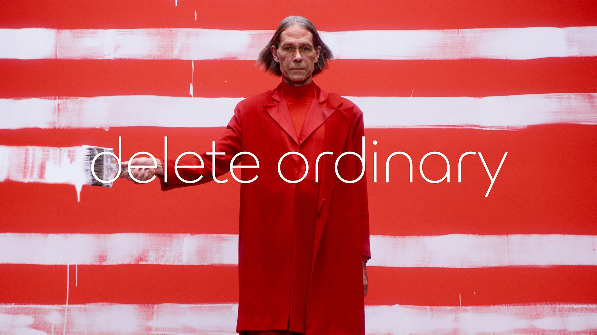
Jaguar, the 90-year-old sports car brand operated under parent company Jaguar Land Rover (JLR), has plans to “completely reset” its image to become an ultra-luxury, fully electric-vehicle brand. To make the change, the brand is scrapping its iconic jaguar logo.
At a recent press briefing from its headquarters in England, Jaguar executives announced that the brand is aiming to fully relaunch to capture a growing audience of EV buyers. In the coming years, the carmaker plans to transition to an entirely battery-electric fleet of vehicles, each of which will be about twice as expensive as existing models. The move upmarket is complete with a new logo, color scheme, maker’s marks, and some pretty weird concept videos.
Jaguar’s bold rebrand is an amped-up version of a strategy that other companies, like Audi and General Motors, have used for new EV lines: moving away from recognizable brand touches to signal an entirely new, more tech-centric era.
Behind Jaguar’s risky new strategy
As a brand, Jaguar has a storied history going back to 1935, when the first-ever Jaguar car hit the market. Throughout the 20th century, the company experimented widely with form and silhouette, becoming especially notable for the skinny, low-profile 1961 E-Type. Founder Sir William Lyons based the brand in a spirit of risk-taking design innovation, famously stating that, “A Jaguar should be a copy of nothing.”
Jaguar was purchased by the company Tata Motors in 2008, which then merged the brand with Land Rover in 2013, forming what’s now JLR. Over the past several years, Jaguar has fallen into relative obscurity compared to its heyday. Last year, it sold 43,000 vehicles globally compared to 179,000 in 2017.

“[Jaguar] wasn’t always distinctive enough in the last decade,” CEO Adrian Mardell said at the recent press briefing.
The company is now making an aggressive play to combat its major sales slump. In 2021, it announced a plan to move toward luxury, all-electric vehicles by 2025, courting a new audience of young, wealthy, sustainably minded, first-time buyers. Jaguar already ceased production in June of its three remaining internal combustion cars, and the company previously reported plans to end production of a fourth model by the end of this year—leaving the brand without any new vehicles until its upcoming electric line, which it expects to debut by late 2025 or early 2026.
It’s a bullish move, signaling that Jaguar’s existing business model is simply no longer working—and the company sees a way forward with EVs, which have grown globally by 24% in sales in January through October 2024 compared to the same period in 2023, according to Rho Motion.

The iconic “growler” growls no more
Back in 2023, Jaguar hinted that the pricing of its upcoming model could sit somewhere around $127,000—a hefty jump from its existing cars on the market. To fit the lofty price tag, the brand debuted an all-new, gold-plated look today.
Most notably, the Jaguar rebrand scraps its recognizable “growler” logo, which displayed a snarling jaguar’s face in the center of a roundel, topped by the brand name in an all-caps font. The new logo is a pared-down, sans-serif wordmark with lowercase letters (except, somewhat frustratingly, the “G”). The new “j” and “r” also appear in one of two maker’s marks, which is a simple circular design featuring the mirrored letters.
“[The wordmark] is a powerful celebration of modernism—geometric form, symmetry, and simplicity—demonstrating the unexpected by seamlessly blending upper and lowercase characters in visual harmony,” the brand explains in a press release.
While the seamless visual harmony is somewhat debatable, the new logo’s rounded edges and simplicity certainly signal a move away from the 20th century and toward a more tech-forward, modernized brand. The rebrand does include a nod to the brand’s heritage with a second maker’s mark, which uses another previous jaguar logo—the “leaper”—against a striped background.
The new branding materials are all rendered in a luxurious gold, though Jaguar has described its future color scheme as “inspired by the painters palette,” with yellow, red, and blue accents. The brand is calling its new aesthetic “exuberant Modernism,” a descriptor that’s perhaps best illustrated by a series of wacky, futuristic concept videos posted to its newly designed web page. Overall, the new branding is a departure from Jaguar’s existing assets, which, according to Jaguar managing director Rawdon Glover, is essentially the point.
“This is about a reset,” Glover told Design Week UK.

A broader branding trend
Jaguar isn’t the first brand to reinvent itself for a new EV line—nor is it the first to experiment with distancing itself from iconic brand symbols in pursuit of creating a distinct electric identity.
In 2021, General Motors traded its old logo for a more techy, rounded, light blue logo to represent its new focus on electric vehicles. And just this month, Audi ditched its famous four-ringed logo for a line of EVs in China, opting instead for a Tron-esque all-caps wordmark.
For many brands, EV lines seem to present an opportunity to break away from heritage standards. This presents the dual opportunity of experimenting with new visual assets and ensuring that a brand’s EVs have a distinct look compared to their gas-powered vehicles, considering that EVs tend to appeal to a younger consumer base.
Audience-wise, Glover told Design Week UK that he anticipates 80% to 90% of Jaguar’s upcoming electric model sales to go to first-time Jaguar buyers.
“We think there will be a lot of new customers,” Glover said.
The extended deadline for Fast Company’s World Changing Ideas Awards is this Friday, December 13, at 11:59 p.m. PT. Apply today.
