You might be a fan of Harry Potter, the Dark Knight trilogy, Crazy Rich Asians, or Friends (one of my friends had a DVD box set of all 10 seasons), but you might not realize those titles and a lot more were all created by the same entity: Warner Bros. studios. As a heritage brand, Warner Bros. had the benefit of brand recognition; the shield emblem that encases the Warner Bros. initials is easily identifiable on its own. But as a studio without its own network, the TV shows, movies, and other content it produced lacked a sense of brand cohesion—the ability of a viewer to recognize individual titles as Warner Bros. content no matter the platform they used to watch it.
The studio found itself at a point of tension between the past and the future. It was approaching a historic 100-year anniversary in 2023, and, at the same time, executives were gearing up to take on new changes at a business level. According to Dee Dee Myers, Warner Bros.’ executive vice president of worldwide corporate communications and public affairs, the proliferation of streaming content has widened the studio’s pool of competition beyond other movie studios to include Netflix, Hulu, and similar services, and going forward this will make the ways in which fans watch Warner Bros. as diverse as the studio’s creative portfolio itself.
The “visual identity looked a little dated,” says Myers. But there was more to it than that, and from brand strategy to overall identity, the studio that invented the talkie was ready for a change.
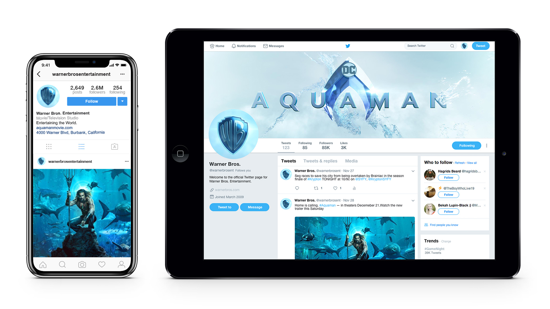
[Image: courtesy Pentagram]That’s where Pentagram partner Emily Oberman and her team stepped in. Rather than see the tension between past and present as a problem, it became the design solution for the brand: By making small tweaks to a well-established visual identity and logo, the team aimed to reestablish a sense of overall unity, while differentiating the logo for the needs of individual use cases (think mobile vs. movie screen), making it effective for the diverse viewing experience of a modern audience. This wasn’t a brand reinvention, but a recalibration.
According to Oberman, the team aimed to give Warner Bros. two things: “a way to talk about their brand moving into the future” that differentiated it from other big studios and established its place in a world of digital networks, and a way for the team “to talk about who they are”—a way to convey that as a studio they strongly believed in “the power of story.” Established during the year-long brand strategy phase of the project, this became a guiding light for the visual brand.
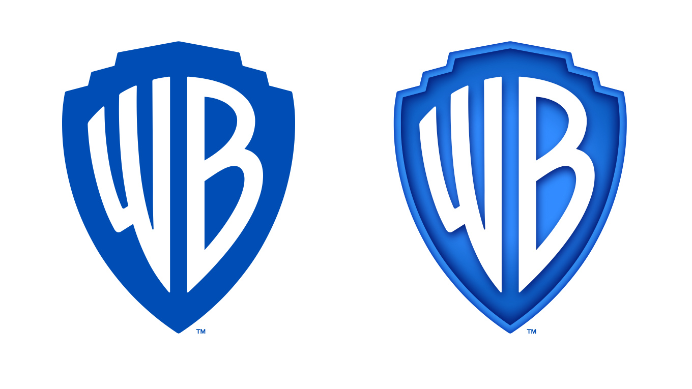
While the logo will still be recognizable to fans, the shield underwent a few changes to make it more “sleek and clean,” says Oberman. The “WB” was redrawn to give the letterforms a better sense of balance, and the shield icon itself was put in a golden ratio and thinned out. The historic blue was made brighter and more modern.
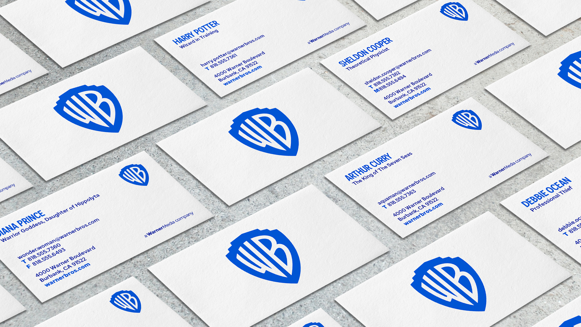
While Oberman established guidelines for how the icon should look (which corrected for what Myers referred to as “logo soup” across divisions), the team also left room for variation: There are two versions of the logo itself—a flat primary version, and a more dimensional version requested by Warner Bros.’ TV and film divisions. There’s “a tremendous ability to play with it and bring it to life,” says Myers. The secondary palettes would come from the content itself: The Pentagram team wanted to create a logo that felt “contemporary, while also being able to be used as a sponge for any story they wanted to tell,” says Oberman of the decision.
One component that is completely new: Warner Bros. Sans, a custom typeface that evolved from the “WB” of the shield, that was inspired by the Art deco of the 1920s—the decade when Warner Bros. was established—and that, according to Oberman, “would allow the brand to still be present if the shield wasn’t there.”
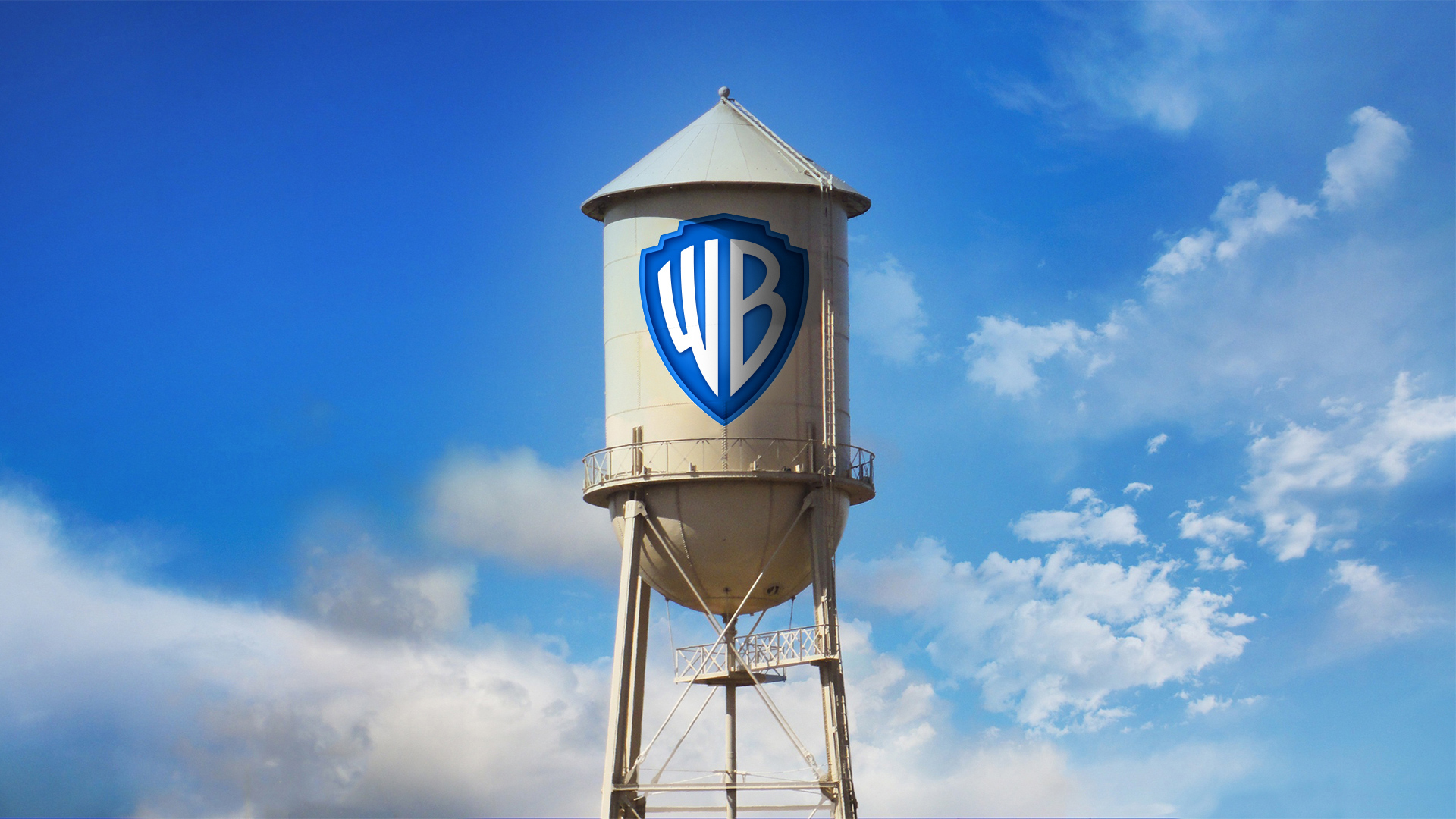
After more than three years of development, from brand strategy to visual development to launch preparation, the new visual identity is rolling out today and will be seen on everything from the iconic water tower on the Warner Bros. lot to distribution trucks, digital to print collateral, and more.
The rebrand of a heritage company is a huge undertaking—especially when it has a worldwide presence. And yet it is a common challenge, with heritage brands adapting for the 21st century by trying to strike a balance between recognition and modernization with small changes on a big scale. Warner Bros. is no exception. “We’re excited about refreshing the brand,” says Myers, “connecting it to the past, but with eyes firmly ahead.”
The extended deadline for Fast Company’s World Changing Ideas Awards is this Friday, December 13, at 11:59 p.m. PT. Apply today.