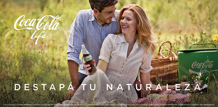
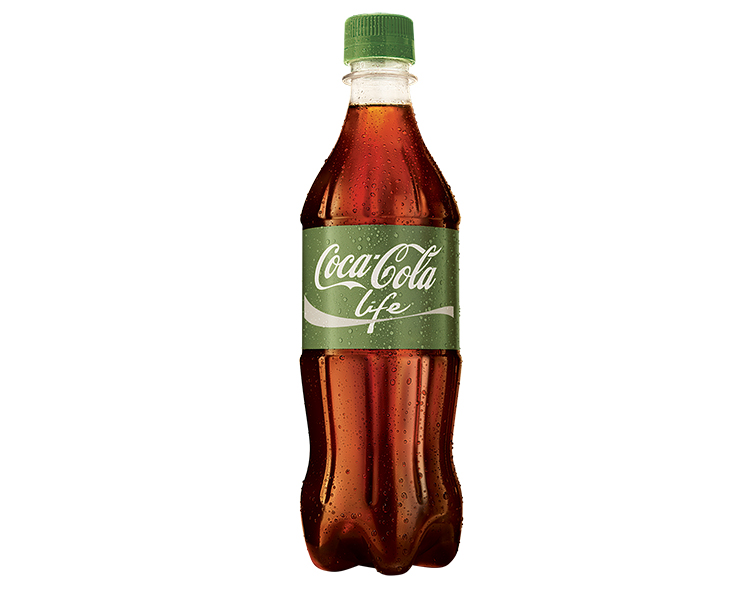
The red splash of Coca Cola is one of the most recognizable pieces of branding across the globe. It’s stamped on cans, bottles, and polar bears of every nation. But for the soft drink giant’s Argentinian spinoff, Coca-Cola Life, the new label is green.
Now the green label is an absurdly obvious bit of greenwashing–the bottle is 30% plant plastics, so marketers just had to paint it green somewhere–but it also implies vigor, purity, and the healthy allure of a leafy green vegetable performing photosynthesis. No doubt, those implications are intentional, to subconsciously convey that Coca-Cola Life uses a blend of sugar and stevia extract, which cuts a 200 milliliter serving down to a mere 36 calories with “naturally sweetening” ingredients.

I actually find the new label a bit nauseating. Maybe that’s because, on a bottle “Coke Life” becomes a green-on-brown affair, more akin to compost than to an artificially dyed sweet treat.
But I suspect there’s a deeper idea gnawing at my insides. In terms of color theory, there is no greater opposite to Coke’s classic red than green. The two are complementary colors that reside on opposite ends of the color wheel. So if Coca Cola Life is green, then what’s that say about its opposite, Coca Cola Classic? Is it…is it death?

Yes, actually. Coca Cola classic is delicious, delicious death. And the audaciously named Coca-Cola “Life”? It’s not just greenwashing; it’s healthwashing.
[Hat tip: Treehugger]
The extended deadline for Fast Company’s World Changing Ideas Awards is this Friday, December 13, at 11:59 p.m. PT. Apply today.