Today, the design team for the Paris 2024 Olympics revealed the Games’s official Olympic and Paralympic posters, and they take inspiration from an unexpected source: the picture book Where’s Waldo.
In past years, Olympic posters have generally embraced simplicity, featuring one main symbol and the dates of the event. At Rio’s 2016 games, for example, the poster consisted of a simple white background, minimal text, and that year’s tricolor logo. But in 2024, the pendulum has swung in the opposite direction. According to Joachim Roncin, head of design for this year’s Olympics, his team wanted to capture the event’s unique “richness and ambition” with the posters. So, they brought French designer and illustrator Ugo Gattoni on board.

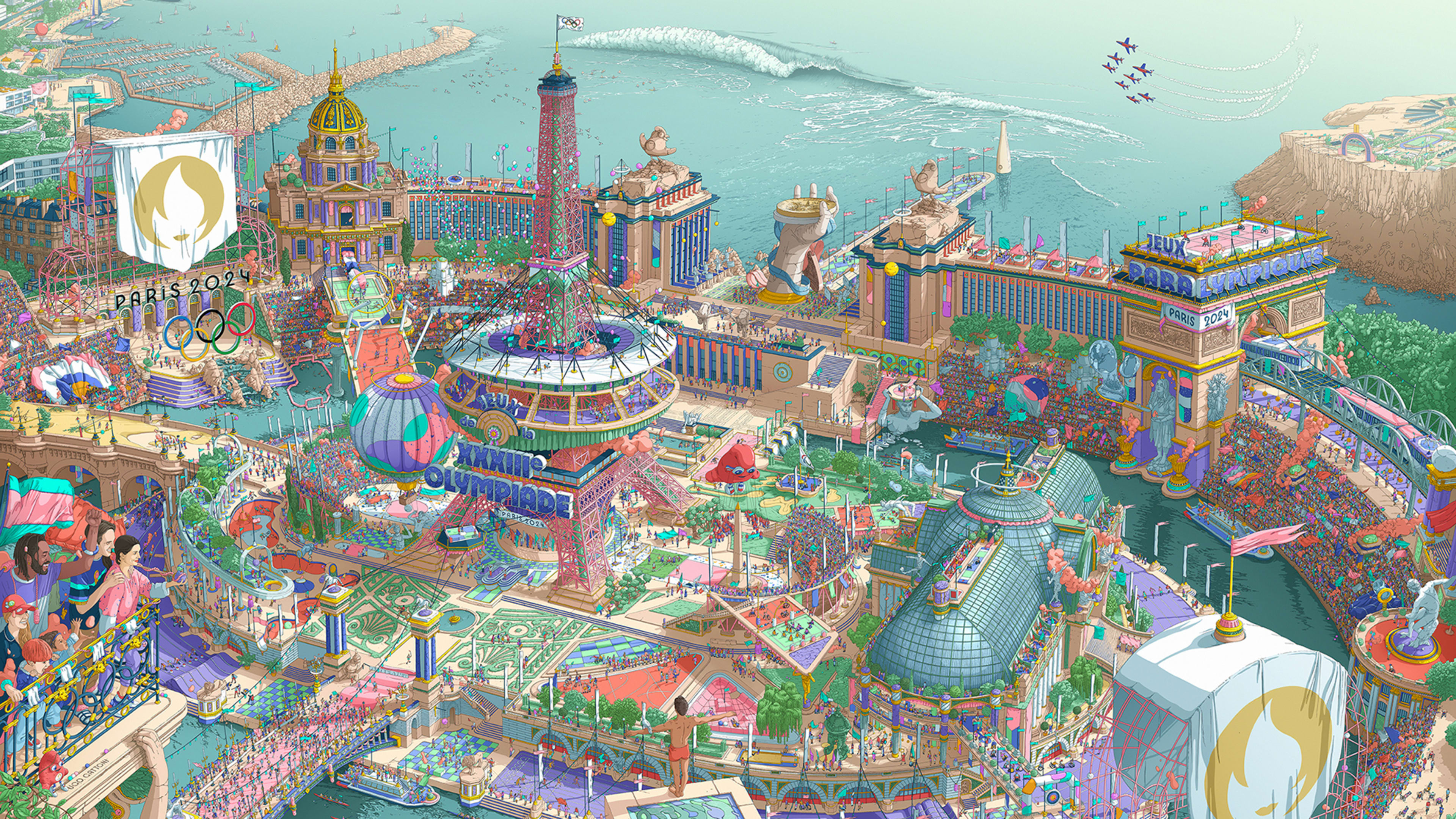
“[Gattoni’s] work is very rich, very colorful; a lot of stories, plenty of symbols,” Roncin said in a press briefing. “You have an overall main story, and then you have a lot of details and small stories inside it. This is what I wanted to do—like when you see some drawings like Where’s Waldo—those kinds of drawings where you can see a lot of action everywhere.”
Gattoni, who is renowned for his work’s detailed world-building, spent around 2,000 hours creating an impressive 13-by-16 foot drawing to be printed on the posters. The right half of the drawing is the Paralympic poster, and the left half is the Olympic poster, meaning that they come together to form one large image. It’s the first time that the two have been designed as a diptych. No digital tools or AI technology were used in the drawing process; a fact that Roncin said showcases the “savoir faire à la française,” or French know-how.

The final product is an intricate, fantastical version of Paris. It reimagines the city as a stadium on an island—filled with historical landmarks, spectators, and athletes—and surrounded by the Seine and the Mediterranean. Gattoni estimates that there are 30,000 or 40,000 hand-drawn figures in the piece, although he lost count somewhere along the way.
“I wanted not just to draw a classic Paris that we are used to, but to bring some magic,” Gattoni said. “My goal was to do something really epic, to have this feeling of amazement when we have the first look . . . If you can zoom in, there are a lot of funny little scenes that you can smile at. It’s serious, but it’s not serious at the same time.”

These “funny little scenes” are Easter eggs that Gattoni included to be discovered by viewers, similar to a traditional seek-and-find. For those who have the patience to look, there are hidden details in nearly every corner of the drawing. Breakdancers are grooving on the Stade de France that sits around the Eiffel Tower; the Gardens of Versailles make a cameo; and there are eight Paris 2024 mascots (adorable red blobs called “the Phryges,” inspired by a French symbol of freedom) hidden throughout.
The playfulness of Gattoni’s artwork captures the ethos of this year’s games—a festive celebration of both athletes and spectators.
“My main idea in the beginning was to showcase Paris 2024 as a huge party,” Roncin said. Mission accomplished.
Recognize your brand’s excellence by applying to this year’s Brands That Matter Awards before the final deadline, June 7.
Sign up for Brands That Matter notifications here.
