Giorgia Lupi is a judge of the 2024 Innovation by Design Awards. You can apply for this year’s awards here, and read more about past winners.
What does the word “data” conjure up in your mind? Is it brush stokes, petals, or pie charts? Chances are, you picked the latter, because that is how data has been conveyed for much of modern history. But for one information designer, pie charts are just one tool in a designer’s toolbox.
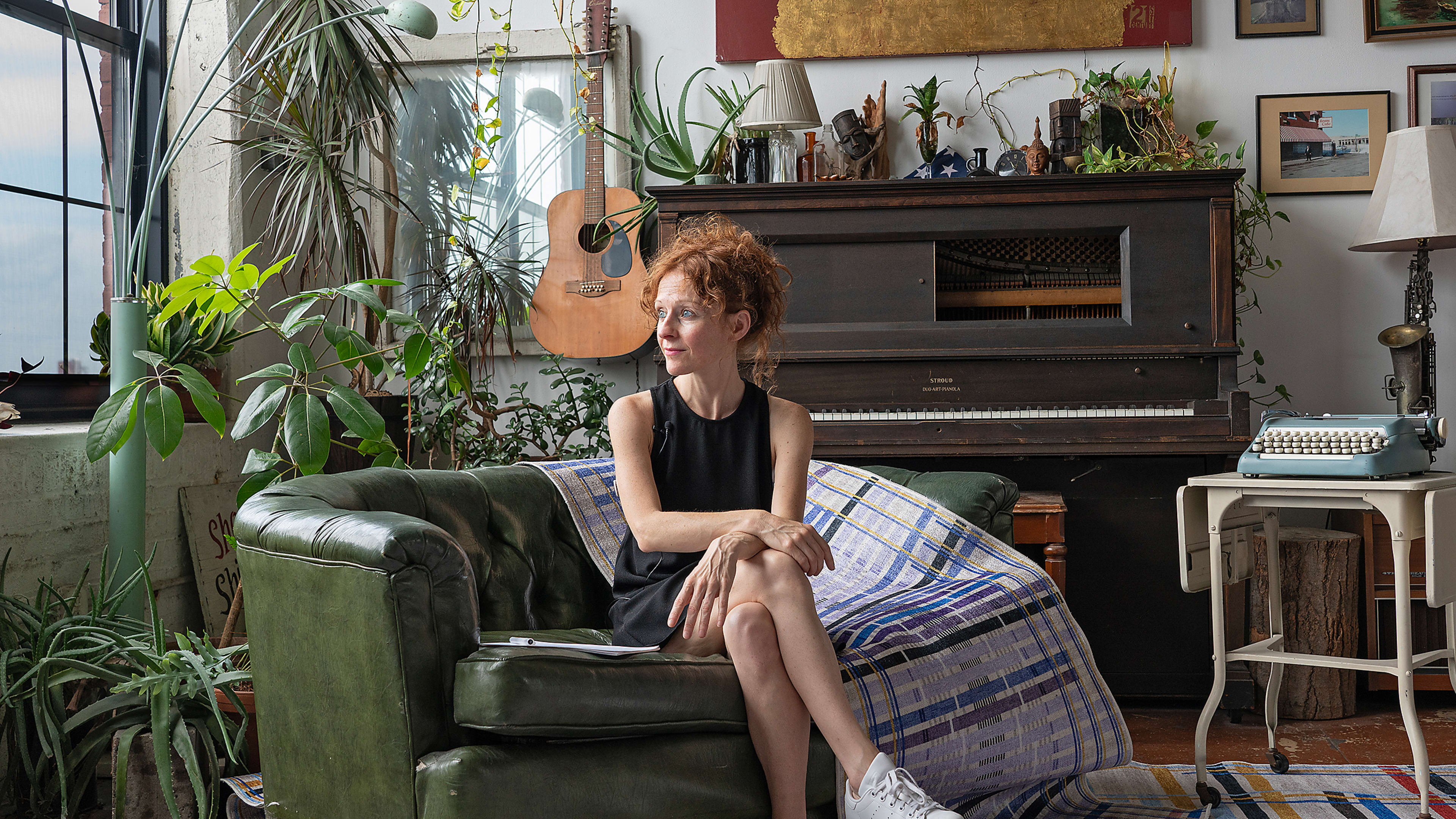
Giorgia Lupi insists she doesn’t hate pie charts, but she does admit they can be limiting. That’s no surprise for the Italian-born, Brooklyn-based designer and partner at Pentagram who has spent the past 14 years or so advocating for a more nuanced, more humanizing approach to data—or “data humanism” as she calls it.
Lupi’s portfolio includes a year-long postcard exchange with fellow designer Stefanie Posavec, in which the pen pals sent each other regular postcards visualizing a week’s worth of personal data; a collection of stories about lost and endangered textile techniques encoded in rugs; and most recently, a stirring rendition of her experience with long-haul COVID-19 that is a painstaking inventory of her symptoms, ER visits, and diagnoses, but looks more like a hand-drawn painting where every brush stroke is a datapoint dripping with feelings.
Lupi was recently named one of this year’s judges for Fast Company’s Innovation By Design Awards, so we decided to call her up and nerd out about all things data. In this interview, Lupi explains that data visualization is not about simplifying reality, but about making complex information more accessible. She talks about why datasets are more powerful if they include not just the things we know, but also the things we don’t know. And she shares why it’s important to design for both the Bart Simpsons and the Lisa Simpsons of the world.
The interview has been edited and condensed for clarity.
I wanted to start off by saying that I read your New York Times op-Ed [where you visually describe your life with long-haul COVID-19], which was heartbreaking and harrowing, but also so beautiful and hypnotizing, and I want to ask how you are feeling today.
Thank you, I really appreciate it. It’s been a really tough journey. It’s ups and downs. Today, it’s not a bad day, but I’ve learned that there’s no real trajectory like tomorrow might be a bad day. I’m pretty limited in what I can do physically, but there’s a lot of research going on, so I’m hopeful that maybe in like a couple years we’ll know, we’ll truly understand the condition. But thanks for asking.
Of course. Are you still going through your process of documenting everything?
Yeah, and I think it’s really, mostly a way for me to just feel that I have some control, or that if I start a new treatment, I can talk to my doctors. But I think it’s just that I’m primarily a data nerd, and so just collecting data about my life has always been something that I’ve done.
Have you shared this with your doctors? What was their reaction?
Even in 2020, 2021, when we didn’t even know what [long-haul COVID-19] was, I was still doing my spread. And so, in the beginning I would just print out this huge spread and I would go to doctors like that. And I got two type of reactions. Some were looking at me like I’m completely crazy [laughs]. But I sent it to a couple of my doctors, and I think what they really reacted to is that it feels like a service to the community to actually show what it feels like to live with a chronic illness on a daily basis.
I’m glad we’re talking about this because it is a perfect example of something you’ve been advocating for, for years, which is data humanism. Can you explain what it is for those who might not be familiar with this concept, which I believe you coined?
It’s something that I started to really think about at the beginning of my practice. I started to work with data in 2010, 2011, and I saw that most of the approach to data at the time was very much based on a statistician’s background, and that’s fantastic. But I was also interested in using data myself as an anchoring point to tell stories. I thought that there’s just more that we could do to actually represent our reality if we include context, anecdotal details, if we embrace the imperfections that are inherent to how we collect data. And so, I started to just use these ideas in my practice, and I felt that I needed to just come up with an umbrella term for that. Data humanism was a good one, and data humanism is an approach to data that tries to reconnect numbers to what they really stand for by adding less factual and more anecdotal information.
It’s funny that you should mention anecdotal information because data and anecdotes strike me as opposites.
I don’t think that there’s necessarily a right or wrong definition of data. If we want to really dumb it down, data is an abstraction of our lives. One layer at a time. Some data is really okay to be just numbers, but I think that there are some situations, especially when we have to tell stories that represent our human nature, where we have to include an additional layer of data.
What happens if we don’t consider those additional layers of data in more nuanced ways?
If you were in New York during the bulk of the pandemic, looking at Governor Cuomo’s PowerPoint, that was really amazing because it just kept us true to reality. But I also feel that there was so much missing data there. There was never an addition of what we didn’t know, and there was so much we didn’t know back then. Just by seeing what we really don’t know, it would’ve painted a more complete picture for people to really understand how even a pandemic might affect them.
So, we should get more comfortable with the things that we don’t know?
I think maybe in the end yes, because if you even think about the election, there’s so much that is just speculation on the polls until we have the final results. But we do believe it so much and some people might be thinking that those are the actual numbers, and they might even decide to not go vote because it’s already done. So, I don’t think that it’s necessarily only getting comfortable with the unknown, but it’s actually just for the general population to understand how to actually speak data, how to be fluent in the language that we see every day.
But a big problem is that the general public does not know how to interpret this data because it has been made so dry for them—because it has been poorly designed.
I think design really plays a role here. There’s so much that we can still learn as a population because we were not born knowing how to read a bar chart. We learned it. And I think we can still learn to read more articulated charts. And especially right now that we don’t even know where artificial intelligence will lead us in the future. I guess the more that we’re able to use our critical skills to actually evaluate data and data streams, probably the better.
Do you see pie charts and graphs as the opposite of data humanism?
It’s funny that you ask me because I feel that even in the past, I’ve been painted as the person who hates pie charts. I have nothing against them, but I feel that so many times, it’s just that you cram the data set into that well-defined standardized model without really understanding that if you could only create a custom one or use a bit of a more nuanced chart, you’d do your datasets and your readers more justice. I believe that almost every data set deserves a customized way to visualize it because every data set is unique.
But with every customized dataset, there’s a learning curve, right? How do you think about the effort that you’re asking of people to decipher it?
Absolutely. If I’m designing a dashboard for a pilot to land a plane, I’m not going to design a beautiful complex chart with a legend to read. I’m just going to do red and green and that’s it. But I think for a newspaper or a news article or anything that is meant to engage people, adding even one more layer of context when it’s possible is the step that we might need for people to understand better. Then of course, if you’re talking about an exhibition in a museum and people have all the time to navigate a data visualization, you can even go crazier.
And even if you add layers of complexity, because our world is complex, there still needs to be well-designed focal points for people to grasp at a glance. I almost feel that most of the charts should appeal both to the Bart Simpsons of the world and the Lisa Simpsons of the world, where Bart is very much like a “quick fix” guy and Lisa is a nerd and reads books. So, it’s really about something that can appeal both to someone who wants just a quick peek and then somebody that with the same chart has the time, ability, and interest to go in a bit more details. And I think that is when good design matters, and layering matters.
Is there a moment in history or maybe even a person that you look up to who did a particularly good job at conveying information in a nuanced or empathetic way?
I think one of the best examples [of someone who was able to] convey a powerful story is Charles Minard and his map of Napoleon’s Russian campaign. What you see in this beautiful chart is actually the size of the armies from the beginning to when they arrived to Russia and came back. The orange shows the size of the troops shrinking as they went, and the black shows who actually came home, but [there is] a layer of geography to understand where the big battles were, and a layer showing the temperatures because, at times, people died because it was too cold. It is such a powerful chart that if you just take two minutes to try to understand, it tells such a compelling big story.
So, what you’re appreciating is the variety of layers?
I think it’s the very powerful way that it told a story. I think that chart makes you pause and be like, “wow.” It could have been just a map with a trajectory geographically, but is it really important for people to really have a geographic understanding of where exactly things happened? Or is it more important for people to understand the real planning of the story? Honestly, to me it’s really good design.
I am curious if there’s any advice that you would give young information designers who want to figure out a way to provide a fuller picture or a more nuanced picture?
First of all, ask yourself critical questions. It’s really about what the audience would need to know first, so put yourself in the shoes of a reader or a user that will encounter your chart for the first time. And starting from there, try to design it in a way that can paint as full a picture as possible. Visualization is not about simplifying reality; it’s about providing an access to complexity.
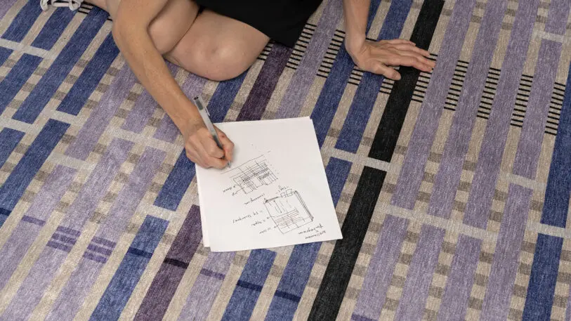
Switching gears a bit: many of your projects [like Dear Data or Bruises] have this very tactile, hand-drawn quality to them. What is it about putting pen or brush to paper that appeals to you so much?
Drawing and using tactile materials is my way of thinking, so that’s primarily my entry point to data. I also think that in some contexts—again, not everywhere, not if you have to design a dashboard for decision making on analytic data—but in some cases a warmer depiction of data can make people relate. And there are some stories, such as The New York Times stories, that I feel benefit from an entry point that is emotional. And sometimes, if you get people to an emotional level, you might get them interested in learning more and spending more time.
You get a little more buy-in.
Yeah, even with beauty in general. Beauty is such an entry point for everything. You wouldn’t buy an ugly dress just because it’s very functional. So, I feel there’s nothing wrong with trying to make charts a little bit more beautiful.
I agree. So, considering your affinity for the analog process, what are your feelings and thoughts on AI?
I think we cannot think about a world without AI right now, so it’s about accepting that this is what’s going on. I feel that in particular fields, the use of AI and data can be revolutionary because I’m very invested in healthcare right now, and I believe that if it’s used the right way, in especially complex illnesses that still need a diagnosis, that still need to find biomarkers and phenotyping, it’s an amazing tool.
I think that for a designer, there’s still such a big amount of intentionality that goes into whatever you use. So, AI to me is still a tool that can be used to have a different set of ideas or solve a problem more rapidly or help you in some discovery processes and, um, it can fasten processes.
Do you use it in your creative process?
Yes, especially lately we’ve been using it, but it’s never to create the final product. It’s about testing, prototyping, seeing how things can be done quickly, and having a preview of how we can generate a particular pattern.
Okay, I have three quick fire-round questions for you. What’s a design pet peeve of yours?
Don’t put orange and green together in any design. Because I cannot stand it. [laughs]
What worries you most about design today?
That I’ll have to think about.
What excites you most?
To me it’s the fact that, more and more, we’re understanding as a population that design is everywhere. And that good design influences our experience of life so much.
Recognize your brand’s excellence by applying to this year’s Brands That Matter Awards before the early-rate deadline, May 3.
