Since its launch in 1929, 7UP’s logo has been delightfully inconsistent. Whereas some mainstay brands focus on glacially paced evolutions and the occasional overhaul, 7UP seems to have long embraced change as its design ethos. Over the years, that has resulted in Thomas Miller’s brilliant Futura Dot packaging, billboards by Milton Glaser, and the once-ubiquitous ’90s “Cool Spot” mascot logo, to name just a few of the brand’s design dalliances.
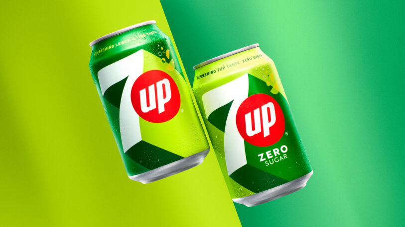
While the brand has always oscillated between modern and retro, today 7UP is back with a fresh look that balances both. When PepsiCo last overhauled the mark more than seven years ago, it introduced a look that paid typographic homage to the soda’s earliest days (after inventor Charles Leiper Grigg jettisoned his original brand name, “Bib-Label Lithiated Lemon-Lime Soda,” which notably contained . . . lithium). The refresh landed in design annuals, and the latest iteration builds on its strongest elements, retaining the red dot “up” placement while adding a definitive sense of motion and energy, thanks to the designers pushing the drop shadow of the ‘7’ to the seeming extreme.
The palette and overall composition, meanwhile, go all-in on the lemon and lime to great effect, yet somehow feel zen compared to its corporate cousin Mountain Dew’s sense of jagged chaos. Our favorite detail, though: The fruit slices on the top edge of the shadow, which playfully transition from lemons to limes.

The only downside? If you’re in the U.S., you’re going to have to hop on a plane to see the packaging in person. That’s because erstwhile owner Philip Morris (yeah, that Philip Morris) sold the international rights of 7UP to PepsiCo in the mid-’80s, and the domestic distribution is owned by Keurig Dr. Pepper. It has all led to a bit of a logo multiverse, with domestic varieties taking on a much more expected beverage-aisle aesthetic.
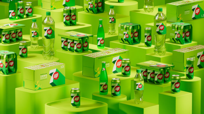
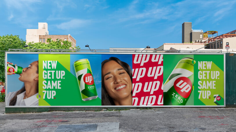
Starting in March, PepsiCo’s latest iteration is set to roll out to Bangladesh, China, Egypt, India, Ireland, Latin America, Pakistan, Saudi Arabia, the U.K., and all European markets—which perhaps makes an effective design system all the more critical when covering so much ground across so many languages and cultures.

The redesign naturally comes with a brand story, too—a release noted that the concept “adds moments of ‘UPliftment’ to the everyday. 7UP is on a mission to offer light relief from the mundanities of daily life by bringing moments of UPliftment, positivity and surprise.”

But ultimately, it doesn’t need it. Sometimes, a refreshing refresh is good enough.