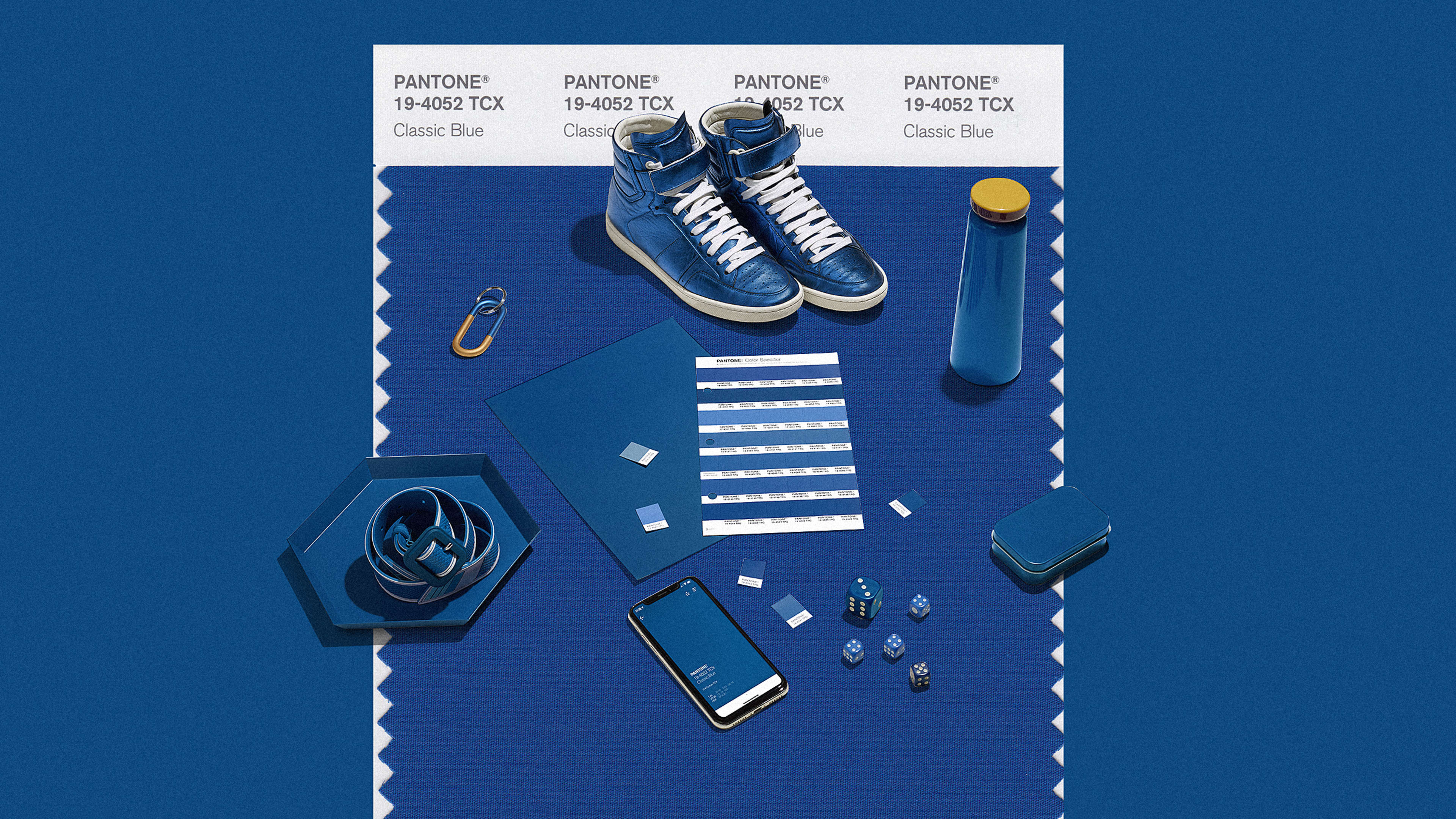
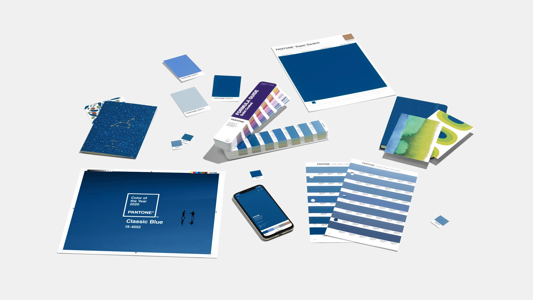
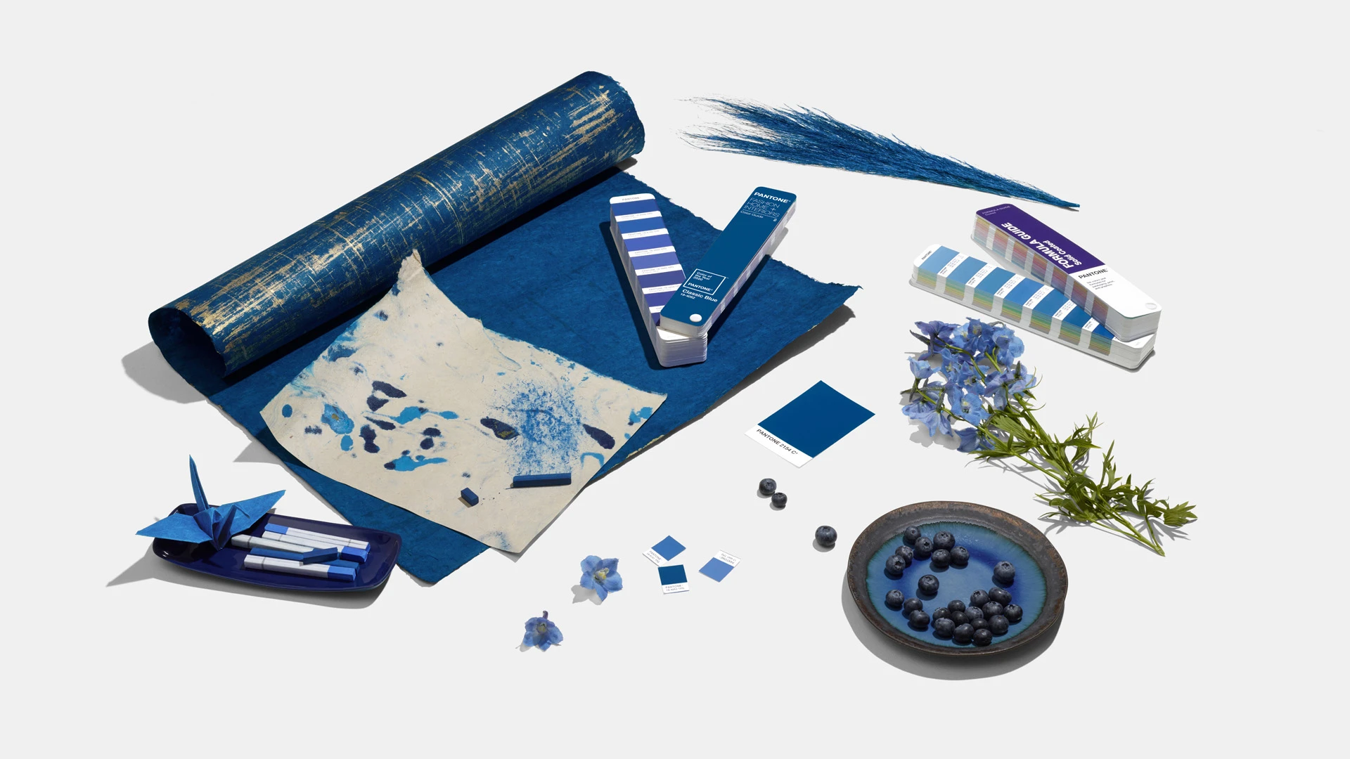
It’s the color of blue jeans, blueberries, and the sky at dusk. Pantone’s Color of the Year 2020 is Classic Blue. It’s what the color forecasters at Pantone have deemed to be a comforting, timeless color for a time of change.
And amid all this, Pantone was faced with deciding which color best expressed the zeitgeist—a tradition now in its 20th year. “We landed back on the blue family, where we’ve been and where we are,” says Pressman. “Just not knowing where to go and who to trust…[blue is] the feeling of calm and reassurance that help us have that confidence to move forward.”
All of this psychology might sound familiar: Pantone’s 2019 Color of the Year, Living Coral, was “comforting and energizing at the same time, a color meant to serve as a salve in a time of global uncertainty,” as Co.Design reported last year. Classic Blue is in many ways a product of the same core observation.
While Classic Blue is the color of 2020, it’s been bubbling up for a while now. Pressman walks me through slide after slide of examples in which Classic Blue has been poking around the design world already. She shows a dozen catwalk photos from fashion shows—and more than one design by Virgil Abloh—with garments that feature a deep blue. In fashion, it can serve as a baseline, much like black, off of which other more experimental colors can play. Classic Blue catches light in a way that seems to create contrast, which makes it superb at highlighting tactile materials, from felt to pleather (perfect timing, since texture is having a moment in fashion and interior design alike). And because it’s good old blue, pieces in this color shouldn’t go out of style soon, which is valuable to those of us who want to consume less, Pressman argues.
Whether or not you agree with all of Pantone’s psychology and forecasting, there’s no doubt its 2020 Color of the Year is a safe choice, and that’s by design. “When I do my psychology presentation, I say, ‘Everyone wears jeans! We all relate to this color! It’s an approachable color,'” says Pressman. Indeed, it’s hard to argue with blue.
Recognize your brand’s excellence by applying to this year’s Brands That Matter Awards before the early-rate deadline, May 3.