The global design powerhouse Ikea is known for tweaking the way it markets products in different countries to suit local tastes. But as the furniture giant continues to expand globally, Ikea has updated its standard typeface to one that will function in any market, because it supports more than 800 languages.
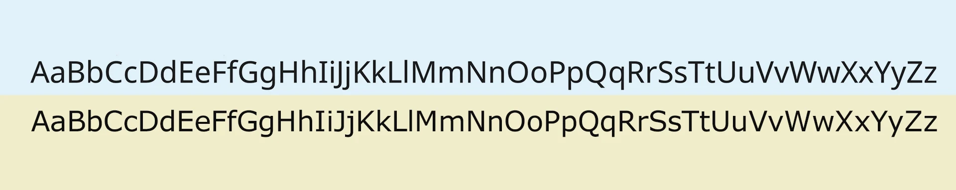
The font, called Noto, was launched in 2016 by Google and Monotype, which spent five years creating a family of typefaces that include upwards of 300,000 glyphs representing more than 800 languages. The Latin characters in the typeface family are simple and sans-serif, and they look slightly slimmer and cleaner than Ikea’s previous type, Verdana.
But that’s not the main reason that this change makes a lot of sense for Ikea. As the company continues to operate 422 stores globally and open even more, it needs a typeface that will work in all of these contexts while unifying Ikea’s brand.

Given that in the last year Ikea opened its first store in India, where there are 22 national recognized regional languages, to go along with stores across Asia where conventional Western typefaces don’t work as well, it makes sense that the company wants to use a font that will support a broader range of languages.
“Our ambition is to make Ikea one of the most loved and trusted brands in the world,” said an Ikea spokesperson in a statement. “We are renewing the Ikea visual identity to make Ikea even more recognizable. Today, people experience Ikea in many different places, both physical and digital. We needed to complement and update our visual identity to enable many more people to meet Ikea in a consistent and inspiring way.” The company updated its logo recently, making it more legible and mobile-friendly, and the new typeface, the spokesperson added, “stands out, builds a strong visual identity over time through consistent and coherent use, and feels modern.”
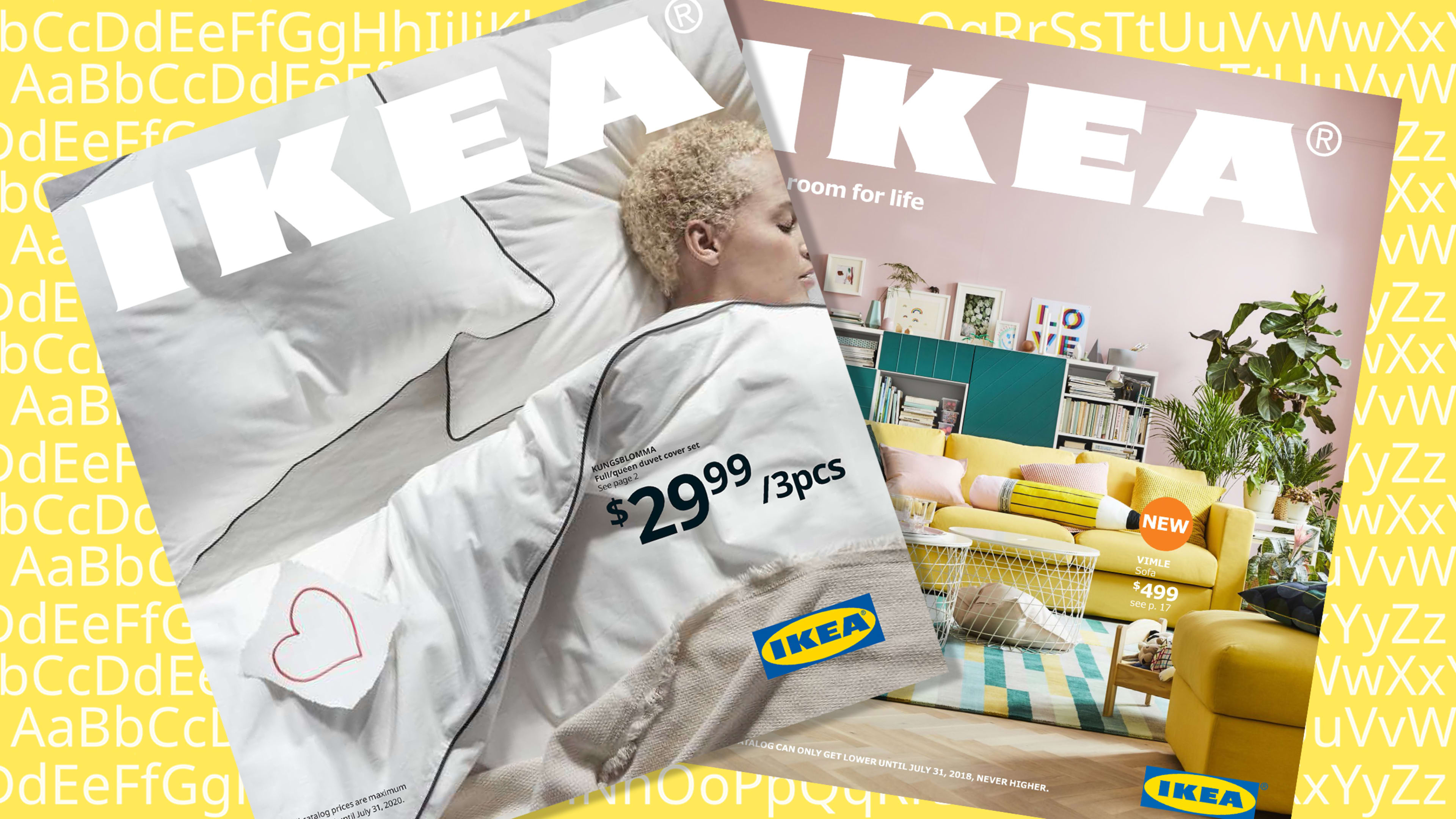
Using Noto means that Ikea won’t have to worry about changing typefaces for different languages when it prints its yearly catalogs, the most recent of which arrived earlier this month and was the first to use Noto. Instead, the company will be guaranteed standardized branding across the more than 50 markets where it currently has stores and the places where it is looking to expand in the future. Previously, Ikea used the font Verdana, which it changed to in 2009 because its former typeface, Ikea Sans, didn’t support Asian characters (though it didn’t stop some designers from complaining about the decision and even dubbing it “Verdanagate”).
By adopting Noto as its typeface, Ikea is bucking contemporary branding trends, where large companies are commissioning custom fonts so they stand out from competitors. But while that trend might be widespread, it’s not always the best way to scale a brand across many countries, languages, and contexts—something that Ikea has realized.
With Noto, Ikea is clearly continuing a trend toward globalization and inclusivity, which Ikea often prides itself on championing.
Recognize your brand’s excellence by applying to this year’s Brands That Matter Awards before the early-rate deadline, May 3.