The moment Pentagram partner Emily Oberman’s team got the call that they’d be working on a brand refresh for American Girl, she says “a primal scream went through the office.”
The designers, who were part of an all-female team for the project, were American Girl superfans. “I think that loves comes through in everything we made,” she tells Fast Company. For Zoom calls with the client, “the team all got their old dolls out.”
The team’s main objective was to revitalize the beloved brand, which had been diluted through years of spin-offs and extended product lines. Sales were down, and the brand wasn’t quite finding its voice with its core customers. The team pulled elements from around the time of the company’s 1986 launch, like a 1990s color palette and historical patterns from the original doll collection, and then refined and standardized it all into one cohesive identity system.
“The brand refresh was never meant to be modern or historic,” Oberman says. “It was meant to be timeless, and take the best of everything that had come before and reinvigorate it in a way that felt respectful of a beloved brand while bringing new life to it.”
Small toys are big business
The market for dolls and stuffed toys is projected to bring in $22 billion in 2024, according to data from Statista. Mattel, which owns American Girl and Barbie, is currently second in the category behind MGA Entertainment, which makes relative newcomers like Bratz and L.O.L. Surprise! dolls. (Though Mattel did see a major sales boost for Barbie following the movie.) The refresh allows Mattel to capitalize on a lucrative moment: Millennial parents who grew up with the doll are now buying toys for their own kids.
Brand value becomes brand motif
The inaugural American Girl dolls did something novel for a children’s toy: they taught U.S. history. One doll, Kirsten, was a Swedish immigrant whose family settled in Minnesota Territory in 1854, while Molly grew up during World War II. Barbie may have been an astronaut, attorney, and president of the United States, but American Girl dolls came with their own historical fiction. Books brought the dolls—and history—to life, and the line grew to cover a more expansive view of the American experience through the eyes of young girls.
“Their backstories are so deeply ingrained in every doll that they feel like fully formed characters who really lean into the idea of the ‘exceptional story of girlhood,’” Oberman says.
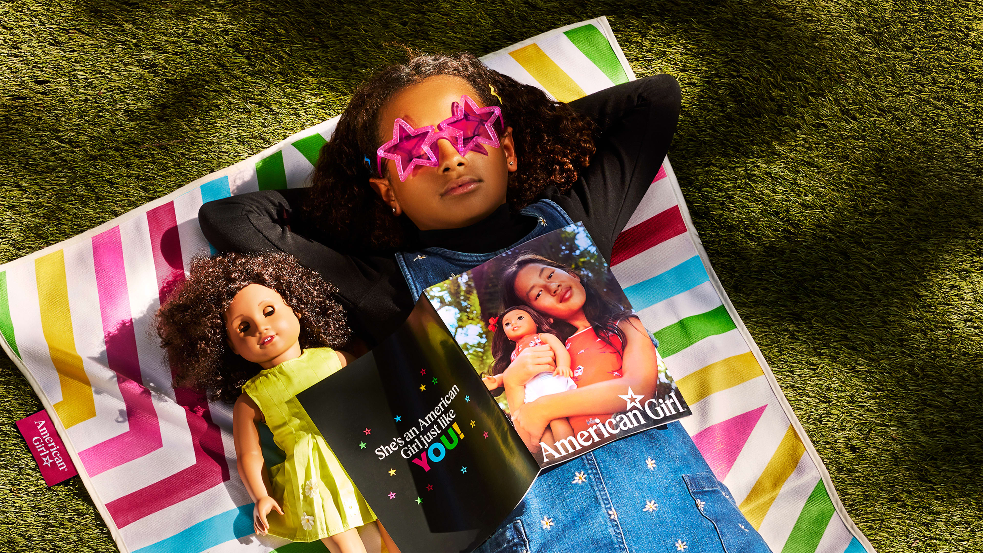
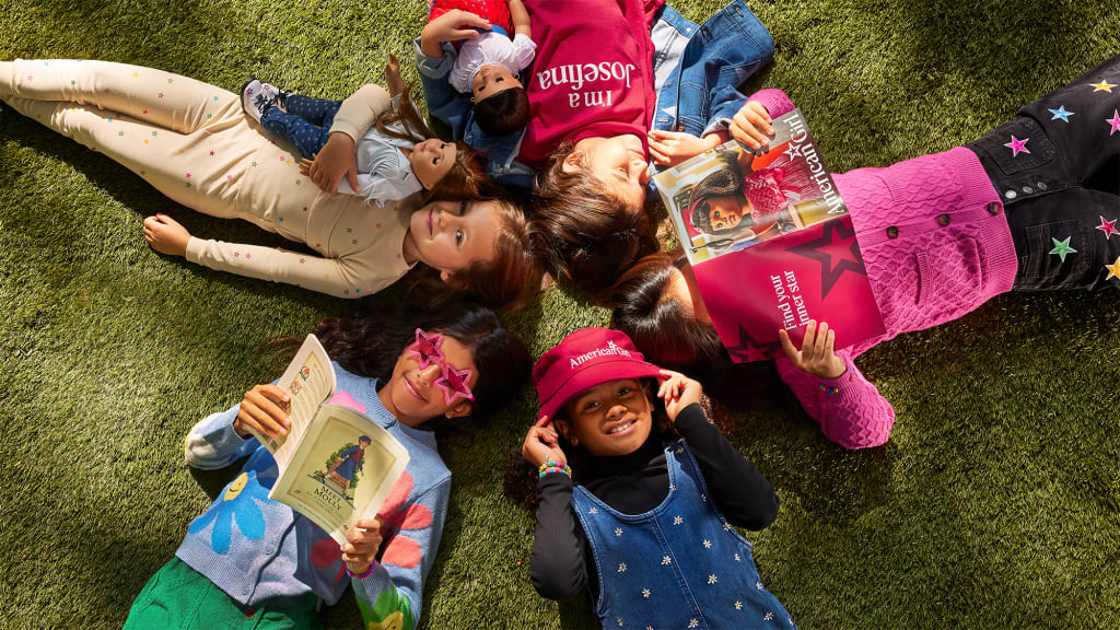
The new tagline for American Girl, “Find your inner star,” is a statement about the dolls’ spirit of independence and self-reliance, according to Oberman. The symbol is everywhere, turning the tagline itself into a recurring visual motif. A star hides as an Easter egg in every photograph. A redrawn star icon is in the new logo and monogram, and the refreshed branding also uses the star in repeating patterns or as a portal for images.
It’s all in the doll-sized design details
Oberman’s team paid keen attention to small design details—something a client that itself makes tiny things (like this very small iPhone) would be sure to appreciate.
They angled the star at 18 degrees as a reference to the dolls’ 18-inch height. The letter “i” has a slightly different height in “American” as compared to “Girl” in the wordmark; a subtle nod to a girl and her doll. And the wordmark itself uses a new, slightly sharper proprietary typeface called “Pleasant Serif,” a reference to American Girl creator Pleasant Rowland and her company Pleasant Co., which Mattel purchased in 1998 for $700 million.
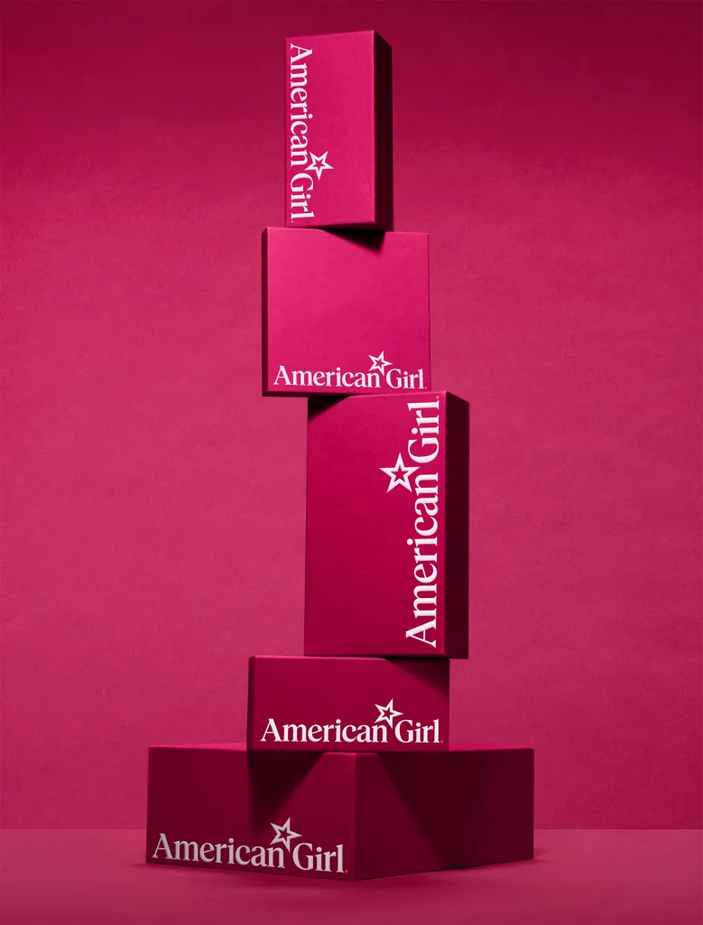
Now, the color. American Girl has used a berry pink color for the logo, store signage, bags, and more for years now, but the exact color was inconsistent. Pentagram standardized it with “Pleasant Berry,” a hue picked for its richness and brightness. Oberman says they wanted the color to feel like American Girl’s own Tiffany Blue, to be used “uniformly and elegantly.” The rest of the color palette, dubbed the “Berry Patch,” includes colors from cream to blackberry. ’90s American Girl branding inspired the secondary palette, with contemporary takes on sky blue, green, yellow, and hot pink.
Oberman’s team also expanded the brand’s signature silhouettes of girls reading to be more inclusive and to show icons of historical dolls and other ephemera, Pentagram says. They also updated the identities of American Girl sub-brands, like Truly Me, Bitty Baby, WellieWishers, Create Your Own, and the annual Girl of the Year, to tie into the parent system.
Samantha, Addy, and Julie dolls still sit in the Pentagram team room today, Oberman says. She hopes girls “get a sense of joy and camaraderie out of the rebrand.”
“I know it sounds corny, but I have a team of exceptional women who all felt seen by American Girl when they were young,” says Oberman. “I want people to know that those dolls are still here, and they—the dolls and the kids who love them—are amazing.”
Recognize your brand’s excellence by applying to this year’s Brands That Matter Awards before the final deadline, June 7.
Sign up for Brands That Matter notifications here.
