Featuring dramatic cuts in the facade or portions of floor plates sliced away—a new kind of architectural detail is reshaping the exterior of high-rise towers on a global scale. Distinctive gashes are splitting the surface of new buildings with a kind of surgical intent.

There’s The Axiom, a recently completed 49-story office tower in Shanghai designed by Buro OS. It appears from one side to be a conventional rectangular tower until about halfway up, where the facade cuts back sharply to create a brief two-story indentation. The space created by shrinking back the building becomes a few large “sky terraces” that wrap almost all of the building’s three sides. A second tower, still under construction, will have a similar mid-point cutaway.
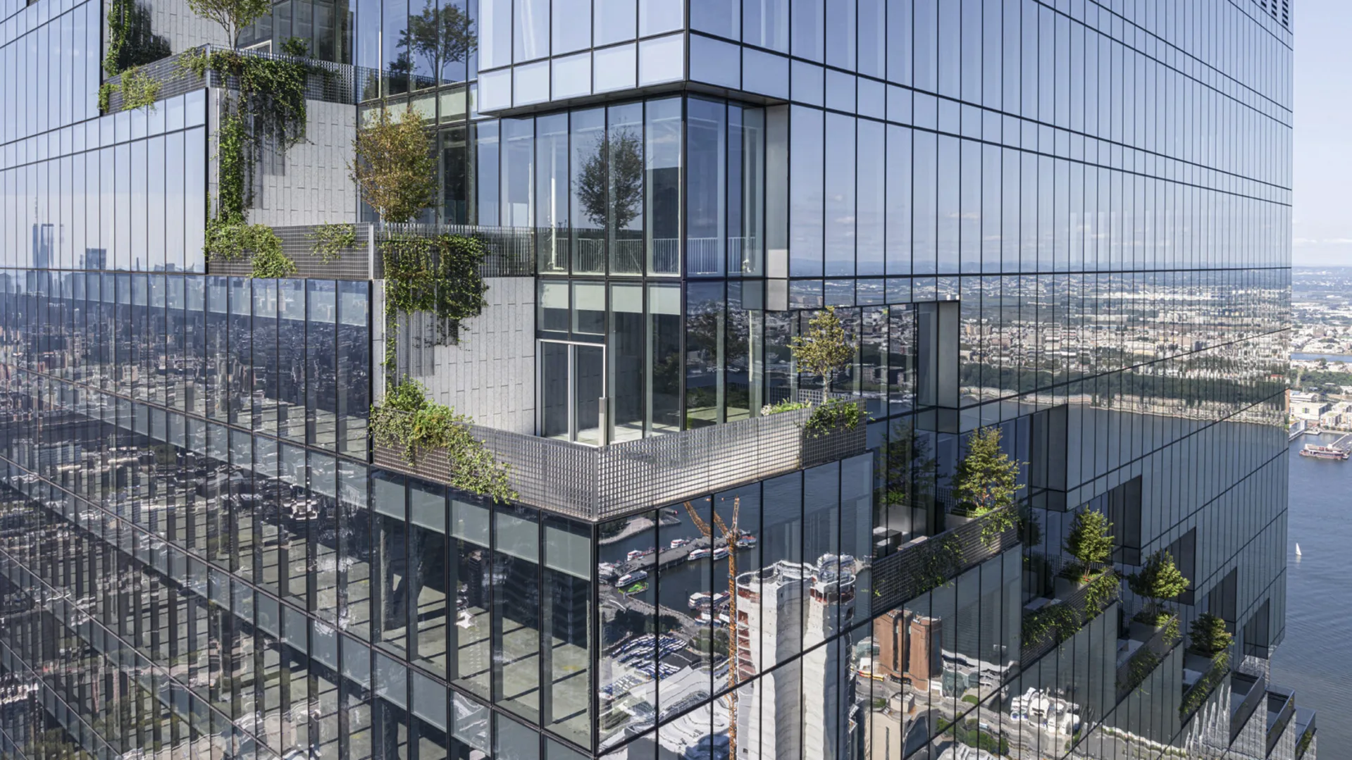
In New York, The Spiral is another new high-rise with terrace spaces carved out from its vertical edges. Designed by Bjarke Ingels Group, the 66-story office building has, as the name suggests, a spiral of gracious setbacks all the way around that translate to a series of outdoor terraces, one per floor, all with sweeping views and access to fresh air and natural light. A rarity in NYC buildings, terraces are even more scare in office towers, previously known for hermetically sealed windows and bad indoor lighting.

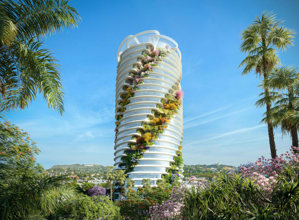
A recently announced project in Hollywood, dubbed The Star, multiplies this spiral concept, with carveouts encircling a cylindrical tower like a cascade of garlands from top to bottom. Designed by Foster and Partners, the $1 billion “vertical office campus” building’s renderings show lushly landscaped outdoor patios, four per floor, that decorate the glass-lined facade. If reality comes close to the renderings, the building may appear as rainbow swirls of flower petals and succulents.

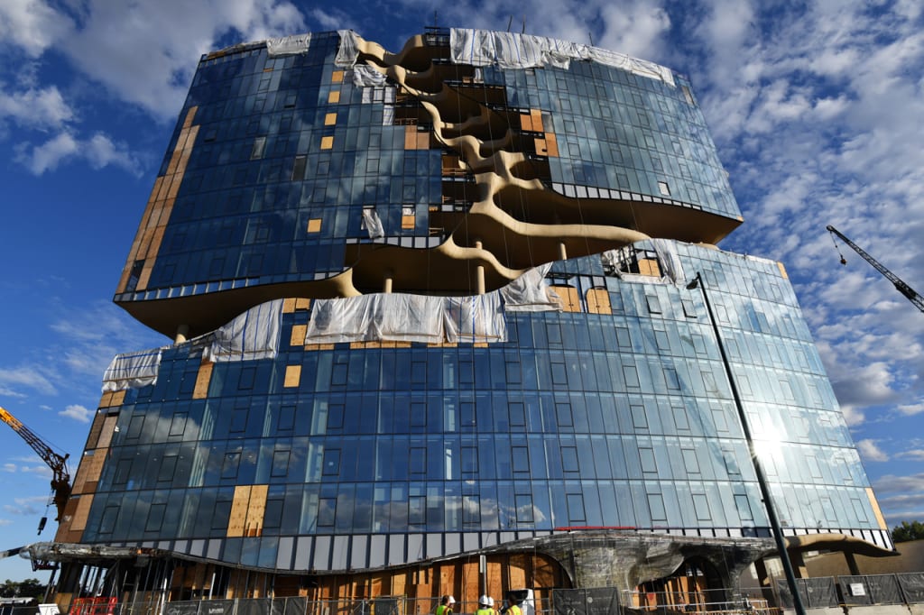
Perhaps the most interesting example of high-rise scar-chitecture is One River North, a 16-story residential tower in Denver designed by MAD Architects and opening later this year. A Y-shaped section of its glass-lined facade appears to have been meticulously erased, revealing bone-like interiors. This negative space creates undulating open-air terraces for the building’s more luxe units. (Monthly rents for the larger terraced penthouses can be upwards of $10,000.) Three of these open-air decks are accessible to all residents, as is a rooftop pool and deck that seems to be a horizontal extension of the scalpel-job on the building’s vertical edge. Each a uniquely shaped- and sized-space, the cut-out terraces become a key selling point.

Some of the buildings’ scar-like slices may be more gimmicky than others, but they all tap into a growing interest of integrating outdoor space in the dense setting of a tall building. In the residential context, the gash reveals a more interesting balcony. In the office setting, it’s from a pandemic-inspired realization that people want to work in different settings and spaces throughout the day. Ripping a chunk out of a building facade or slicing away a bit of floor plate to create welcome outdoor space may seem a radical architectural move, but these projects could be a sign that high-rises will feature more sliced, diced, and gashed facades than the smooth glass towers of today’s skylines.
