Zipeng Zhu is a judge of the 2024 Innovation by Design Awards. You can apply for this year’s awards here, and read more about past winners.
Electric bursts of color that spin your head and threaten to melt your monitor. Type that pirouettes across the screen in bouts of contained chaos. Wordplay and double entendres for days.
Few designers working today have such an instantly recognizable aesthetic as Zipeng Zhu. The Dazzle Studio founder—on a lifelong stated mission to “make every day a razzle-dazzle musical”—cut his teeth as an intern on Paula Scher’s team at Pentagram and spent a few years at Sagmeister & Walsh before going solo, quickly establishing himself as a veritable defibrillator of staid design.
With his social media presence turning his output to max volume, and his fashion sense directly mirroring it, Zhu has built a brand entirely his own. And we’ve wondered: Where did it all come from in the first place? And moreover, does he see his 360-degree life of design as the future of the field?
As we prepare for this year’s Innovation By Design Awards, which Zhu is judging, we decided to ask the doyen of Dazzle himself.
You had a lot of prominent design teachers and mentors early on. What are some of the biggest things they taught you?
Gail Anderson taught me in my junior year [at the School of Visual Arts], and we’re still dear friends. Her class doesn’t have strong artistic direction; she’ll give you an open concept and you come up with things for it. It was really good for me to be open and to not be limited by any certain style or medium. Following Gail, I interned for Paula at Pentagram during my junior year’s summer. [What I learned from] her is just to be your own boss, or to be the baddest boss you can be—the baddest boss bitch you can be. For a little gay boy like me, it was really empowering to watch someone who is so powerful and so clear about her vision. It was really astonishing to witness.
After that, I owe Debbie Millman many, many things because I took her class in my senior year. At that time, that class was titled “Differentiate or Die.” And what I learned from her is how to be yourself, how to be authentic, and my mission that you see on every single bio of mine—“to make every day a razzle-dazzle musical”—was actually written in her class. So without her, basically, [there would be] no me or my studio, Dazzle. And then after that, both Stefan Sagmeister and Jessica Walsh taught me so much. If Gail and Paula gave me the foundation to get in the door of graphic design, and then Debbie gave me an idea and a name, Stefan and Jessica totally gave me a guidebook to be able to learn, sit next to them, just absorb like a sponge every single day. Stefan has a saying, and I still believe it: If you don’t ask, you won’t get. People can’t read your mind. You have to voice your needs and the things that are important to you. Right now, I’m trying to ask as much as possible. Ask questions, ask for more, and just always ask—never assume.
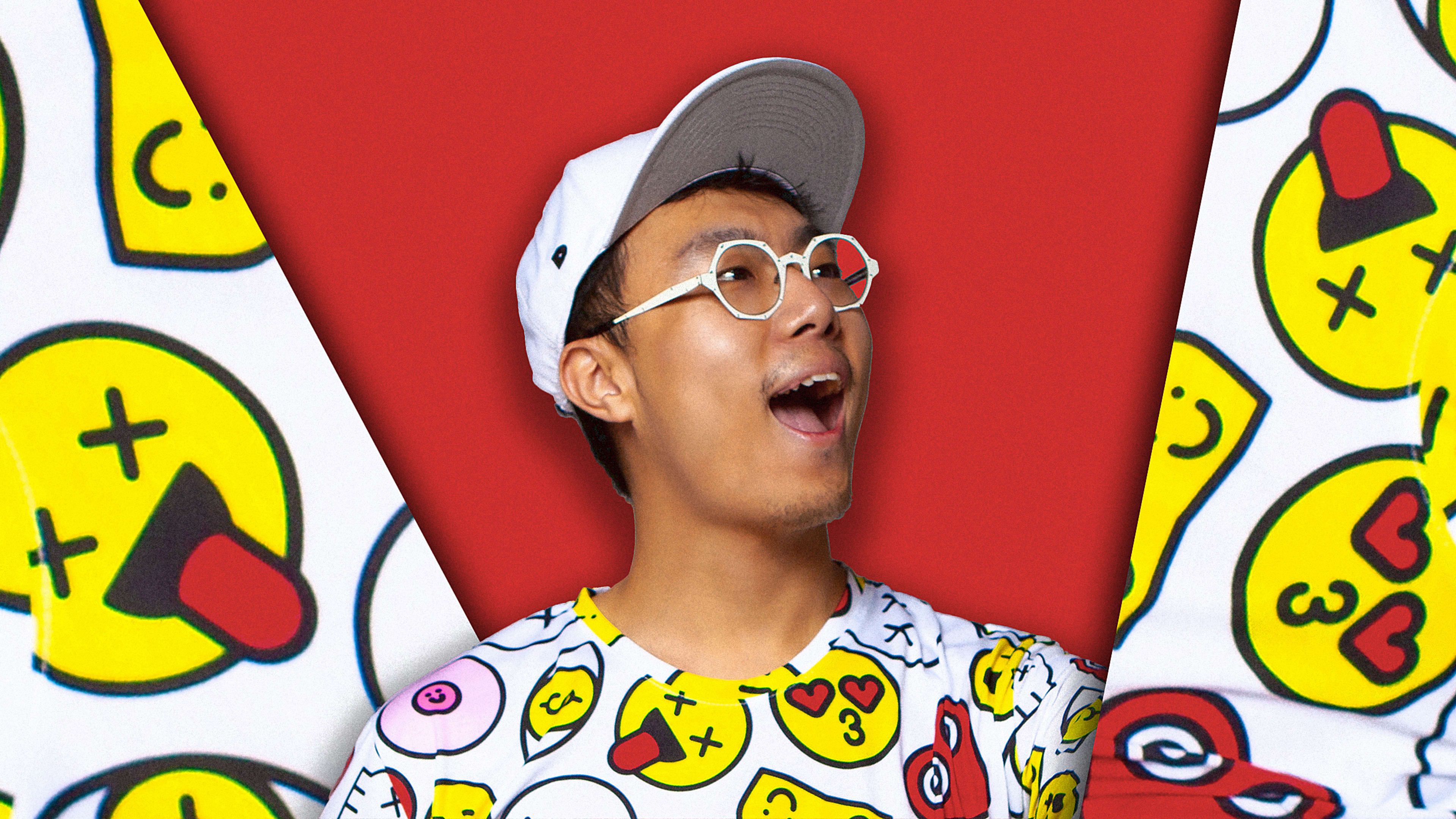
One thing that has always been so striking about your work is your vibrant, shocking color palettes. Where did you develop your approach to color—and do clients ever ask you to tone it down?
For the first question, there are actually two parts to it. I’m from Shenzhen, which is in the south of China. Imagine Miami, but filled with Chinese people. So this is where I grew up. It’s a tropical beach town. There are vibrant colors everywhere. And I think because of that, I was naturally familiar with bright, saturated color. When I moved to New York, every New Yorker is black and navy and gray, which is the fake identity that I took on for a few years during college. At the time, I also had an English name that I no longer go with. I had a moment of realization: My name is Zipeng, right? Zipeng means “an exuberant child.” I decided to go back to my Chinese name because this is the name that my parents gave me, and I want to really live up to my name. And so that’s when I started to embrace color.
Meanwhile, I was exposed to musicals as a gay person in New York City. I saw Chicago, and in the movie/musical, Richard Gere has this song called “Razzle Dazzle,” and that word really caught me because we don’t have that translation in Chinese. So I had to look it up, and I was like, Oh, I can relate to that. I feel like there’s something about razzle dazzle that I can really own. So with that, the color and the flashing graphics and the very bold strokes came together.
Clients are interesting. I think most of the clients who come to me, Zipeng the artist, usually understand the color palette that I run with or the mixture of things. Most of my clients have the balls to hire me to do all of that. The clients that sometimes come to Dazzle who didn’t look up all the things that we do [might] have a [different] response. For us as a studio, we do our due diligence; we do our homework. We do a lot of conversations and questionnaires and back and forth with our client before we get to work. So only sometimes do we get asked to tone something down, but usually there are some good reasons [for it]. And also, we’re not unreasonable. The way that I describe myself to a lot of my clients is, just because I like to eat spicy food doesn’t mean that I can’t make delicious non-spicy food. I can still make something delicious, even if it’s subtle. And funny enough, we do a lot of black-and-white work as well. We just did the Bloomingdale’s holiday campaign. It’s only black and white, silver and gold. I mean, it’s shiny—but there’s not that much color in it. We have variety in our arsenal.
You’re pretty prolific on social media. What role does it play in your overall practice? Is it a concerted business strategy? A place to just freely play and share? It certainly shows off your design and marketing chops.
I was that “one-thing-a-day” person for about six or seven years. The only reason is because I am one of those people that if I don’t let my idea out, I would just itch. My whole body would be so uncomfortable. So if I have something, I have to get it out there. That became my daily design workout. Everything that you see usually takes me about, I don’t know, 10, 15 minutes to make. I’m pretty snappy with it.
But now I am in a new place because the pandemic really changed me. . . . I had a [thought]: Instead of forcing myself to do something, maybe I should reserve myself to make things with better quality and with even more interesting ideas. So now the stuff that you see on my social media is experiments or when I feel I have something to say, whether it’s activism toward racism or homophobic issues or other social things that I want to comment on, or simply because I have something in me that I want to express.
You bring a candor to your output—nothing feels sacred or too sensitive a topic to broach. Is that approach—sort of a radical transparency—at all how you see the future of design?
Unfortunately, I don’t really see that as our future, very sadly. This is my personal observation, [but] I feel like freedom of speech is being censored on both sides. The First Amendment means so much to me because as an immigrant, I have no power at all whatsoever in this country. But the First Amendment allows me to be me, which is one of the reasons I moved here. Therefore, I felt like as a resident, recently a green card holder, it’s a very important right—especially for a creative. [The old term for what we do is] “communication design.” If we don’t communicate, what are we doing? So I felt like I wanted my work to speak for itself as much as possible.
What rebrands or identity work have you seen lately that you love?
[A project] called Time by For the People. It’s a telecommunication provider, I believe, in Malaysia. It’s brilliant. For the People is an excellent studio in Australia that does absolutely fantastic work that is so beautiful and clever. And the reason I love this project is because they unbelievably, creatively incorporated a clock into the logotype. It’s absolutely genius. So good, so clever, so wonderful. I think about it all the time—no pun intended. It’s just brilliant. It’s brilliant, it’s brilliant, it’s brilliant. I feel like it’s not getting talked about enough.
My last question for you: In your career-long quest to make life a razzle-dazzle musical, have you succeeded, and what does it look like?
I have to say, even before using the “razzle-dazzle musical” line, I have always been one of those weirdos who believes that one day I’ll be walking down the street and people will just start dancing behind me. I’ve been like this since I was a child. . . . And then I submitted that line in class and Debbie just read it and then looked at me and she said, “I have never seen a mission statement that is this outrageous, yet this clear.”
I felt like it’s me manifesting into this statement instead of this statement manifesting into my life, or it’s like a symbiotic relationship. It’s a blessing to be able to find something that resonated with me earlier in my life that, in strange ways, gave me a career. I don’t really want to call it a style, but it gave me a voice. It gave me a point of view.
Now I am looking forward to seeing what “dazzle” can bring for me for the next 10 years—or, is there another word out there for this guy in his mid-30s? It’s exciting and absolutely nerve-wracking. To be honest, that’s what’s on the top of my mind.
This conversation has been edited for clarity and space.
Recognize your brand’s excellence by applying to this year’s Brands That Matter Awards before the early-rate deadline, May 3.