Following seven years of development and billions of dollars in investment, Apple launches its Vision Pro “spatial computer” today. It’s what Apple is touting as the next era of computer interface—one that might not be fully realized today, but will someday feel as essential as using the iPhone. That forecasted positioning isn’t exactly a vote of confidence in the company’s $3,500 debut reality-bending product. Indeed, Apple seems to be urging the world to rapidly celebrate patience.
But after spending 30 minutes in demos this week, I don’t want to focus on what the Vision Pro could be in five, 10, or 20 years. I don’t want to just offer you Big Thought on what it all means, either.
Instead, I’d like to walk you through some of the unique UX details of Vision Pro—some of which redefine the category, and others that seem to undercut the experience.
The world inside Vision Pro is a little less beautiful
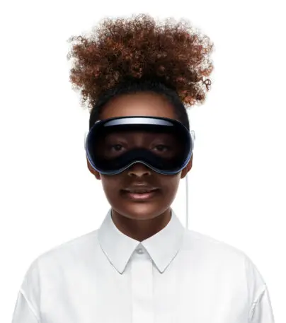
Vision Pro isn’t a pair of glasses; it’s a completely opaque headset that blocks your sight. To bring the world inside, Apple uses a camera aimed in front of you that streams to your eyes. Think of it like your car’s backup camera, but for everything in real life. This idea isn’t new; it stems from years ago with platforms like Samsung’s VR headset frames for its Galaxy smartphones. But usually, interacting with this stream of video felt a bit like wearing drunk goggles.
You won’t feel drunk inside Vision Pro, but it’s not quite at the “I didn’t even know I was inside a headset!” sensation that some reviews have claimed. The world’s scale isn’t 1:1. People are ever so slightly larger than they are in real life, as if you’re talking to Amazons. Turning your head can often create bits of aberration and blur. And while app icons feel as crisp and colorful as on your iPhone screen, after taking the headset off, I realized the Vision Pro’s screen paled in comparison to the sharpness and color of real life.
The display may be miraculous, but it only produces about 50% of the colors our eyes see in real life. It’s kind of like being inside a room lit by a cheap LED bulb. I suspect the dullness could add to your mental exhaustion over time. And there’s zero doubt that if you were looking through a window with pixels on top rather than a screen, that’d be preferable in every way.
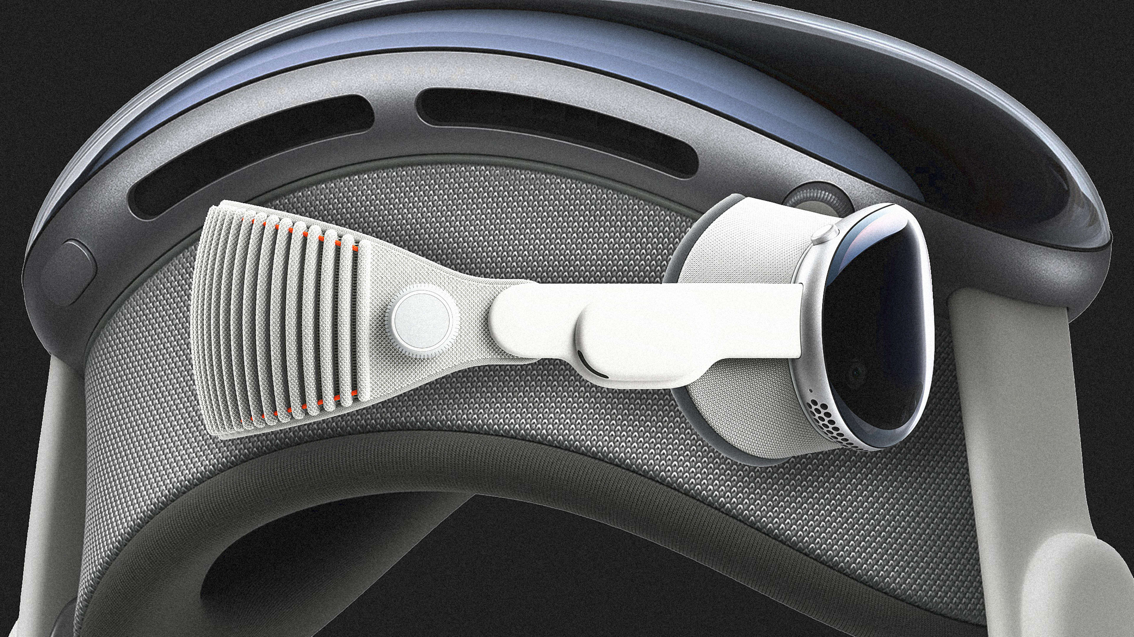
The digital crown is a clever reality tuner
A little knob on the top right of the Vision Pro, modeled after the crown of the Apple Watch, is what lets you tune out the real world. As you turn it clockwise, the screen drops it subtly into shadow to help you experience more immersion. (You can also press it at any time to get back to your main screen of apps.)
The idea works, and reminds me of when the lights dim in a movie theater before the show starts. I think what’s most powerful about it isn’t that you’ll even touch the crown so often, but that it gives you a feeling of agency. You can decide at any moment, no matter what is going on, that you want to float shallower or deeper in the machine.
A foggy UI was Apple’s best design decision
The interface that floats inside Vision Pro is modeled like semi-transparent glass, and catches light from the atmosphere. But what impressed me more was a UI element I can only call fog. (I’m remiss to say, we don’t have an image of it from Apple. The fog you see below is thematic only.) While you can use the digital crown to cast the world in shadow, this fog pours in around the edges of objects, almost pooling around your feet, to be the bridge between the real and the virtual. When you look directly at the spot someone is sitting, or someone near you moves closer, they cut in through the fog through a feature called Breakthrough. When you are walking around a room, fog seamlessly blends a side table into your view so you don’t trip.
I can’t imagine how much refinement, and how many algorithms, went into making this fog (which is a key component of a new design language Apple developed for Vision Pro). But it feels surprisingly organic. Because of this visual effect, my brain instantly understood that it’s living an experience somewhere between two worlds.
The gaze and pinch interface works almost perfectly . . .
Your eyes are your mouse in Vision Pro—and that’s a decision Apple made from the earliest days developing the device. But instead of a cursor, buttons highlight when you look at them. And pinching together your fingers is your mouse click.
I’ve tried gaze experiences in VR before and found them exhausting. But gazing and pinching on the Vision Pro is effortless. You look at an app, pinch, and open it. You can look at the edge of a UI window, pinch, and close it. It makes sense. Cognitively speaking, nobody really multitasks on a computer or in life. You just unitask many different things in a row. So controlling the thing you’re actively looking at is a quick adjustment.
The click gesture works so well because the Vision Pro’s external cameras see your hands superbly. Even on a couch with my hands slumped to my side as I swapped the controller between them, the system responded fine. Other gestures include pinching your fingers on both hands to pinch-to-zoom in midair, and a gesture that felt like pulling down a window shade to scroll up and down pages.
. . . but I had a lot of help
The UI is new, and if an Apple representative wasn’t watching along on an iPad, I could imagine the learning curve would have been steeper. I think this is because when you’re looking at the floating windows of apps, their main UI elements that live around the edges—a button to close and another to resize windows—disappear unless you’re looking at them. (And the only way to make them reappear is looking at the spot where you remember they were.) That’s fine once you learn the interface, and it makes the UI cleaner all around, but it’s also harder to get started.
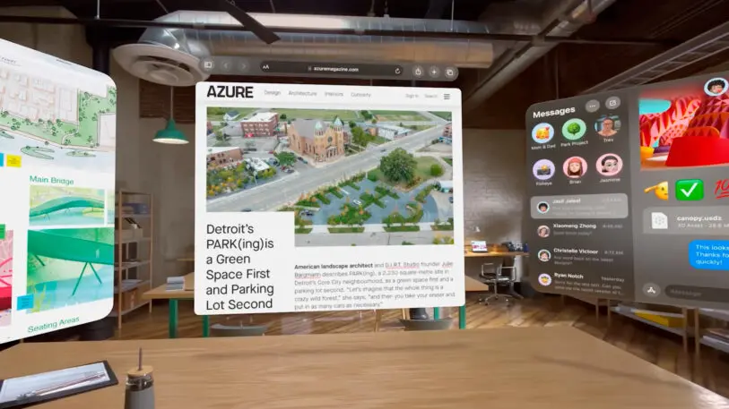
Vision Pro’s most immediate promise seems to be its sports bar UI
I experienced a demo where a dinosaur walked through a screen to sniff my hand, and another where I could disassemble an F1 car, scaling it from the size of a Matchbox vehicle to a full scale racer. Much of the enterprise use case for VR is for architects and designers experiencing their models in 3D. For any of those people currently using an Oculus, I imagine Apple’s enticing interoperability with MacOS could replace the competition rapidly.
Another interesting affordance with less immediate commercial impact is a button that lets you hop into 3D models (this one I didn’t get to try). For instance, the digital product agency Work & Co developed an app for the PGA tour that will stream live tournaments, allowing you to pull up a hole and follow the trajectory of shots across the fairway. With the gaze and pinch of a button, you’ll be able to Beetlejuice yourself into that model, and stand on the fairway or at the green.
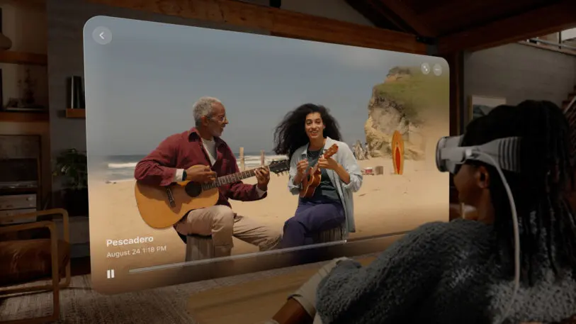
However, most of Vision Pro’s core UI seems to be about juggling and positioning more 2D screens in your environment, like a giant custom sports bar. You can make an app big, and toss it onto a far wall or even the ceiling. Or you can shrink a screen a little smaller, and move it a foot from your face like a desktop monitor. You can also just use the Vision Pro with a keyboard or even a Macbook, and it’ll provide you with a single large monitor to work on.
Apple has mistakenly built a personal computer for shared environments
In one demo, I sat inside a Star Wars landspeeder, with the world of Tatooine rendered all around me. In front of me, a giant movie screen displayed a Star Wars trailer. It was a bit like being at a Disney World drive-in. I turned to the open seat next to me, naturally expecting to see another person in Vision Pro, but of course there was no one else in the vehicle with me.
That aforementioned fog, coupled with options to crank the opacity of the world up or down by twisting the crown, do a lot of heavy lifting to make this VR-ish experience feel less like you’re going into an isolation tank with no way out. But to not be able to share the wonder of a movie alongside someone else makes me question how much I’d use this for immersive entertainment. I don’t want to ride a roller coaster or sit in a movie theater alone. And this sentiment would only grow for spatial computing in real work environments. To not be able to operate alongside other people, sharing 3D models and various screens, gives the interface a bit of a late-career Howard Hughes vibe.
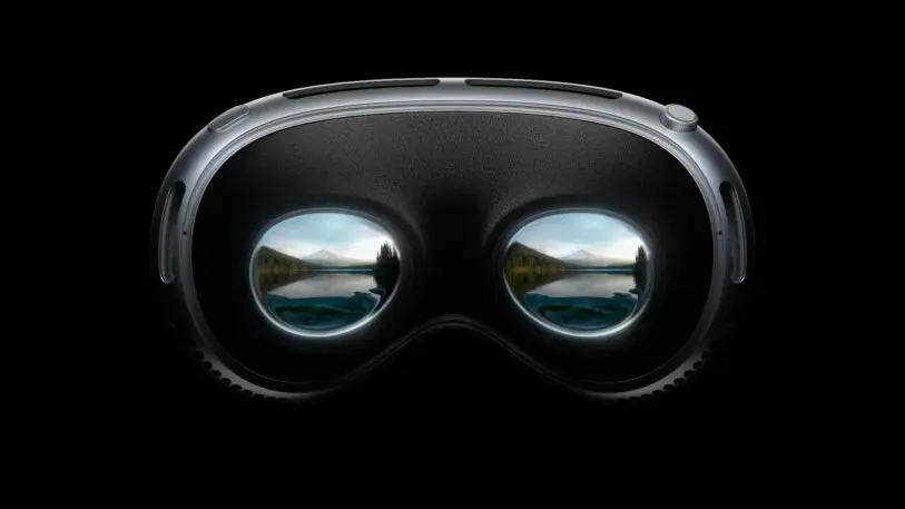
That said, Apple’s external eyeball screen is actually less weird than it looks in pictures
The Vision Pro’s external facing “Eyesight” display is strange in marketing photos, but it’s much more palatable in person. The screen glows in colorful abstraction when someone is immersed in media and can’t see you. And as you step through the fog into their view, their eyes fade in. I had a perfectly normal-ish conversion with an Apple employee wearing one, as their simulated eyes blinked and looked around the room, even going so far as to return my gaze. It almost looks like someone’s eyes are in shadow, which I believe reduces an otherwise uncanny effect.
3D movies still look like 3D movies
Much of my 30-minute demo was highlighting photos and videos, including fully panoramic landscapes that wrap around you, my own 3D video recorded on the iPhone 15, and AppleTV’s 3D streaming movies. No doubt, the professionally shot stuff could be pretty remarkable. You could really see into a scene and appreciate certain textures that get lost in 2D imagery. But my attempts to capture the grandeur of the World Trade Center’s Memorial Plaza, near Fast Company’s headquarters, didn’t translate to anything particularly special. And sitting in a professional picture of a forest still didn’t feel like sitting in a forest. It was more like being wrapped in a big ‘ol desktop background.
The best 3D movies looked like 3D movies always have, and not appreciably better than I remember them looking on those 3D TVs that the industry tried to sell us on years ago (requiring, yes, a pesky headset to work). I think just like 3D movies today, there are times the novelty is great, and times it’s not additive enough to justify the headgear.
I suspect Siri is going to be Apple’s AI bubble buddy
On your phone, Siri appears as an iridescent orb. In Vision Pro, that orb is more like a 3D soap bubble. At one point in my demo, the orb floated in front of me, as if catching a draft of wind in the room. It seemed to be an intentionally choreographed moment with no explanation beyond its inherent gee-whizness.
While this is pure conjecture, I found myself wondering, again and again, how Apple could build AI deeper into Vision Pro—especially as it just committed to invest $1 billion a year into generative AI development. Spatial AI as a soap bubble—something that could sink into your hand, or float toward an object, or rest on a surface, or stick to something, or balloon and morph itself into a new shape altogether—is both a touch whimsical, and a touch feasible. Of course, you can just talk to Siri in Vision Pro just like you can on an iPhone. But AI as a physical entity in space seems like UX theory worth exploring.
The Vision Pro makes people’s jowls look extra jowly
This is not a slight to my well-toned peers in the journalism industry. But the way the Vision Pro fits your face, I’ve noticed everyone’s cheeks look saggier. I have theories . . . is the space-tech on your face too much an aesthetic contradiction to your skin? Is it the squeezed fit? Is it the proportion? Either way, it’s not flattering, which makes it hard to imagine wanting to wear this in any kind of social setting.
I didn’t feel like I needed to hop right back in
I was very impressed by the intuitiveness of Vision Pro, by the countless minuscule design decisions, working in concert, to realize a better AR/VR experience. I find it academically fascinating.
In many ways, the Vision Pro isn’t as weird of a product as it seems. It’s certainly niche, yes, and if it doesn’t catch on, Apple will lose quite a bit of investment and credibility. But otherwise, Apple did what it always has done: It walked into an existing category, tried to make the better version, and launched it.
That said, I’m not sure the Vision Pro is to AR/VR what the iPhone was to smartphones. I haven’t had enough time and experience to tell. But whereas the first time I saw an iPhone I was a moth to the flame, the Vision Pro hasn’t made me dream of throwing out my Macbook.
I’ve read a few takes like, “after being inside Vision Pro, my computer felt like a shoebox!” I don’t feel that way. My Macbook feels like the same lovable little machine as it did before the demo.
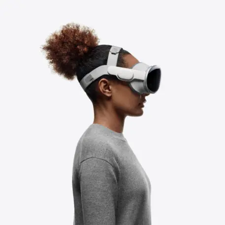
Complaining about the battery and weight is sorta missing the point
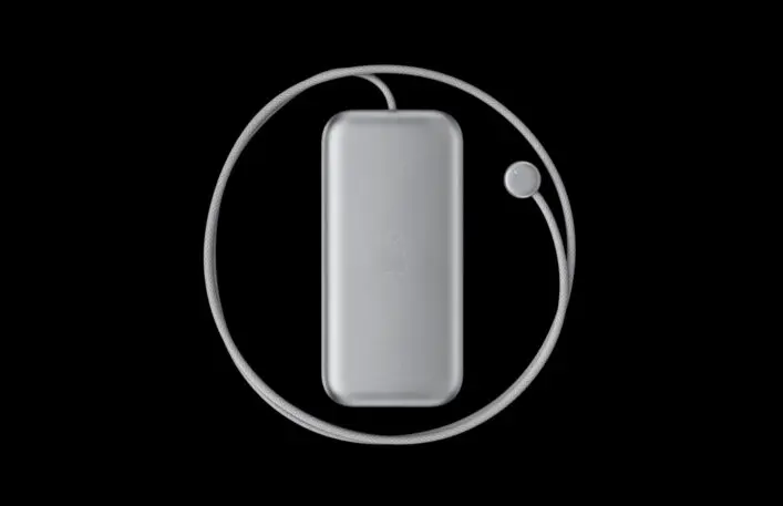
The battery pack that comes with the Vision Pro reminds me of an iPhone 1 without a screen. It’s heavier than you want it to be but also stowed fine into my back pocket. (It’s not something you could wear easily with a silky dress.)
Every review has brought up the battery life, which is about two and a half hours, like some sort of shortcoming or potential dealbreaker. But the question for Vision Pro isn’t how long can the battery last, it’s how long can a person stay inside Vision Pro. I don’t see anyone wanting to be in this experience for more than the length of a movie, and even that seems like a stretch for me. I was ready for a break after 30 minutes.
I could say the same thing about the weight, which yes, at a little under a pound and a half, feels heavy at first. But a tired neck didn’t pull me out of the Vision Pro.
When I consider the industrial design of the Vision Pro, this is where my head is: We are not one, two, or perhaps even five years away from this device being significantly smaller. Apple is already pushing the envelope of what’s possible, materially. This thing isn’t 3 ounces or 3 years from feeling weightless and unobtrusive. I simply don’t see Moore’s law shrinking the product. And I’m not sure a device that’s 20% lighter, 20% thinner, and 20% cheaper matters much for a computer that lives on your face and stands in the way of you and other people.
The Vision Pro is an object I can appreciate for all its curves and ingenuity, but at the same time, there’s a central tension to the device that I can’t easily reconcile; one that doesn’t apply to the Mac, or the iPhone, or the Apple Watch.
The Vision Pro is the first Apple product I wish could disappear. And ironically, the only way to make that happen is to wear one.
Recognize your brand’s excellence by applying to this year’s Brands That Matter Awards before the early-rate deadline, May 3.