Given that people are either averse to change or abhor it, a rebrand can be a polarizing business in the best of times. So what happens when one occurs in what some might consider to be the most challenging of times?
Today, Reddit is beginning its rollout of a polished new logo, typeface, brand colors—and even a new version of its beloved alien mascot, Snoo. The rebrand comes in the wake of a summer marked by a war between the site’s most vocal power users and the company at large over its API changes regarding third-party apps.
Like all rebrands, a new look is often tied to the moment in which it’s designed, and the resulting response is inevitably colored by the environment around it. In the case of Reddit, the visual revamp seems to be signaling that the platform is growing up—and preparing for a new era as it readies for a potential 2024 IPO.

Perhaps as a testament to the stakes at hand, Reddit called in Pentagram, the venerated design studio behind branding projects for Mastercard, DC Comics, and many others, to work on the project. Given that Reddit is a site that thrives on (unrestrained, unadulterated, unabashed) opinion, I asked Pentagram partner Natasha Jen, whose team took on the redesign, if it was a daunting initiative.
“Working with a brand as influential and community-driven as Reddit indeed presents its own set of challenges,” says Jen, adding that the remit to balance Reddit’s long-term, brand-building goals with the community’s desire for creative freedom was a daunting, but welcome, challenge. “We were always mindful that these two aspects might not always perfectly sync,” she says. “However, we placed our trust in the Reddit team’s deep understanding of their user base, as they carefully considered each of our recommended moves in relation to their communities.”

Jen notes that skepticism and critical feedback on a big rebrand is just part of the game—and here, the overall goal was to streamline Reddit’s brand, which had become a bit cluttered, owing to the site’s myriad features and expanding user base. The team at Reddit also pointed out that the project dovetails with the company’s global expansion and its goals to be conversational and consistent. Reading between the lines: the Reddit of the future will feel less DIY than it did in its early days as it expands into new markets.
Chief marketing and consumer experience officer Roxy Young says the design work was a long time coming. “When I arrived at Reddit [in 2017], we hadn’t done a lot of brand work or marketing,” she says. There was the geometric Snoo, the word mark in Linotype’s VAG Rounded, the signature #ff4500 “OrangeRed” color scheme, and some basic guidelines. Reddit iterated and expanded on them as time passed. “Over the last five or six years, it’s kind of like a house that you keep adding onto . . . but over time, we were really just stressing the limits of the foundation around our brand and how we use it,” Young says.

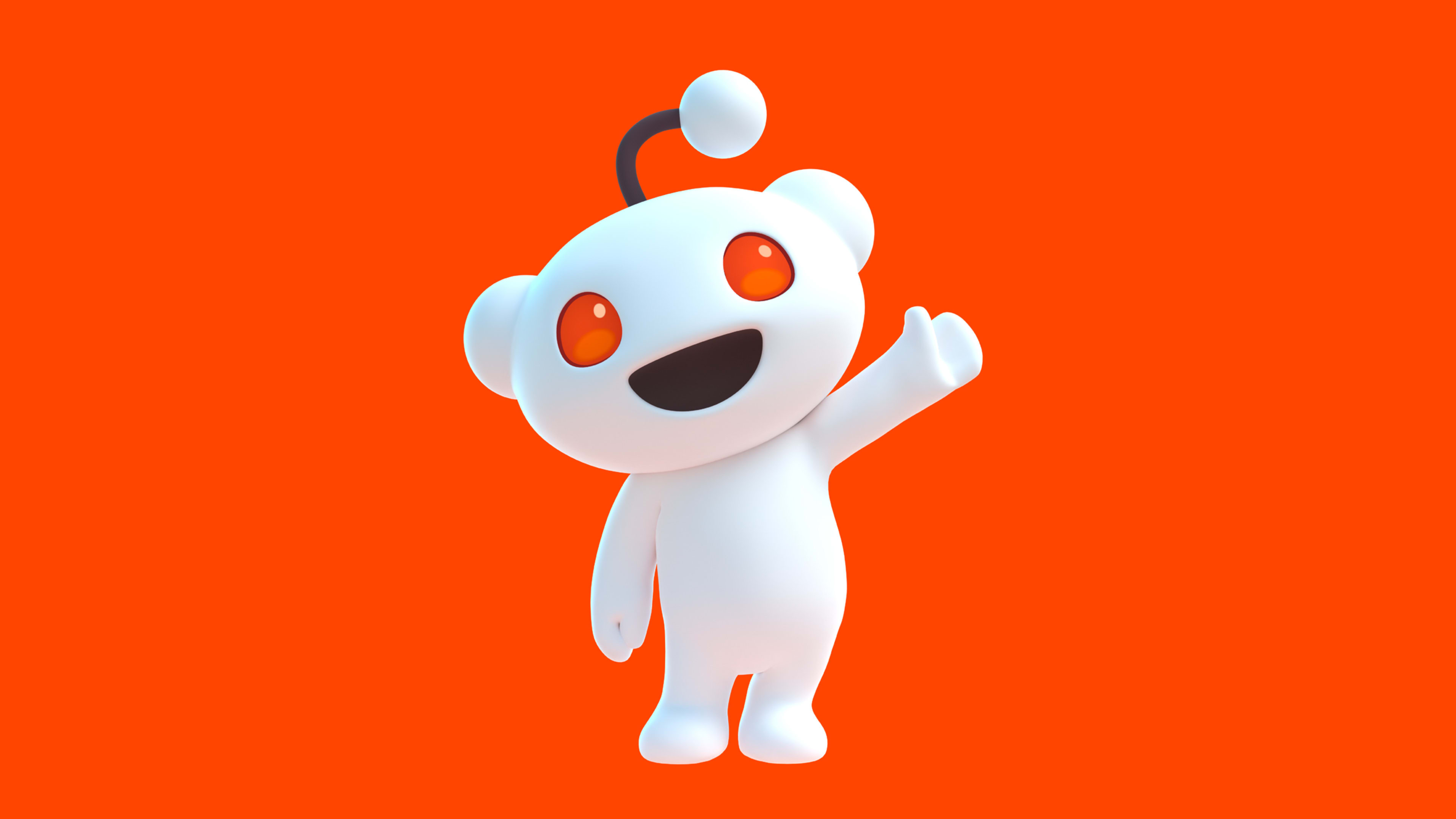
The new updates mark the first significant rebrand since around 2016, when Reddit got rid of Snoo’s body and framed the remaining alien head within the orangey-red brand color. This time around, Snoo has its body back (and opposable thumbs), and a 3D treatment. Contrasting the flat Snoo of yesteryear, the new Snoo looks a bit, well, alien.

Jen notes that iconic characters like Mario and Hello Kitty evolve alongside the media of their time, with the former going from 8-bit to fully 3D in his 2023 cinematic outing. “In a similar vein, we envisioned Snoo’s potential to thrive in a 3D format,” she says. “With 3D graphics now a cultural norm, transforming Snoo into a living, three-dimensional character seemed not just feasible but necessary to ensure its continued relevance and appeal in a rapidly evolving digital landscape.” (Users will also be able to download an open-source Snoo template to playfully devise their own creations.)

A logo designed for conversation
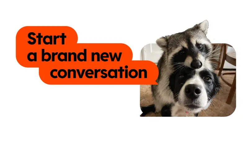
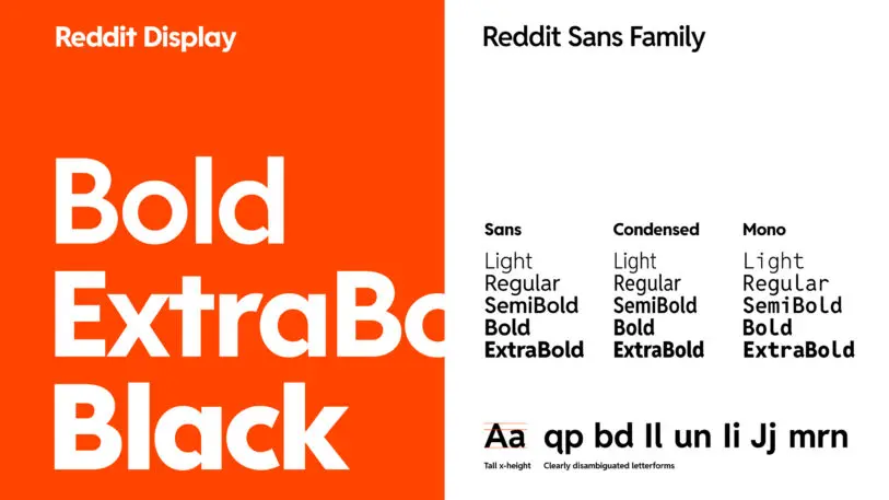
A highlight of the rebrand is Reddit’s reworked word mark, which has traded its friendly, kid-like sans serif for a sharp-edged font. Starting with the DNA of the accessibility-focused Reddit Sans, the designers created the complementary Reddit Display typeface, which dominates the new mark. As they were developing it, they had an “aha” moment when they integrated a conversation bubble into the counterform of a lowercase d—and they went on to cleverly design speech bubbles directly into the counterforms of the full alphabet, nestling the mascot within another bubble for the final logo.

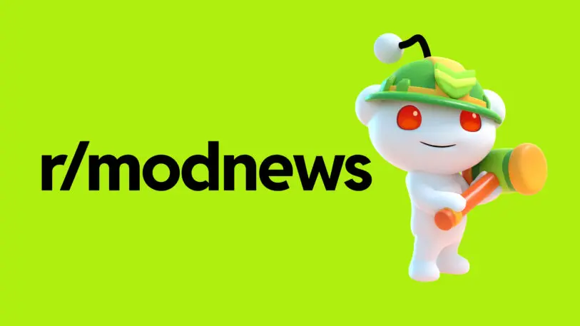
With this launch, the site is expanding upon its official palette with “GuavaPink,” “LimeGreen,” “BananaYellow” and “JuniperBlue.” From a practical standpoint, Young says internal teams, from those working with brands to those creating tools for developers or moderators, wanted a more diverse set of options at their disposal. She adds that previously, in lieu of flexibility within the brand’s OrangeRed/white/black ecosystem, people were inventing their own colors, leading to a kaleidoscopic problem.
“Pentagram did an audit and assessment, and it looked like the extra-large Crayola box where there are 152 colors,” Young says. “And so we went back to the drawing board.”

When will you see the new logo, colors, and more? Not all at once, and that’s by design. The new brand elements will roll out on redditinc.com, redditforbusiness.com, and Reddit-run communities such as r/reddit today; and they will eventually appear on the full app and site “in the weeks and months” following. Young notes that Reddit will also bring users along on the journey and keep them informed so they understand what’s driving the changes.
Ultimately, this conversation-imbued design work will indeed start conversations. But given the current environment, they might not all be the ones Reddit wants. One wonders: Will the work offer a chance for Redditors to rally around the new look—or will it once again stir up its most ardent power users that it is out of sync with them?
“For us, this is an evolution of the things that Redditors know and love,” Young says. Moreover, “This is definitely an evolution versus a revolution. I think a user will definitely experience it as more of a phased rollout versus [opening] the app, and all of a sudden, everything looks different. . . . I don’t think that someone’s going to wake up and feel like Reddit is no longer Reddit.”
Recognize your brand’s excellence by applying to this year’s Brands That Matter Awards before the final deadline, June 7.
Sign up for Brands That Matter notifications here.
