When Johnson & Johnson’s recent abandonment of its 136-year-old cursive logo was followed quickly by Eddie Bauer ditching its script wordmark of six decades, alarm bells rang in all corners of the design and branding spaces. As both logotypes were replaced with no-nonsense sans-serif marks, accusations of “blanding”—the loss of character in the visual components of brands, exemplified by many fashion houses’ turns to spare, indistinct logos—were hurled, and scapegoats were sought.
Were corporate suits with no respect for the craft of hand-lettering or decades of brand equity to blame? Or perhaps it was the nation’s schools who, in their refusal to teach children cursive, had spawned a generation of youth who could no sooner read a script logo than a Greek menu?

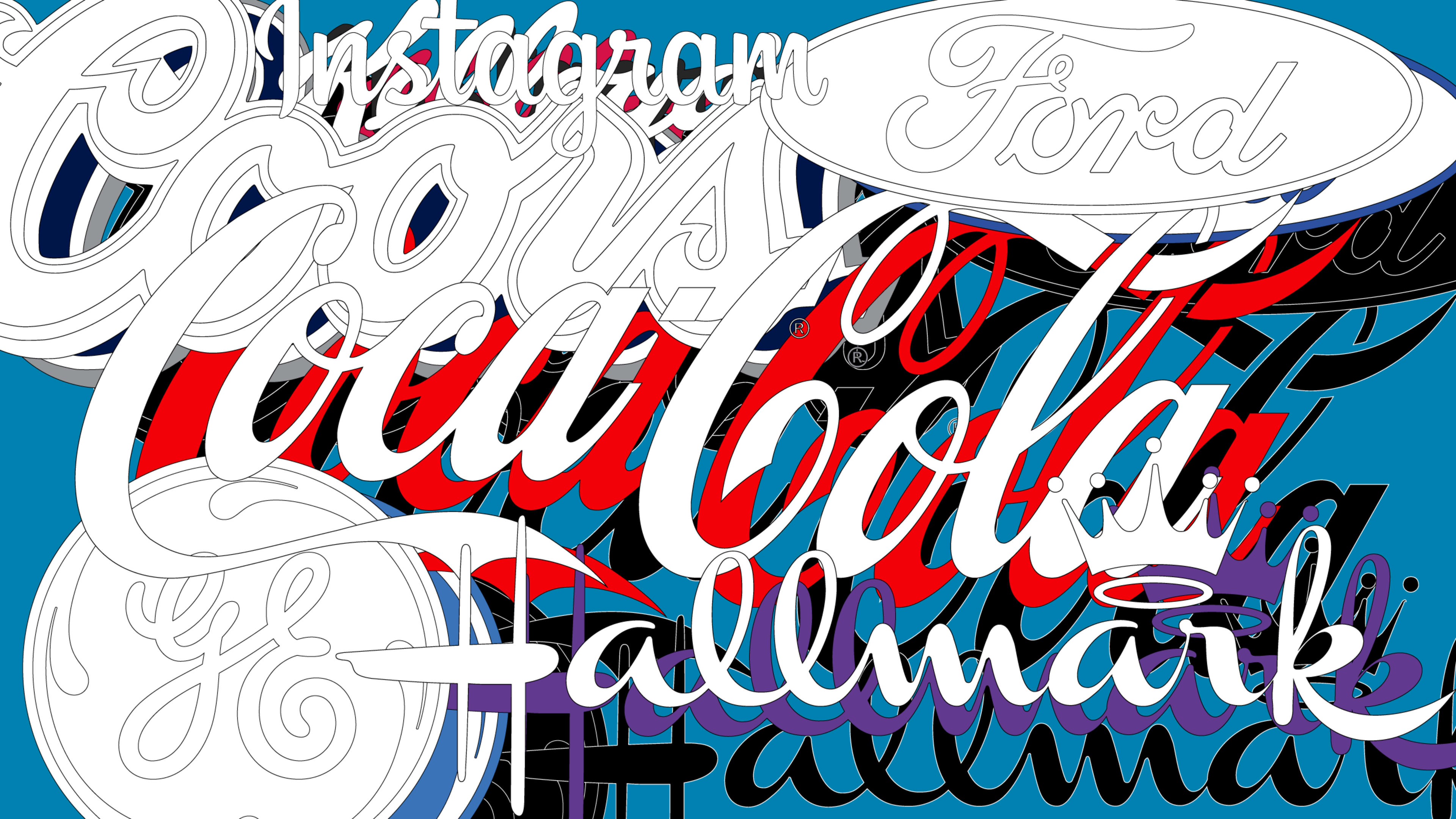
It also raised the question, which will be the next script-logo domino to fall? Could it be Kellogg’s, Coors, Lysol, Hallmark, Cadillac, Champion, or Instagram perhaps? Could it be the classic Ford Motor Company wordmark? The iconic “initials of a friend” in the General Electric logo? Or even the granddaddy of American logos, Coca-Cola’s hallowed script?

Viewed from an historical perspective, the hubbub around cursive logos is a bit ironic, as such marks were not always treasured for their character and distinctiveness. Over a century ago, in his 1916 treatise Trademark Power: An Expedition Into an Unprobed and Inviting Wilderness, Chicago adman Glen Buck counseled that, “A common way to use a trade-name is to letter it in script and add a flourish. You will then have a device that will closely resemble thousands of others—and that will be seriously lacking in distinction.”

More recently, designer Michael Bierut’s memorable rant against the fusty, hidebound trademarks of yore in the 2007 documentary film Helvetica specifically targeted not only an imagined “Amalgamated Widget” logo laden with a “goofy script typeface,” but a 1953 magazine advertisement for Coca-Cola guilty of the “visual bad habit” of “cursive wedding invitation typography.”
So, it’s important in taking a broader view of the trend to recognize that none of this is really new. Just as complaints about blanding date back decades, companies’ discomfort with the stodginess that their script logos potentially project to the public has been around for quite a while. Yet many companies have been hesitant to drop cursive. Ford enlisted logo design god Paul Rand to rework its cursive mark in 1966. In his proposal for a modern update, Rand argued that the script was a turn-of-the-century cliché, and that “what started out to be the signature of the individual and his product turned out to be less a mark of its maker than of its time.” But Ford couldn’t muster the courage to pull the trigger on Rand’s replacement design. Similarly, General Electric shied away from the modern marks that it hired design agency Landor to produce in 1986.
Still it’s possible that we could see more brands drop the script soon. Perhaps Instagram, one of the few tech companies to embrace the script logo, will opt for a more Gen-Z friendly design as it competes with TikTok’s chunky logo. Or we may see more incremental shifts.
Lately some brands have taken some baby steps away from the script. Just two years ago, Campbell Soup separated the letters in its famous logo, perhaps as a service to the cursive-illiterate members of Gen Z. Even Coke has had to prop up its old script with a variety of supporting visual elements over the years, from a “dynamic ribbon” (suspiciously similar to Pepsi’s earlier “wave”) to a bottle silhouette to Lippincott & Margulies’s decidedly non-cursive 1969 “Coke” wordmark. Let’s face it, “Coca-Cola” has become an archaic name; according to Google Ngrams, its use in books peaked in 1940. At this point, calling Coke “Coca-Cola” is tantamount to calling Mick Jagger “Michael.”
It may be, in any event, that the concern with the disappearance of script logos is overblown. Analysis of United States Patent and Trademark Office data shows that while in 1970, 12.4% of new U.S. wordmarks were in cursive, the number dipped to 4.7% in 2000 before rebounding to 7.2% this year.
And although signatures are no longer as important as they once were in our society—I don’t put much effort into scribbling mine when I’m asked to authorize my $1.99 credit card purchase on a digital pad at the corner 7-Eleven—they nevertheless retain a symbolic significance which would undoubtedly endure even if they disappeared completely, just as Harvard’s shield remains meaningful even though no one in Cambridge is riding out into battle with one these days.
Cursive logos will survive in use, then, for as long as their owners perceive that the humanity, authenticity, and personality that they communicate outweigh their connotations of outdatedness and decrepitude. And with every Johnson & Johnson or Eddie Bauer script mark that disappears, those that remain may even gain an added measure of distinctiveness.
Recognize your brand’s excellence by applying to this year’s Brands That Matter Awards before the final deadline, June 7.
Sign up for Brands That Matter notifications here.
