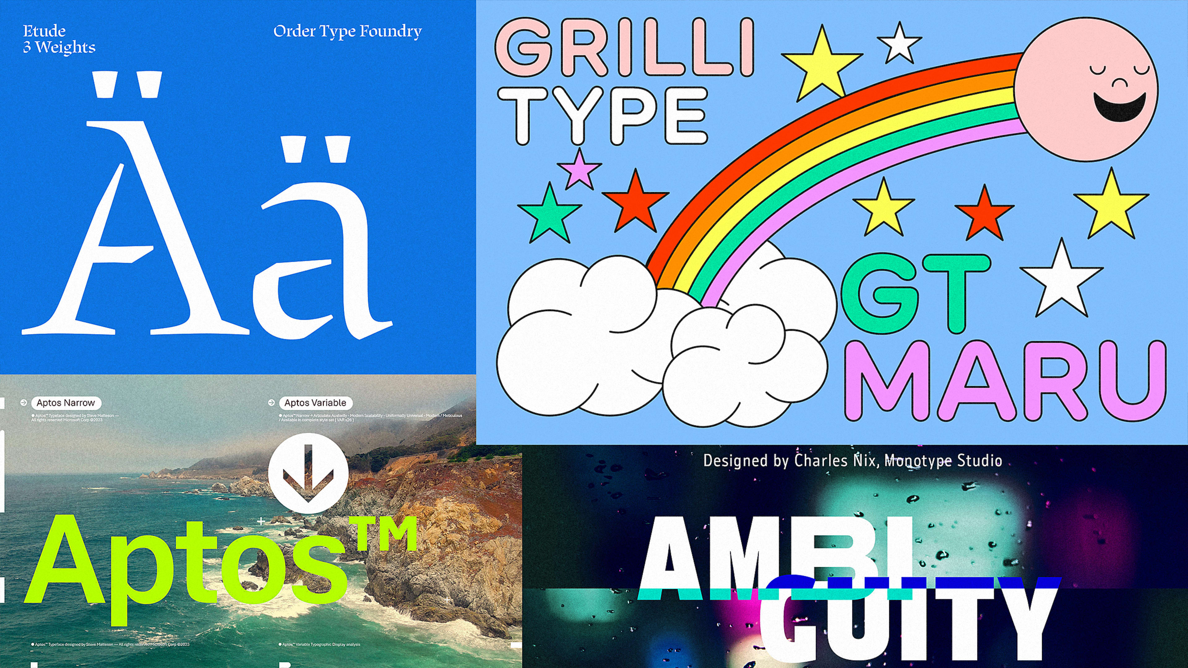
Earlier this month, Microsoft surprised the design community (and anyone who pays attention to the font they’re using in Word) with a new default font. Out with Calibri, in with Aptos. Except Aptos isn’t a new font; it’s a new name for an old font, called Bierstadt, which had been in Microsoft’s library for the past two years but apparently wasn’t being taken seriously. Same book, different cover.
Microsoft did provide some explanation: Bierstadt was named after a mountain in Colorado where the typeface’s creator, Steve Matteson, lives; Aptos was inspired by an unincorporated town in Santa Cruz County, California, which Matteson described as having a uniquely diverse climate. But both names seemed so arbitrary—like plucking a name out of a hat—that it made us wonder: Who’s generally responsible for naming fonts, and what does that process look like? Is there any method to the madness?
So we reached out to four type foundries, and we asked exactly that.
The first question—Who actually decides on the name?—proved easy to answer. When a studio designs a retail typeface, aka a typeface that will become part of its library and sold to whoever wants to buy it, the designers come up with the name themselves. On the other hand, when a studio designs a custom font for a specific client, the studio might advise and collaborate, but the client tends to have the final say. “They are end users; they have something that ties them to the name,” says Eleni Beveratou, a creative director at Dalton Maag, which has designed fonts for Netflix, BBC, and the city of Vienna.
The other questions were decidedly harder. Almost every designer we spoke with drew a parallel between naming a font and naming a child. “It’s a lot of responsibility, as it will guide the way your work is being perceived to a large extent,” Noël Leu, cofounder of Swiss foundry Grilli Type, says via email. “I find it really interesting that some cultures decide on the name for a child before it’s born, while others wait till after birth to decide what name to attach to a person. Our is similar: Sometimes the name is one of the most defining features of the design process at the start, other times it’s a painful process at the very end before publication.”
The studio recently designed a custom font for TikTok called TikTok Sans (boring but logical). More interesting on the naming front is GT Cinetype, which the foundry designed in 2015. Leu explains that his team wasn’t targeting the cinema industry with a name like Cinetype; instead, the name is inspired by an old typeface design used by a Swiss machine that burned subtitles into film. Still, the font took off in that realm, and today is the official font for the Academy Museum of Motion Pictures in Los Angeles.
Naming, then, can be seen as a bit of a self-fulfilling prophecy, which isn’t all that surprising considering the power of a name and our innate ability to draw meaning from it. Much like a company name acts as a portal into the brand’s origin story and what it stands for, a font name is a storytelling tool that, with a little hand-holding, can help people understand the underlying concept and interpret the form more easily.
“It’s difficult for most normal mortals to look at a typeface and see an idea in a typeface, but when you tell them what the idea is, it helps them understand how the form and meaning are tied to one another,” says Charles Nix, an executive creative director at Monotype.
Nix recently designed a sans serif typeface with five distinct personalities. Inspired by a lecture he attended, which questioned the contemporary notions of perfection and urged people to explore what lies at the edges of what may be considered a normal frame of reference, the designer became interested in the concept of ambiguity. “As [the type] was rolled out, the campaign was to embrace ambiguity, get people to think about ambiguity as a state of perfection,” he says. Naturally, he called it Ambiguity.
But names don’t always come naturally. When Emily Atwood, then a designer at the Brooklyn-based design studio Order, started working on a new typeface, she drew inspiration from the study of type design and experimental music techniques. Her working title was “Notation,” but she says she knew it wasn’t right: “I had a placeholder while I was designing until something really felt right.”
And then it all came together. In classical music, there’s a particular kind of composition called an étude (“a study” in French) that is designed to help musicians experiment with or practice a particular technique. (Chopin’s masterful “Revolutionary” étude is perhaps the most famous.) She named the typeface Etude, and it went on to be used by, among others, the Riverside Choral Society in New York City.
In most cases, the type designer who knows the ins and outs of their project holds the naming rights, but at Dalton Maag, the team takes a different approach: Everyone proposes a name, the team checks to see whether the proposals pass a certain number of criteria, and then they vote. “Any deadlocks are settled by a wider group of our colleagues,” Beveratou says.
The criteria aren’t numerous or set in stone, but they do exist. Chief among them is the length of the name, which shouldn’t exceed 10 characters, and how distinctive it is from other typeface names (lest it fuel a lawsuit). Leu from Grilli Type says a name should be easy to understand in different languages, and Nix from Monotype notes that the first letter matters more than you think, considering all font menus are organized alphabetically.
I suppose by that logic, Microsoft climbed a few rungs by switching from Bierstadt to Aptos. It’s too early to know if the switch has paid off—though if Helvetica is any indication (the type was known as Neue Haas Grotesk before being licensed by another foundry and renamed in the 1960s), changing a name a few years in shouldn’t cause too big of a stir.
Then again, maybe we’re all overthinking this. For Jesse Reed, who is the cofounding partner at Order, the name alone doesn’t make the font, or the company; it’s what you do with it that matters. “You should just name it what you want to name it, and that’s the name,” he says with a laugh. “It’s your personal choice, and you can think about it, but it’s that one piece of design where you don’t need approval. This is up to you, and you get to crown it what you want it to be.”
Recognize your brand’s excellence by applying to this year’s Brands That Matter Awards before the early-rate deadline, May 3.