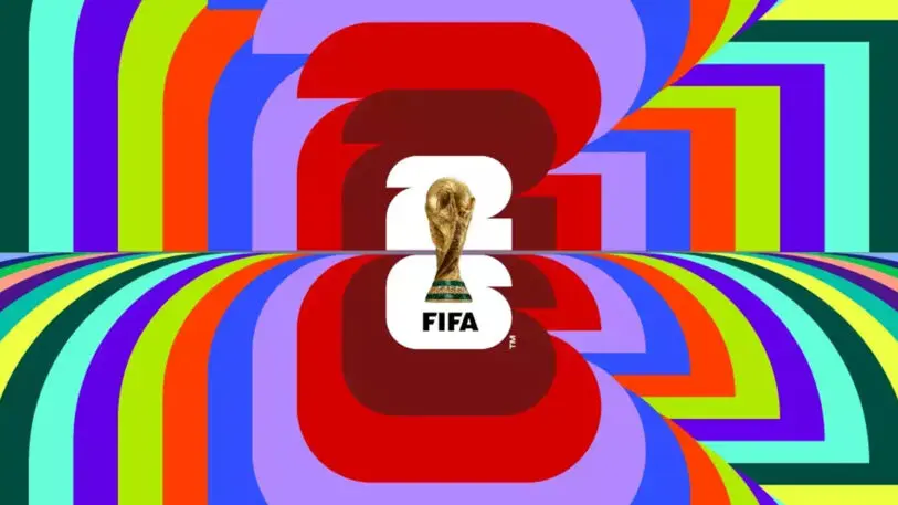
“That’s it?” many seemed to be asking last week when, at the end of the gala 45-minute FIFA World Cup 26 Official Brand Launch ceremony, an underwhelming logo comprised of a fat “2” and “6” overlain with a photographic image (usually a no-no for logos) of the World Cup trophy and a “FIFA” wordmark was unveiled. There was no, as some might have anticipated, combined symbolic representation of the United States, Mexico, and Canada, the nations that will in 2026 serve as tournament cohosts—a trio for the first time in World Cup history. Perhaps a cowboy wearing a sombrero and riding a moose was too much to ask for. And we should have known that the mark wouldn’t contain a soccer ball either; that basic graphic element that had anchored just about every early World Cup logo has been almost entirely absent since 1998. With this logo, there seemed to be no there there.
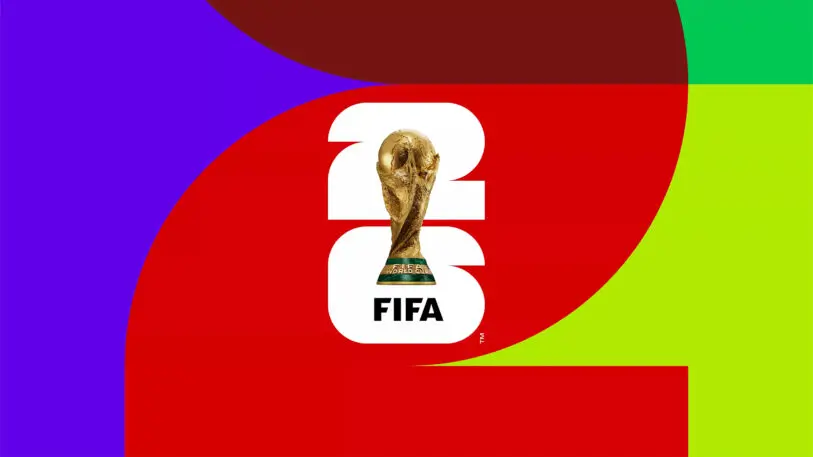
In the days that followed, the usual social media furor that surrounds any major new logo announcement raged (although this time, in a sign of progress, that old chestnut of “my five-year-old could have done that” was all but replaced by “AI could design a better logo”). Then once the furor faded, a clearer picture of the World Cup 26 brand emerged. Individual graphics and color schemes were introduced for each of the 16 host cities. While still rather generic, they provided a bit of local flavor and pizzaz to the basic “26” logo, which, it became obvious, was less an overt symbol than a frame or a backdrop, within or against which any number of various patterns or images could be inserted, creating not a monolithic identity, but more of a whole vibe.
The problem of devising a stand-alone logo to represent a multifaceted entity such as the World Cup, with its teams from a record-high 48 nations playing in 16 cities across 3 countries, has been apparent for some time. Contemporary logos such as these are expected to contain multitudes, and designers of Olympic marks have struggled with the challenge of expressing diversity in a single symbol. To use an analogy from American football, they have often simply punted. The organizers of the 2026 Winter Olympics in Italy passed the design buck and allowed the public to select a no-frills “26” device similar to this World Cup’s, and Los Angeles’s 2028 summer games will use a flexible logo system in which the “A” in “L.A.” will be presented in a variety of graphic styles. And, of course, the infamous London 2012 mark provided the blueprint for using the numbers of a year as a frame that could contain any graphic.
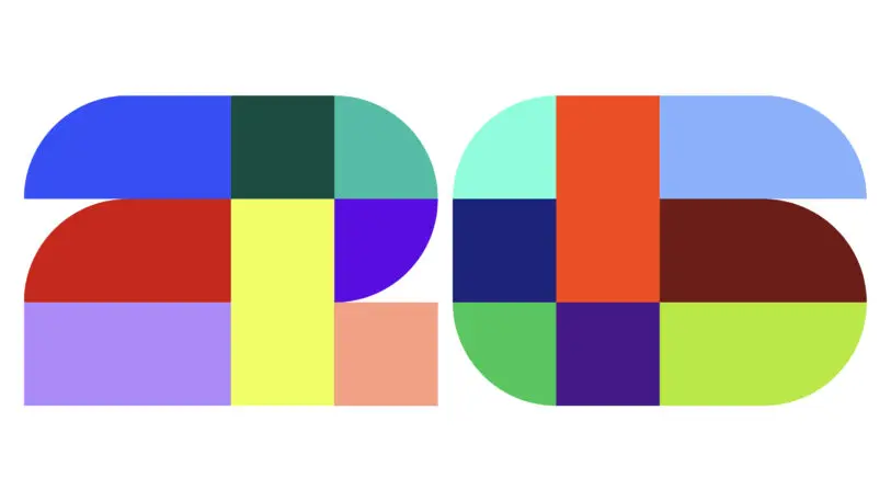
Unlike the flexible approaches of London and L.A., though, this World Cup logo-as-frame technique provides very little in the way of distinctiveness. The “26” logo seems almost like an outgrowth of the current “quiet luxury” trend in fashion, in which the in-your-face plastering of designer monograms across clothing and handbags has given way to a more discreet, restrained elegance. The problem is that the 26 is simply too restrained. Very little separates its shape from a generic rectangle with rounded corners: Those modest notches in the 2 and the 6 are asked to do a lot of heavy lifting in defining the numerals as such. And, based on some early examples of the branding in use, it appears that some images placed inside the 26 obscure the logo to the point of being unrecognizable.
In the end, there’s not much that seems “ownable” in this branding scheme. The logo fails to stand out, and the color palette is vibrant but not distinctive. It’s true that many contemporary brands are no longer restricting themselves to just a signature color or two, but across all 16 World Cup cities, virtually every color imaginable is employed. All that’s left is the image of the trophy itself and the FIFA name.
FIFA finds itself in a branding quandary, attempting to salvage its reputation in the face of corruption charges and recent foray into sportswashing in Qatar. Even its name has been recently stripped from the popular soccer video game that millions had referred to simply as “FIFA.” It makes every effort to insist that “FIFA” precede “World Cup” in all references to the tournament, and now this branding program places “FIFA” front and center, at the expense of any specific local indicators. What’s worse, FIFA’s brand launch press release, with its talk of “building an identifiable brand structure for years to come,” implies that future tournaments could use the same branding, with, perhaps, the “26” replaced with a “30,” while keeping the FIFA name at the forefront. It’s likely, though, that most soccer fans would prefer a more local focus, despite the difficulty of devising such branding today.
James I. Bowie is a sociologist at Northern Arizona University who studies trends in logo design and branding. He reports on his research at his website, Emblemetric.com.
Recognize your brand’s excellence by applying to this year’s Brands That Matter Awards before the early-rate deadline, May 3.
