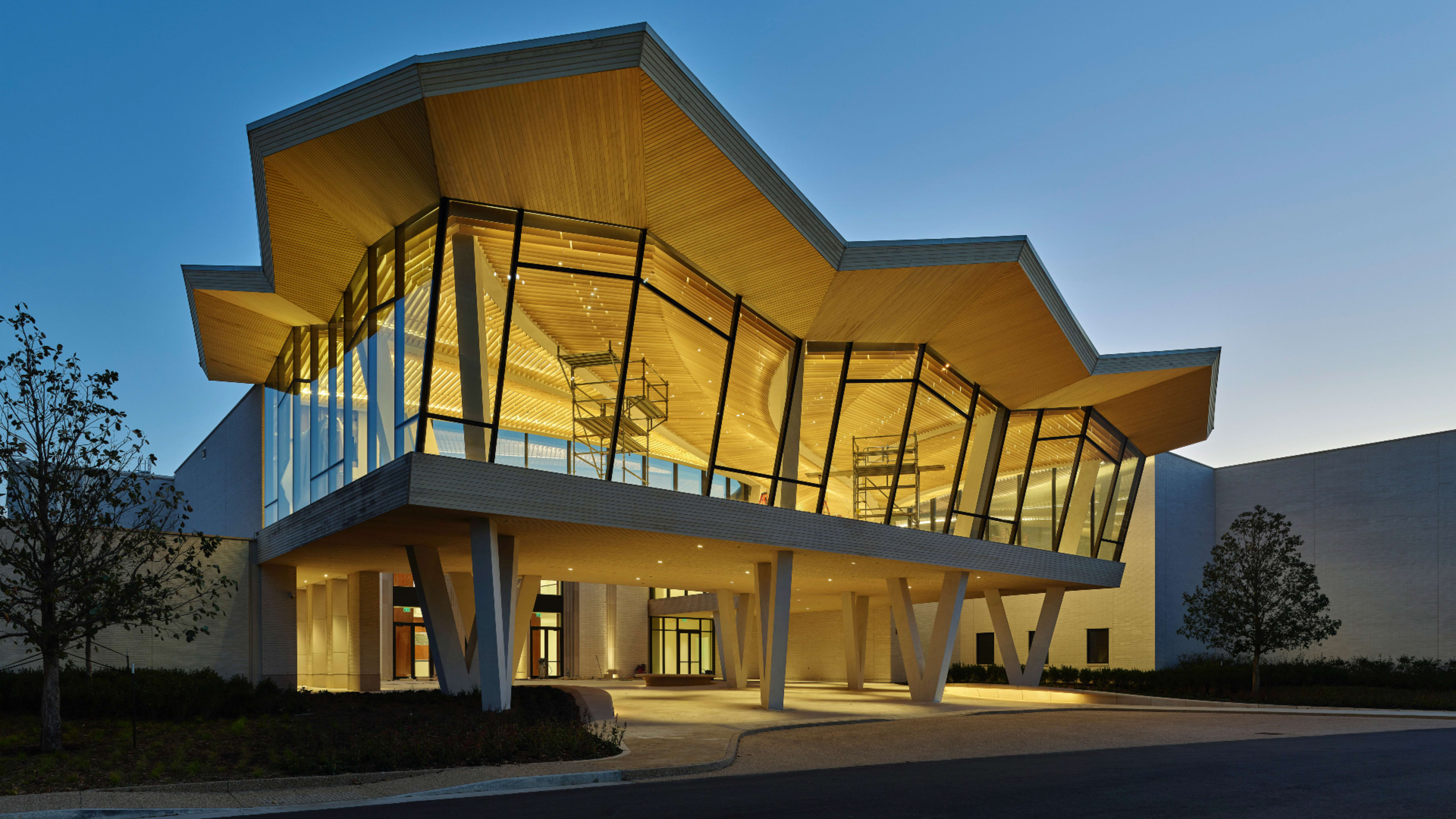
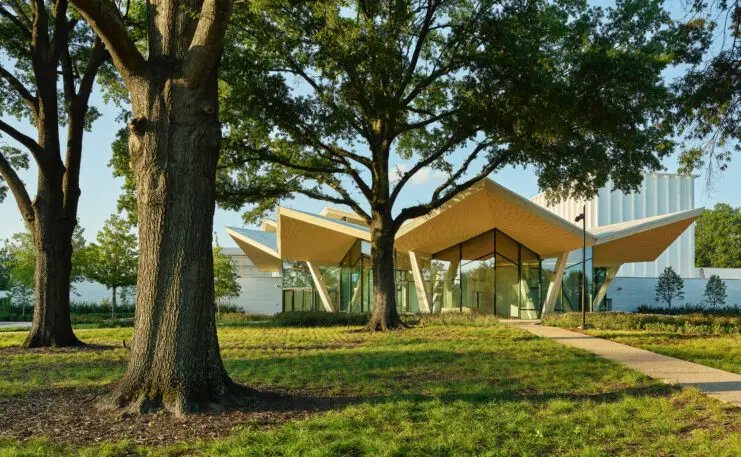
The new folded concrete roof that swoops across the center of the sprawling Arkansas Museum of Fine Arts (AMFA) in Little Rock is the rare expressive design feature that’s also essential to making the building work better.
The museum, a free cultural touchstone in the state for nearly a century, has been renovated and redesigned by the Chicago-based architecture firm Studio Gang. Inside, beneath that swooping roof, a visitor can see from end to end, as well as to all the entrances of the museum’s galleries, art school, renowned children’s theater, and new café and gathering space. From the street or the adjacent park on the museum’s back side, the roof frames huge jagged openings, like origami crowns.
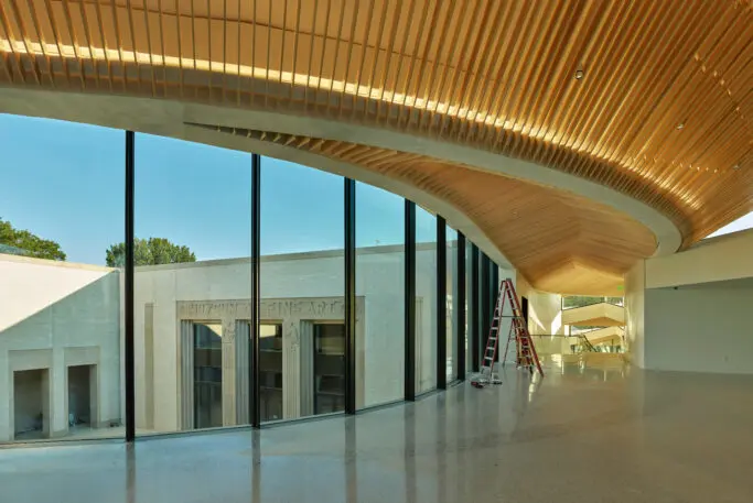
Beneath the roof, the museum has been given a new spine.
That might sound like a typical hallway, but in this case it was an act of architectural surgery. The museum, which originally opened in 1937, has undergone a long, multiarmed evolution over the past eight decades. “The museum was a combination of eight different renovations and additions,” says Victoria Ramirez, AMFA’s executive director. “The mechanical systems weren’t necessarily speaking to each other. We had issues with art storage and a growing collection, and we had a growing audience and ambitions to do greater things. It was really the building that was preventing that.”
About 10 years ago, the museum’s leadership decided it was time for an all-encompassing solution. A city bond issue had made funding available, and a capital campaign exceeded expectations—so, the museum, which is free to the public, was flush. They hired Studio Gang, which is known for its undulating skyscrapers and clever adaptive reuse projects.
AMFA wanted a little bit of both: a stylistically impressive building that made use of what was already there. The museum was hoping to unify its dysfunctional Frankenbuilding and improve its connections with the city and adjacent park, while also increasing its appeal to new audiences and making it stand out as a piece of significant architecture.
Creating the central-spine connection was the biggest and first step, and one that would help address all the other pieces of the design brief. Studio Gang spent six months working with structural engineers to research the existing buildings, and then created a thorough map of what structural elements should remain, what parts of the building have historic significance, and what parts could be used to support new uses of the space.
Some elements, like the original 1937 facade, were preserved, while other parts of the building were cut away to create a kind of wavy thoroughfare through the museum, topped by the folded roof, which the designers call the blossom. “That was the great thing about choosing a shape that’s somewhat organic,” says Juliane Wolf, design principal and partner at Studio Gang. “That blossom could really take on the shape that it needed around the elements that we couldn’t touch.”
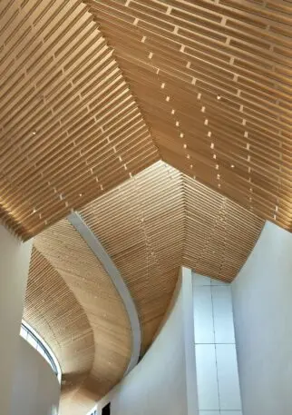
The design also allows natural light to come into the museum from both ends, and even into some of the galleries. “Museums are often quite opaque because they need to protect the art from light. But what that meant is the whole building started to be opaque,” Wolf says. The new design obliquely welcomes in light; it bounces into galleries beneath the folded roof’s long overhangs and shines through the whole spine.
On the street-facing side of the museum, Studio Gang designed a 32-foot-long window at the zigzag end of the roof, creating a jewel box-like gathering space they call the cultural living room. Walls were placed within to strategically block light, allowing some art to safely be on display. The glowing light, a story above the museum’s main entrance, could serve as a billboard for the museum. “We can use it to essentially promote the art that’s inside,” Ramirez says.
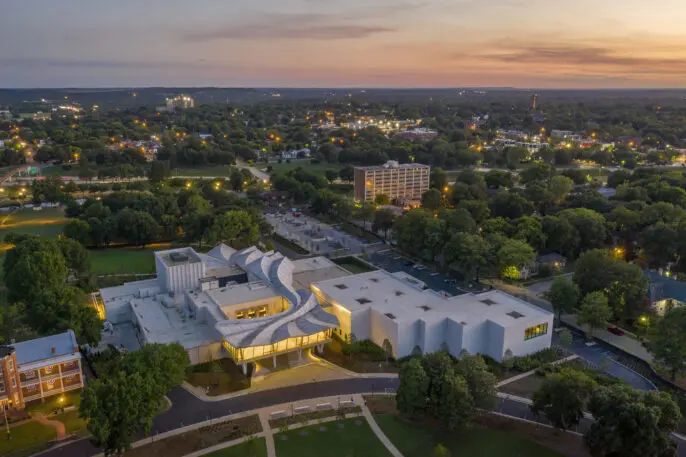
At the other end of the museum, which opens onto the historic MacArthur Park, the roof overhang doubles as a shade structure for a restaurant patio. Studio Gang worked closely with landscape architecture firm Scape to blend the edge of the museum into the park. “It’s somehow hard to imagine the building without the landscape and the landscape without the building, they’re so integrated,” says Wolf.
Much of the museum’s former asphalt parking lot was also removed and replaced with hundreds of trees and a sculpture garden that connects to the reduced parking. Ramirez says these efforts to connect the building to its surroundings is a way to expand how the museum presents art to its visitors. “Their experience coming to the museum really starts when they enter the parking lot. It doesn’t start when they walk through the door or enter the galleries,” she says. “We can make for a much more holistic guest experience if we embrace the environment that we’re in rather than ignore it.”
Ramirez says the museum’s new design has already unshackled its curators from their previous limitations. They’re exploring new ways of showing art to new audiences within the building, even taking advantage of mounting hooks embedded in the underside of the new central roof and also displaying pieces in the large window space facing the street.
“We wanted a building and an aesthetic that’s accessible for people who may not be comfortable in a museum or who may not think an art museum is a space for them,” Ramirez says. “I think it’s going to create a visitor experience that really will be one other museums will want to emulate.”
Recognize your brand’s excellence by applying to this year’s Brands That Matter Awards before the early-rate deadline, May 3.
