Fast company logo
|
advertisement

Launched in 2021, the brand refresh took subtle inspiration from 1970s cooking and the natural imperfection of life.

Sweetgreen’s delicious brand was inspired by old cookbooks

BY Mark Wilson1 minute read

Burgers. Fries. Milkshakes. Cartoon mascots and toy giveaways. It’s easy to understand why fast-food packaging is so irresistible. But when Sweetgreen launched its new brand in 2021, developed in conjunction with Collins, the salad chain proved that healthy branding can be every bit as enticing as the flame-broiled stuff. Which is why Sweetgreen is the winner of our 2022 Innovation by Design Award for Branding.

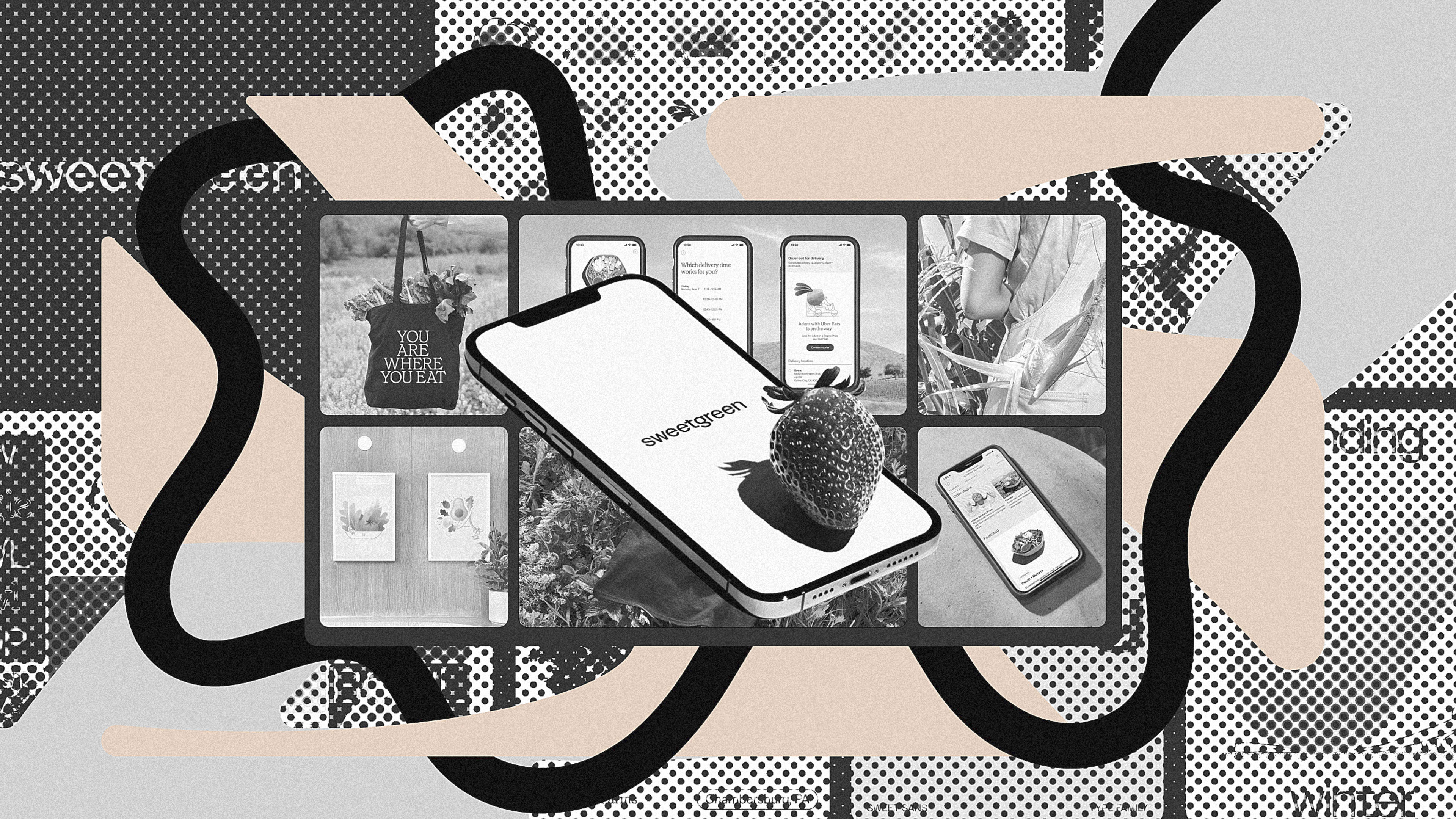
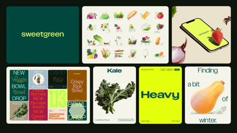
Sweetgreen’s brand refresh includes a new logo, typography, and color treatments, and even promotional photography that stuck a piece of lettuce right between the teeth of brand ambassador Naomi Osaka. As with any good brand, the execution isn’t about any single component, but the sum of its parts—a point on which Sweetgreen excels.

[Image: courtesy Sweetgreen]
“We always saw that the food companies with the best marketing were also the most unhealthy,” says Nathaniel Ru, cofounder of Sweetgreen. “We don’t think we can just tell people to eat their vegetables; you have to find creative ways to [convince them].”

[Image: courtesy Sweetgreen]
The rebrand began in 2020 at the front end of the pandemic, when Ru’s team reached out to Collins to help the teenage salad chain turn over a new leaf. Many healthy eating chains end up going too cool—full of white paint and sterile minimalist type that gets no one’s appetite going—but the Collins team found inspiration in the warm, tangible, and nostalgic. In other words, they found inspiration in the hottest graphic design trend of the moment: the 1970s (which happens to bethe same era Burger King minedfor its recent makeover, too).

[Image: courtesy Sweetgreen]
Specifically, Collins studied cookbooks from the era (a natural fit, given that Sweetgreen already shares many of its recipes on social media), lifting elements of the typography. “They had a perfect quirkiness,” says Ru of the vintage typefaces. “Even though they were type, it felt hand drawn.” That imperfection also plays through the art direction and salad bowl photography.

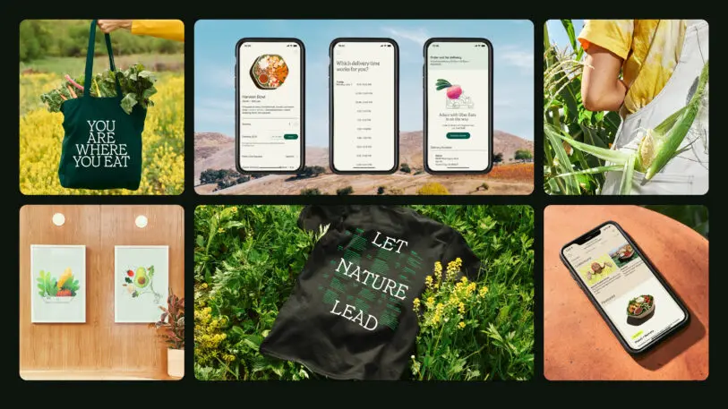
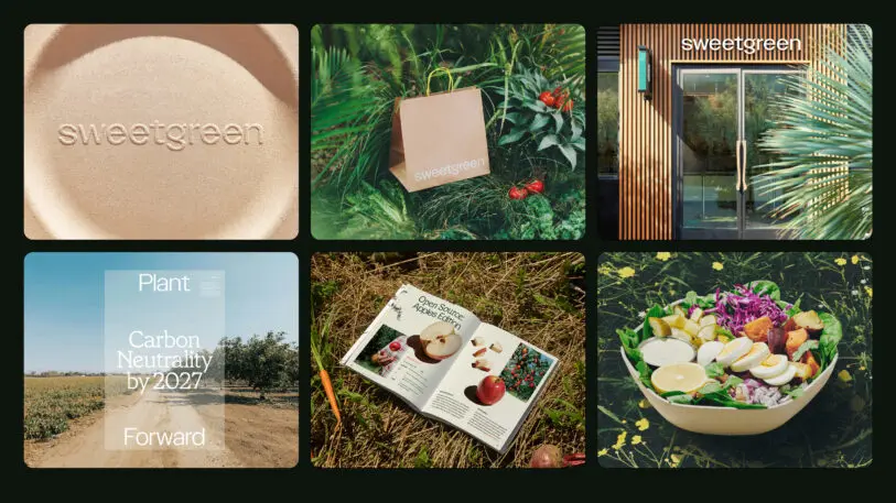
“We took a lot of that imagery around more faded, organic-looking photos to make it look like you’re in someone’s kitchen,” says Ru. Even though you may be browsing through salads on a cold cellphone screen, the food still looks warm and cozy—good enough to eat.

This story is part of Fast Company’s 2022 Innovation by Design Awards. Explore the full list of companies creating products, reimagining spaces, and working to design a better world.

Recognize your brand’s excellence by applying to this year’s Brands That Matter Awards before the early-rate deadline, May 3.


ABOUT THE AUTHOR

Mark Wilson is the Global Design Editor at Fast Company. He has written about design, technology, and culture for almost 15 years More


Explore Topics