Almost eight weeks after the World Health Organization declared the coronavirus a pandemic, a number of U.S. states have begun the task of gradually reopening their economies. This journey will be a precarious one, as daily case counts are still spiking in many areas, even as they show signs of decline in states like New York and New Jersey that have been among the hardest hit.
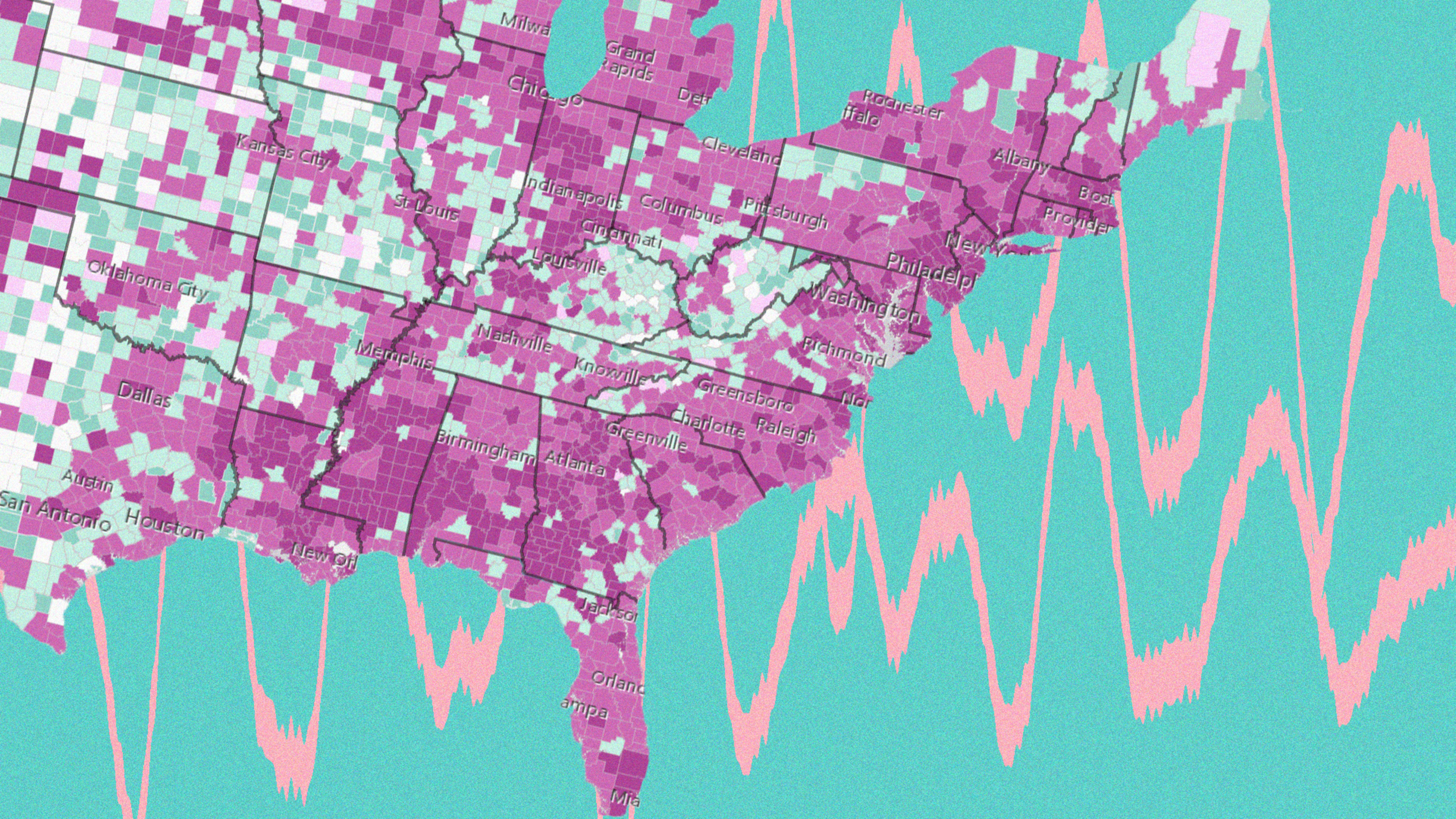
Now a new series of interactive maps has added several layers of context to the much-cited coronavirus statistics provided by Johns Hopkins University. The series, by spatial analytics firm Esri, analyzes recent COVID-19 cases at the county level to help determine whether counties could be on the verge of an outbreak or not. The data is then broken down and classified into one of five stages:
- Emergent: Early stages of outbreak
- Spreading: Early stages and depending on an administrative area’s capacity, this may represent a manageable rate of spread
- Epidemic: Uncontrolled spread
- Controlled: Very low levels of new cases
- End Stage: No new cases
The analysis is based on “epidemiological and pandemic scientific literature,” Esri says, and the methodology is posted on the description page.
The full series contains eight interactive maps that highlight different trends at the county level, and they’re searchable so you can zoom into a specific county for more detailed information. This is what the maps will tell you:
- County trends: Trends represent the day-to-day rate of new cases with a focus on the most recent 10 to 21 days.
- Days since last new case: A color-coded map that shows how many days it’s been since a county’s last confirmed case.
- Recent outbreaks: The larger diamonds show the recent outbreaks and the color indicates the county population.
- Active cases per 100,000 people: Active cases provide an estimate of the number of people who can spread COVID-19.
- Mortality rate by trend: A map that shows where high or low levels of mortality are occurring.
- Deaths per 100,000 people: A map that shows which counties have been most affected by mortality due to COVID-19.
- Deaths as a percentage of total cases: This number could be different than the number of deaths per 100,000 people for a variety of reasons, including local factors not yet accounted for.
- State summaries: The darker the dot, the longer cases have been occurring. Larger dots mean more cases. Smaller dark dots may indicate a state has successfully slowed the spread of COVID-19.
All the trends in the map series will be updated daily. Although they use statistics from Johns Hopkins, they may lag a day behind since the data has to be analyzed. You can check out the full series here or via the embed below.
Recognize your brand’s excellence by applying to this year’s Brands That Matter Awards before the early-rate deadline, May 3.