Even as America continues to see the death toll of COVID-19 rise, the unfortunate reality is that this pandemic will follow us for many months even after cases decline. Experts suggest we’ll weather 18 months of outbreaks across the globe before we have a vaccine, which means we might not shelter in place just once to get the virus under control. Rather, our behavior will need to be rapidly tweaked, city-by-city, as new cases crop up, to thwart new exponential spread.
Which is why Andy Slavitt, the former Acting Administrator of the Centers for Medicare and Medicaid Services appointed by President Obama, has a suggestion: “We’re going to need to find a way to communicate [threats and appropriate behaviors] as they come and go, and we need a national standard,” says Slavitt, who’s also the founder of healthcare nonprofit United States of Care. His solution, which he says he’s proposed to the White House, is to build a nationwide, color-coded alert system much like the Department of Homeland Security implemented to warn of terrorist attacks following 9/11—or much like New Zealand has implemented to warn about COVID-19 right now.
The other thing we must do is develop a color coded system like we did after 9-11 to indicate safety levels and restrictions while we get to a vaccine.
New Zealand has. 16/ pic.twitter.com/budwUdOJLL
— Andy Slavitt 🇮🇱 🇺🇦 (@ASlavitt) March 26, 2020
New Zealand’s alert system is a four-stage, color-coded gradient. Each color comes with its own specific instructions. It transitions from a low alert, where people can freely roam but avoid mass gatherings of 500 or more (yellow), through two shades of orange, which suggest at-risk people stay home and prohibits mass gatherings, to red, which is basically the status in which most of us are living now: businesses are closed, travel is restricted, and citizens are instructed to stay home.
“You’re just going to need to communicate [with that style of shorthand]. I think it’s a sensible way,” says Slavitt, while clarifying that a national COVID-19 color system should actually allow every city and region to declare its own state of emergency on a day-to-day basis. Local health commissioners would monitor any new COVID-19 cases and adjust the local color warnings in response. (Yes, that’s a lot of responsibility placed on local governments, and it’s hard to imagine it being implemented to equal success in every locale across the country. But to Slavitt, it’s our best option for tracking so many regionally specific outbreaks.)
Why Colors?
But why use a system of colors? Why is that approach more helpful than unfettered text? Used properly, research has shown that cues like colors, numbers, and icons can lower the cognitive load, or mental effort, of understanding information, and these cues can make it easier to remember said information, too.
As such, Deborah Adler, a design specialist in medical projects, best known for designing a lauded medication bottle for Target in the mid-aughts, agrees that New Zealand’s color-coded approach makes a lot of sense.
“I think there’s something there with these four [colored] alerts,” says Adler. “They’re well-thought out, and to me, they make sense. I just don’t think they’re well designed.”
Specifically, Adler thinks that if the U.S. did adopt a four-color system, it should not be a color gradient, or at least not one with colors that are so similar to one another. “I think if they’re going to do colors, they should make them more different, so people can recall them,” says Adler. “If it was yellow, orange, and red, that could maybe work. But the two oranges in the middle aren’t working. Visually, I like that it’s going from mild and severe, and the color is symbolizing that, but when you’re trying to think of [one color’s individual meaning] it doesn’t work that well. Unless you’re looking at all four.”
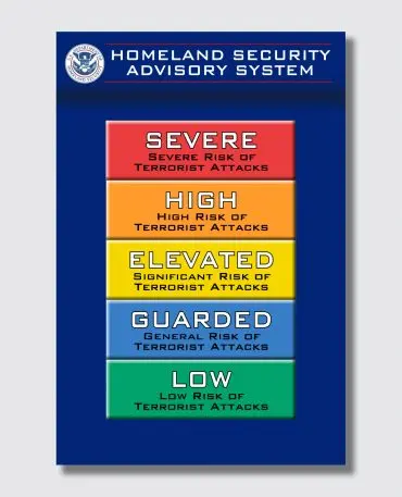
Another positive about the Homeland Security Advisory System is its brevity, which doesn’t saddle a reader with too much information. Adler also points out that, in at least the New Zealand chart above, there’s too much text, period. The government has published a confusing mishmash of guidelines, presented without any uniformity of organization or even grammar. She suggests that a more grounded approach would be to use icons in addition to colors. “With each alert, if you had an icon for travel, and an icon of gatherings, and an icon of handwashing, you’d know what to look for, and you quickly understand it,” says Adler. “I [also] think it would help with people retaining information.” These icons should be arranged in the same, predictable spot under each color. And they’d come with an added bonus: You could read them with no understanding of English required.
In any case, Slavitt isn’t wedded to New Zealand’s specific design. He acknowledges its shortcomings, and even suggests he’s fine if we build a system without colors.
“You could use numbers. Or hot, warm, cold,” he concedes. But Slavitt does believe there’s a particular social and political accountability to such a clear labeling system, which we will need to stomp out COVID-19 in the long term.
“I think we’re somewhat accustomed to colors from Homeland Security. Nobody loves them. And hopefully, if it’s scary, the country works harder to make fewer red days,” he says. “If I’m a governor or mayor, and my state has had 180 red days and the state next door has had six red days, then maybe I have to answer as to why it’s happening.”
Recognize your brand’s excellence by applying to this year’s Brands That Matter Awards before the early-rate deadline, May 3.