Last fall, a fire swept across Sonoma County, California, burning more than 77,000 acres and scattering particulate matter throughout the Bay Area, where I live. I had just had a baby, and as the sky over my house turned a strange popsicle orange, I took to obsessively refreshing air-quality maps on my phone. Was it safe to take my newborn outside? Should my family leave town, as we had done the previous fall—smoke refugees from the deadliest fire season on California record?
The maps were not helpful. My neighborhood appeared yellow on one map to indicate “moderate” air quality, and red (“unhealthy”) on another. At one point, the latter map turned violet (“very unhealthy”), even though the first map was still yellow. I couldn’t get a clear answer. So for days, I hunkered down indoors and parked my baby by the air purifier. Better safe than sorry.
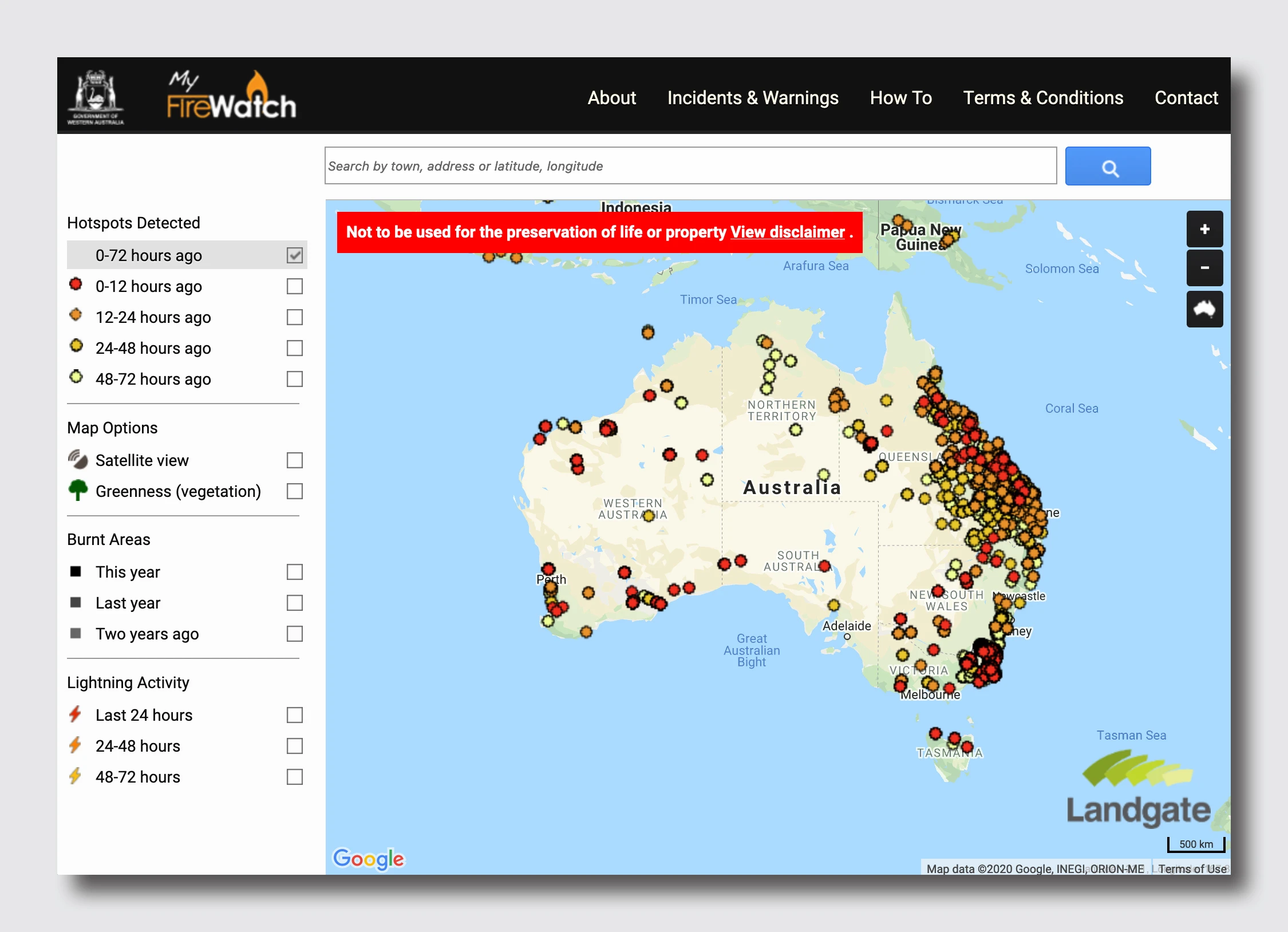
My experience isn’t unique. The question of how to best visualize extreme weather and the disasters it precipitates is confounding even the industry’s top experts. In Australia, wildfires have burned more than 26 million acres and killed 33 people and 1 billion animals (that’s billion, not million). There are plenty of resources for tracking fires in Australia. But they struggle to capture both the scale and the nuances of the problem. As climate change leads to increasingly catastrophic floods, fires, and other crises, effective data visualization is becoming an urgent public health matter. Lives literally depend on it.
Misleading maps are only the beginning
If you spent time on the internet last month, you likely saw this image, which appeared to show the entire continent of Australia lit up in a fiery hellscape:
It was a 3D visualization of hotspots, not a map of real-time fires, but it had a convenient shock factor. Buoyed by an incorrect photo caption, it sailed around the internet, accuracy be damned.
Misleading maps only hint at the ways data visualization fails users facing the consequences of climate change. The more pervasive issue, as I discovered last year and as many residents of Australia found out more recently, is that much of the mapping just isn’t that useful.
“Better than nothing” isn’t good enough
I sent several data visualization experts an array of fire-tracking tools that document everything from air quality to hotspots. They were largely unimpressed. “It’s hard to imagine using any of these tools as a resident or occupant of one of these areas,” says Lisa Strausfeld, founder of the New York data visualization studio Informationart. “They’re better than nothing, for sure, but there’s got to be a better form of information.”

One major problem: The maps often visualize fires on a commonly available library, like Google Maps or OpenStreetMap. Then they “jam the graphic full of dots or tiny icons that never scale well and aren’t representative of the issues at hand like ‘air quality’ or ‘what’s the risk?’ or even ‘where is the fire?'” as Ben Fry, principal of the Boston-based data visualization firm Fathom, points out. “Generic tools give you generic answers, but this is very different data, with very human impact, and shouldn’t be shown as an ugly early-2000s-style ‘visitors to this site came from these places around the world’ mashup (remember those?).”
Fuzzy information design is not limited to mapping fires or to climate-fueled disasters more broadly. “Many of the problems seem to be more about the usual issues around communicating data: not enough empathy for your audience, not making something that’s specific enough to communicate clearly, and so on,” Fry says. “Start with the audience you’re trying to reach, think about the context in which it will be used, and work from there.” Climate change is simply giving old problems new urgency.
To standardize or not to standardize?
But the urgency is real, and solutions remain elusive. I suggest to Fry that perhaps we need a new mapping convention that visualizes the effects of climate change, including extreme weather and disasters—something that reads well on the screens we surround ourselves with all day, whether a smartphone or a flatscreen TV. After all, what is a good map but data organized around a shared visual system?
Fry isn’t convinced. “Standardization is a two-edged sword,” he says. “On one hand, it’s useful to have everyone speaking the same language. On the other, it’s often the case that the visual language chosen isn’t very good, and may have more to do with whoever was first.” He cites work he did previously in genetics: “People would want certain kinds of data represented in a specific way . . . because that was the way that kind of data was represented in the first Nature paper about it.” It didn’t matter how irrelevant or distracting, legacy visuals found a way of becoming the gold standard.

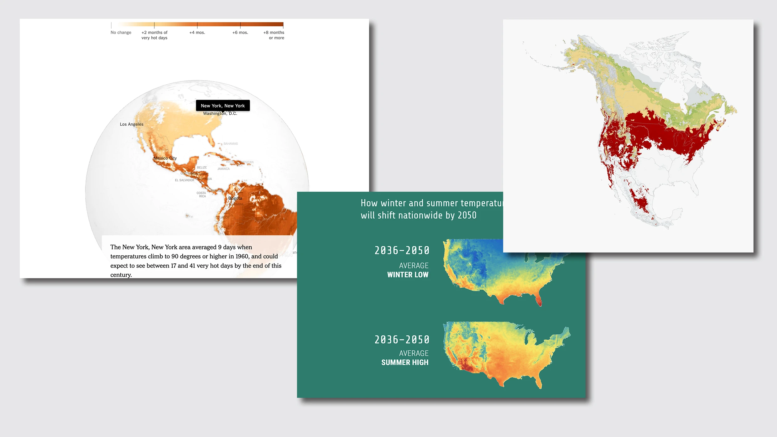
But there are signs that some standardization may be forthcoming. The Bureau of Meteorology in Australia recently adopted a new color, violet, to convey extreme heat in weather maps. Media outlets like the New York Times, Vox, and Audubon have taken a stab at visualizing different aspects of climate change, from how it’ll devastate North American birds to how much warmer cities will be in 2050. And though the aesthetics and design decisions vary from one publication to the next, there are some commonalities: Each uses widely agreed upon color codes (such as red for hot and blue for cold) and simple graphics to convey something deeply visceral to people’s daily lives. In this case, an alarming orange line shows readers how much hotter their hometown has gotten since they were born.
That we don’t have a coherent visual system for visualizing the effects of climate change shouldn’t come as much of a surprise. Widespread awareness of climate change is fairly new (and, mind-bogglingly, still denied by some). Also relatively new is the internet, the platform on which many of us consume information. It wasn’t until the mid-1970s that the BBC, one of the world’s most trusted news sources, started using the weather icons familiar to us today, inspired by Otl Aicher’s 1972 Olympic pictograms. This was decades after television became a fixture in the modern home.
Data fragmentation is real
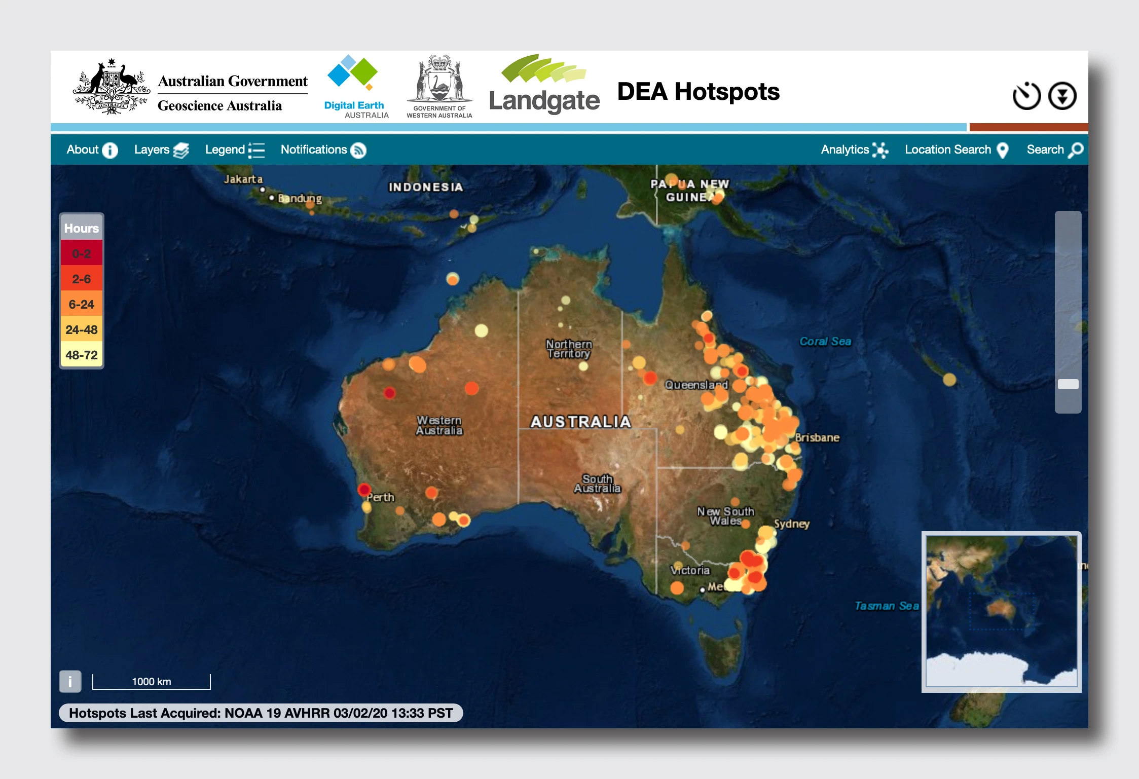
A bigger challenge may lie in the data itself. In Australia, fire agencies are separated by region, and each agency updates its own map of a fire’s perimeter, the outer edge of a fire. But the perimeter doesn’t tell you which parts of the area within are actually on fire. For that, you have to consult a different resource, a map from Geoscience Australia, a federal agency, that shows satellite data of large thermal emissions, a good indication of active fires. Of course, if you live in a region beset by fires, you want both pieces of information at once. “Data fragmentation is a real problem and requires the user to flick through many resources while being in clearly stressful situations,” says Alessio Arena, experimental scientist at CSIRO in Australia.

But there’s little incentive for agencies to pool resources in Australia and beyond. Eric Rodenbeck, CEO and creative director of the San Francisco data visualization firm Stamen, sees a parallel in crime mapping. His firm took outdated, inaccessible crime statistics in San Francisco and Oakland (in some cases, “they were literally using stickers on paper maps to track locations of the crimes,” he says) and developed a shared system that made detailed, accurate data available to the public. But it wasn’t sustainable; Stamen funded the project on its own and eventually had to shut it down. “This kind of thing is cheaper than you might think, but it typically can’t happen within people’s day-to-day work flows,” Rodenbeck says. “Someone has to come in and be responsible for it.”
What’s next
In the future, machine learning may help overcome some of the major challenges of mapping data. “We’re talking with a group that’s using machine vision/machine learning to build models in California that will radically simplify the process of making statewide fire safety maps available quickly and at scale,” Rodenbeck says. “The idea is you ground truth conditions in a very few forest areas, and then you compare data from those few areas to their locations on up-to-date satellite imagery. . . . The MV/ML then quickly builds a model of conditions over the whole state, and this information is useful to fire managers, utility people, the public. It’s not 100% perfect but it’s often enough to point people in the right direction. And it keeps getting better as the models run.”
But embryonic technical solutions may be little consolation to people who currently live in areas impacted by fires, extreme heat, and other climate-related disasters.
Rodenbeck and others suggest that an important first step is to adjust our expectations of what mapping and data visualization can accomplish. In a recent essay, Elijah Meeks, a data visualization expert at Apple and executive director of the Data Visualization Society, argues that even seemingly innocuous maps have an agenda. He highlights the example of Donald Trump trying to cover up a lie by allegedly doctoring a map of Hurricane Dorian with a Sharpie. “Trump knew if he could just change the visualization, that was all that mattered,” Meeks writes. “The naive perspective that data visualization is just a final step to help people see the data ignores the importance of subtle steps like showing uncertainty as well as the necessity to design a product that engages the audience (something Trump does far better than many data visualization practitioners).”
When I think back on the California fires of last fall, I can’t help but feel dismayed. As a mom, I just wanted a simple answer to the question of whether my baby was safe. Unfortunately, that was too much to ask of existing tools. And the sooner we embrace the notion that there’s no such thing as an objective map, the more prepared we’ll be for the only thing that’s certain in the climate change era: uncertainty itself.
Recognize your brand’s excellence by applying to this year’s Brands That Matter Awards before the early-rate deadline, May 3.