


What would happen to our planet if all the ice in the world melted?
It’s a terrifying thought that’s on its way to becoming reality, with the Antarctic and Greenland ice sheets melting ever more each year. A recent study found that from 1979 to 2017, the rate of melting increased by six times.
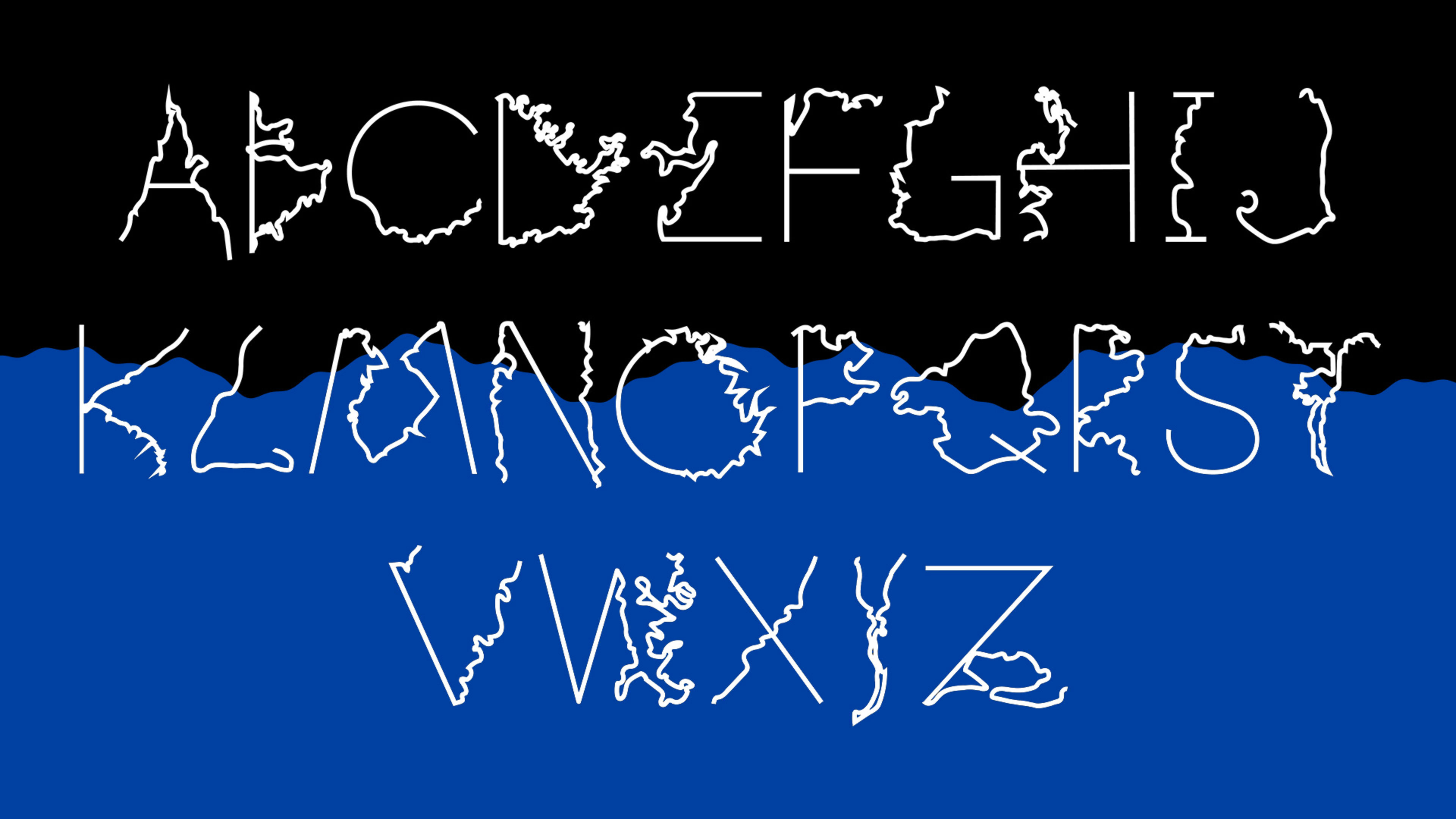
Catastrophic sea level rise is inevitable by the end of this century, and the impact of the rising oceans on coastlines is neatly encapsulated in a striking new typeface by the Sweden-based designer Johan Elmehag.
“I started to see different letterforms in particularly exposed coastal areas,” Elmehag says. As the As and Js and Ts began to pop out at him, Elmehag began to hunt for every letter on the map, eventually creating an entire typeface, called Coastline, out of the futuristic geography.
[Image: courtesy Johan Elmehag]It’s an entirely unorthodox way of capturing climate data. The letters don’t entirely stand alone, which makes a QR code that is placed next to the letters when using the typeface particularly helpful. Without their context, each letter looks partially shriveled and misshapen, but when you learn that Q is an island archipelago that’s been formed now that parts of northwestern India are underwater, and that F represents how the low land levels in Europe, especially in the Netherlands, will be taken back by the sea, each form takes on a perilous significance. The letter A was created from a bay in northern Italy that once held the city of Venice. The letter T is formed by Egypt’s new river delta, where Alexandria is now under water. U represents the new coastline of Mexico, which is divided in two by water.
“There are uncountable stories embedded in these letterforms,” Elmehag says. “It’s important to remember that the environment doesn’t care for borders.”
Elmehag has created a website where you can read more about the different letters and download the typeface to use yourself. If people encounter the typeface, they can use their phone camera to learn more about the typeface and rising sea levels. He’s also created 50 copies of a zine called A-Z: Coast to Coast Shore to Shore that acts as an ABC book, with each page dedicated to a letter, its description, and a corresponding map.
Recognize your brand’s excellence by applying to this year’s Brands That Matter Awards before the early-rate deadline, May 3.