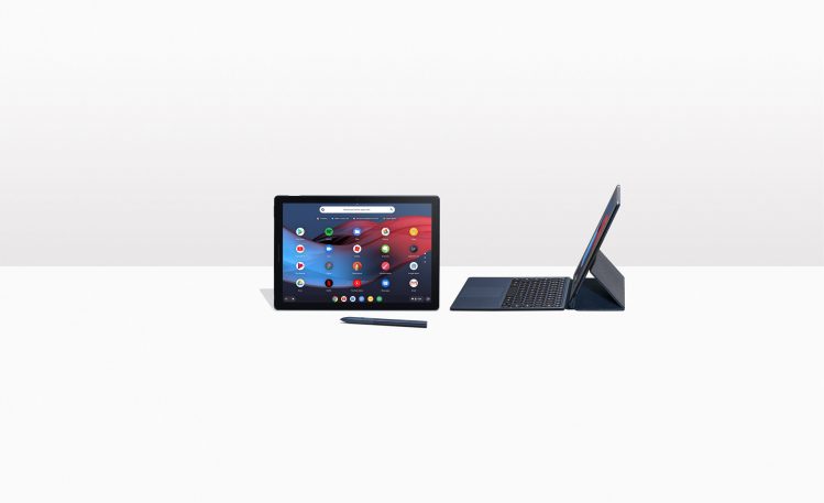
Since their 2011 launch, Chromebooks have been synonymous with low-cost, easily managed laptops that have strong appeal for education. But in 2013, when Google shipped the first Chromebook Pixel–a premium machine with a touchscreen–it became clear that the company was intent on exploring new frontiers for its browser-centric Chrome OS operating system.
Google’s new Pixel Slate tablet, which starts at $599, represents the culmination of those efforts. With its minimalist operating system and minimalist form factor, it’s the best pure web tablet ever made. But the Pixel Slate also offers the wealth of apps in the Google Play Store and accessories such as an optional keyboard and pen, putting it squarely in competition with Microsoft’s Surface and Apple’s iPad Pro. As with those devices, the message is that more is more, at least when you need it to be. However, Google still struggles to meld Chrome OS and Android in a way that feels natural rather than somewhat less than the sum of its operating-system parts.
A dark blue rounded rectangle that’s only 7mm thick, the Pixel Slate is thinner than the Surface Pro, but its 12.3″ screen size and bezels provide the devices with almost identical heights and widths. While the Surface Pro has a full-size USB-A port, a Mini DisplayPort connector, and a magnetic power connector, the Pixel Slate has consolidated all those functions into two USB-C connectors, one on each side. I was able to easily connect and use the new Vinpok Split USB-C touchscreen monitor, although it couldn’t draw enough power from the Pixel and needed to be plugged into the wall. As with iPads, there’s no support for MicroSD storage cards and–like the most recent iPad Pros–no headphone jack. (Google does include a USB-C-to headphone-jack adapter in the box.)

As the newest step in Chrome OS’ evolution to a touch-friendly design, the Pixel Slate is a hybrid of Google’s last two mobile computing devices, the Android-based Pixel C slate and the ChromeOS-based Pixelbook convertible.
In the tug-of-war for tablet strategy dominance between Apple and Microsoft that I wrote about recently, the Pixel Slate hews closer to the Surface approach, albeit with a few key differences. Like the Surface, it has access to a desktop-quality browser. In fact, using Chrome on a naked Pixel Slate is a similar experience to running any number of desktop browsers on an unadorned Surface Pro. At the Pixel Slate’s introduction, Google emphasized that it offered a full-powered browser as opposed to the watered-down version of Safari on the iPad or the Chrome version on Android; that said, you can use the Android versions of Firefox or Microsoft Edge on the Pixel Slate if you prefer.
Also like the Surface, the Pixel Slate can switch between a windowed desktop mode and a full-screen/split-screen-like iPad mode when its keyboard is removed or folded flat behind the display. However, while the Surface allows you to choose whether this happens automatically, manually or not at all, it is always automatic on the Pixel Slate.