Since the 1940s, the Ad Council has worked with the U.S. government and ad agencies to create PSAs that people actually pay attention to–it’s responsible for the fire prevention campaign Smokey the Bear, the slogan “friends don’t let friends drive drunk,” and initiatives urging people to “just say no” to drugs.
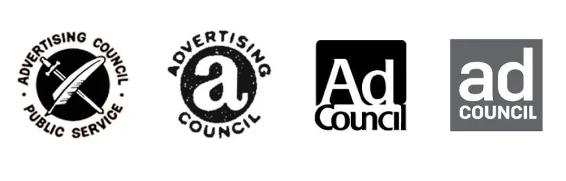
But the Ad Council isn’t limiting itself to PSAs anymore. Today, it’s revealing a new logo by Superunion to accompany the most significant change of direction in its 75-year history. In 2015, the Ad Council started working with for-profit companies as well as the government, creating coalitions of giant corporations–like Google, Microsoft, GE, and Twitter–putting money toward issues like LGBT rights, gun control, and women in STEM. In a time when corporations are wearing their social values on their sleeves and a whole field of impact marketing has sprung up to serve them, the Ad Council is hoping its new branding both conveys its history as an organization and helps it stand out from the competition.
“I think that brands today are leaning into purpose and becoming more purpose driven,” says Lisa Sherman, the Ad Council’s CEO. “I think frankly they see a role they can play in society today that compliments and supplements what governments can do, what nonprofits can do, and, with the vast resources they have at their disposal, they can really add to trying to eradicate some of our nation’s and our world’s biggest issues.”
The logo’s new design is attuned to the Ad Council’s new relationships with these companies, even if the nonprofit only has a small percentage of corporate projects at any given time.
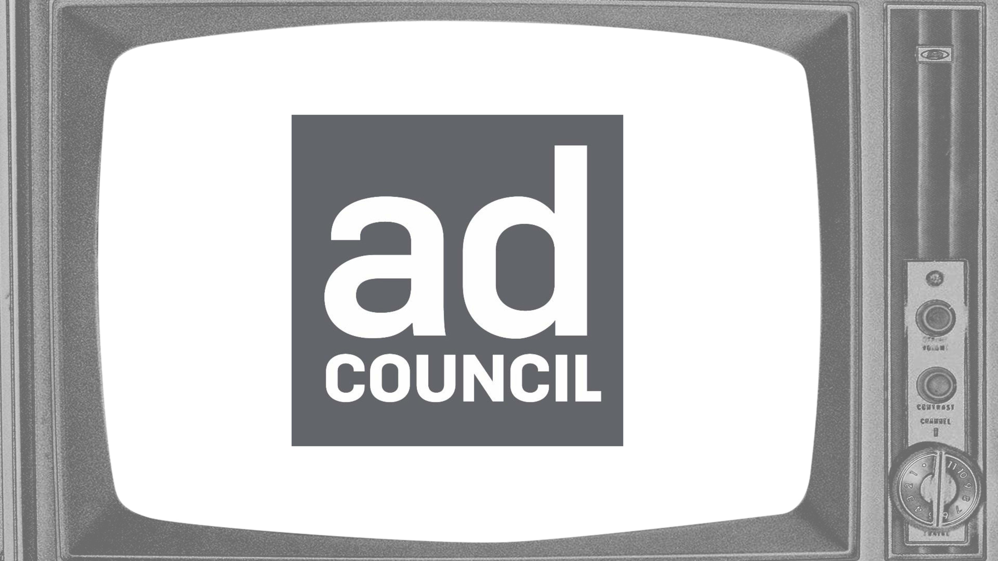
The new logo predominantly features the organization’s name inside a square, a slight variation from the previous logo. The typography is sharper and feels more modern, with the word “Ad” in lowercase and the word “Council” all in uppercase. According to Sabah Ashraf, Superunion’s North America CEO, this combination is supposed to make the nonprofit’s name more accessible while maintaining its history and gravitas; it also makes it feel far more corporate. Plus, the logo’s square backdrop is now a nondescript gray rather than its former, stalwart blue, a move toward neutrality that lets it fade into the background of an advertisement.
“As we’re opening up our model with a new way of partnering with brands to do more campaigns or creators to reach audiences in a different way, we want the logo to reflect that openness and approachability,” Sherman says.
What does it mean for a nonprofit with the Ad Council’s history of working with the government and other nonprofits to start helping corporations? Sherman says she is careful to only work with companies on issues that are “a part of their DNA,” to ensure that their interest is “authentic and real.” Of course, it’s hard to know whether a company is “walking the talk,” as Sherman puts it, but the Ad Council does try to vet its partners. For instance, Sherman says that the nonprofit ensured that all the partners for its 2015 Love Has No Labels campaign had a perfect record on LGBT issues, per the Human Rights Campaign’s Corporate Equality Index. And yet, the organization partnered with tech companies like Google and Microsoft on its She Can STEM initiative focused on encouraging girls to go into STEM, improving diversity in those fields. These companies aren’t particularly known for their records on hiring female technologists or having gender equity in their organizations in general, but they’ll get good PR for participating in the Ad Council’s coalition.
In an era when companies are trying to take stands on social issues–even if their true allegiance is to the bottom line–it’s a sign of the times that the Ad Council is trying to cash in.
Recognize your brand’s excellence by applying to this year’s Brands That Matter Awards before the final deadline, June 7.
Sign up for Brands That Matter notifications here.
