Data visualization, infographics, data posters–whatever you want to call them, the genre is having its “Instagram moment.” Like typography and photo editing before it, the craft of expressing ideas with graphically plotted numbers is now so ubiquitous that you hardly need to take a course with Edward Tufte before trying your hand at it. Of course, with democratization comes … a ton of crap, to put it bluntly. The old saw about statistics might well be updated thusly: “lies, damned lies, and infographics.”
Which is why I’m delighted that Beam exists. It’s an online tool that makes chart-making as simple as scribbling on a Post-it, and just as throwaway. How simple? This simple:

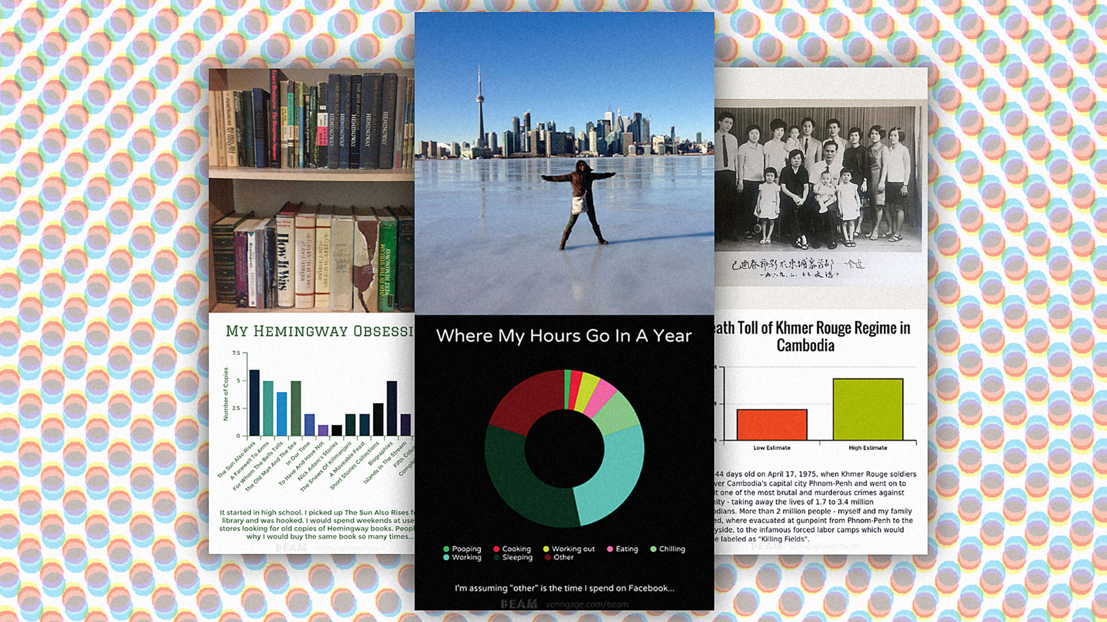
I whipped that up in about 90 seconds. Which means that if it catches on, Beam is probably going to unleash such a torrent of data-visual sewage onto our screens that Alberto Cairo will have to go on beta blockers. But here’s the thing: that’s probably the best way for people to improve their infographical literacy. “I understand the negativity [about DIY infographics],” says Eugene Woo, whose company Venngage created Beam. “A lot of them were outright horrible. But calling for the end of the entire content form was, in my mind, elitist and ridiculous. That’s like asking people not to post photos because the majority of people aren’t professional photographers.”
Like Instagram, Beam has some basic best-practices designed into it. No fancy radar or stacked area charts allowed–you can make a pie chart, a bar chart, or a line graph, and that’s it. “As someone who has been in the data viz field for a while, I see a lot people who are tempted to create large, complex, “beautiful” visualizations like a sunburst diagram or a chord chart and the like,” says Woo. “I try to stick to charts that a 6th grader would understand–similar to how some editors tell their writers to write for a 5th-7th grade literacy level.”

But Beam isn’t dumbed down. In order to edit a graph’s content (as opposed to merely its colors or shape), you pull out a drawer containing a miniature spreadsheet. To their credit, Woo and his designer Steve Shearer didn’t try to hide this basic interface under any toylike veneer (though not for lack of trying). “When you explore other options, it is clear that no matter what, the spreadsheet does the best job,” Shearer says. Charles Eames famously advised designers to “innovate as a last resort,” and Woo wisely took that advice. “The table format is something not only familiar, but also how most data is already stored,” he explains.
But even the dreaded spreadsheet isn’t intimidating to use, because Beam presents it as a table pre-filled with example data. That might be Beam’s smartest overall UX move: it avoids the “blank page” problem and encourages a user to tinker with a chart that already exists. You can directly edit text on the app’s default pie chart, change its shape or color scheme instantly by clicking a button or two, and then (with your confidence boosted!) slide open the spreadsheet editor and tweak some actual data. It’s an ingenious way of “leveling up” a user’s skills, almost without even knowing it.
“The average person does not have a very high level of data literacy. That’s why it’s important to have defaults [to provide] a nudge that we think works for most cases,” Woo says. “A lot of our design decisions are influenced by the work of Tufte, Dona Wong, David McCandless, and Nathan Yau. So if you stick to the defaults and limited styles, it greatly decreases your chances of screwing up.” Gently guiding your hand without making you feel stupid–gee, who’da thought that might actually encourage people to learn a skill?
And that’s what’s most exciting about Beam–its deft fusion of approachable and functional design. Think of it as Montessori unit blocks, but for data visualization. Sure, people will make a ton of silly, useless stuff with Beam. But so what? Just knock the blocks down and try again. Pretty soon, you’ll start to figure out what stays standing up.
Recognize your brand’s excellence by applying to this year’s Brands That Matter Awards before the final deadline, June 7.
Sign up for Brands That Matter notifications here.
