
Traditionally, iOS used heavy shadows and gradient effects to give the appearance of depth. For example, buttons had a border and used gradients and shadowing to make it appear as if the button popped off the screen.
Here are several other things developers should consider changing right away to help their app fit into iOS 7.
How Your App’s Color Palette Should Change
In iOS 7, shadows are small if they are present at all, and 3-D effects have been abandoned in favor of a layered approach, which allows the user to see through some of the layers. For example, iPhone’s iOS 7 home screen will feature a “parallax” background that shifts as the phone tilts from side to side so it appears the app tiles are floating on the background.
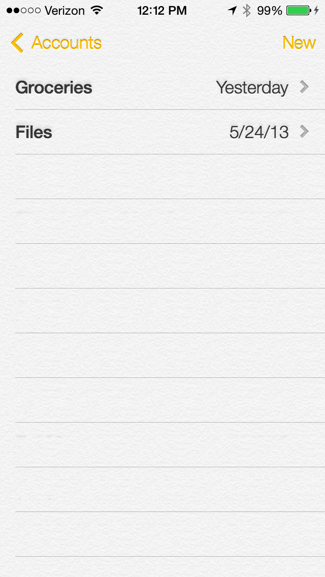
The color scheme for iOS 7 has also changed. The new color scheme is white with bright–almost fluorescent–colors. The default UI will use a white background with a bright color like yellow for anything that is actionable. For example, the Notes app in iOS 7 has a white background and the buttons are done in yellow.
Apps that mostly use system default UI elements should automatically pick up the new UI changes just by compiling the apps for iOS 7, but developers should double-check the changes to make sure the app still looks and functions correctly. For example, color defaults have changed from iOS 6 to iOS 7 so developers need to check for color clashing. (Below, the Notes app in standard white with bright colored accents.)
How Custom Nav Elements Should Change
Apps that include custom UI elements will need updates and improvements. Custom navigation bars are one example. The new UI makes the scrollable area that is usually below the navigation bar partially see-through so that when the user scrolls, he or she can see the content behind the navigation bar.
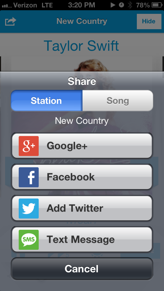
Custom action sheets, which are dialogue boxes that come up from the bottom of the screen–usually for yes or no questions–also need to be adjusted. The transition to layers and flat design in iOS 7 means custom action sheets may not appear the same as their original design. For example, the Slacker app that Metova developed with Slacker has a custom action sheet that works in iOS 6, but will have to be adjusted for iOS 7. (Below, Slacker’s custom action sheet in iOS 6.)
Pay Attention To How Your App Appears When Multitasking
For the most part, necessary changes to custom iOS 6 apps depend on if the developer wants the app to resemble the iOS 7 design. If the app was designed to mimic previous iOS design styles, updating those assets to fit with the new design would be beneficial, but switching to the updated flat design is optional.
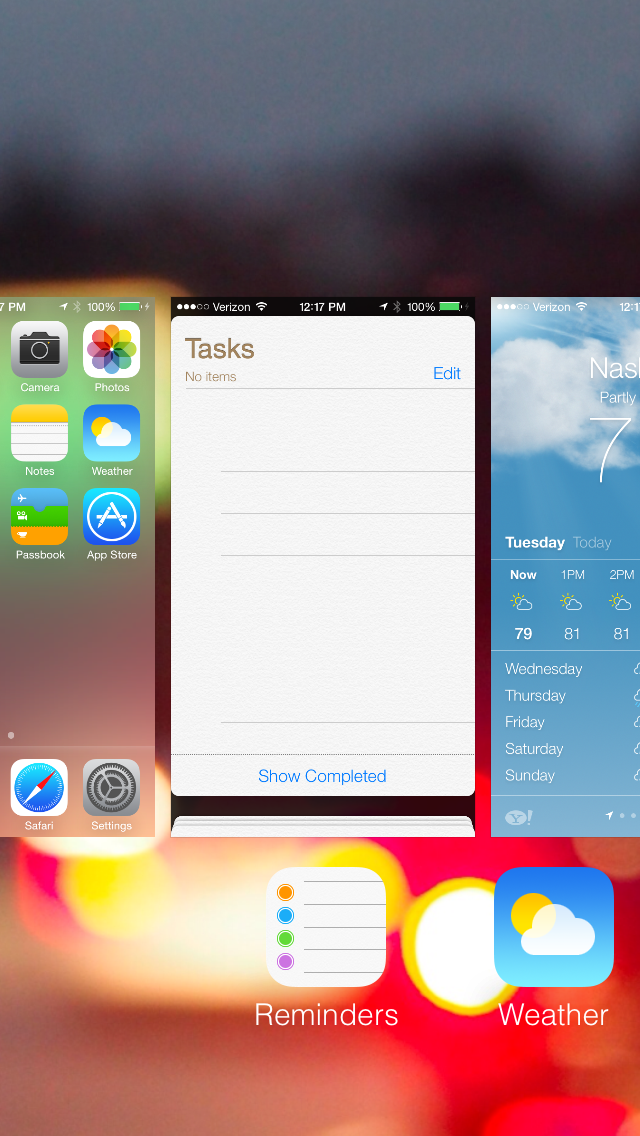
It’s important to note that the difference between apps developed for iOS 6 and iOS 7 will be obvious to users, especially with iOS 7’s new multitasking feature. Multitasking allows the user to see live preview screens of the apps that are open, which will put the differences between old apps and redesigned apps side-by-side. (Below, iOS 7’s new multitasking preview screens.)
In addition to iOS 7’s stylistic changes, the new application programming interfaces (APIs) could change the functionality of iOS 6 apps on iOS 7 and cause apps that worked normally in iOS 6 to crash in iOS 7.
Using Animations In iOS 7 Improve Can Mobile UX
When adapting to the new, more efficient functionality iOS 7 offers, developers should also look at what UI improvements they can make with iOS 7 to put their app ahead of the competition once the software goes live. The best examples are transitions and physics-based animations.
iOS 7 allows developers to control and customize transitions between views. It also has a new framework that is essentially a physics engine, allowing developers to give the appearance of objects on the screen pushing, pulling, and/or bumping into each other before settling back into place gradually. These new physics-based movements can give apps a different look without redoing the entire UI.
By getting rid of the shadows and gradients, iOS 7 gives developers the chance to show the user content without being flashy: It’s an entirely different mindset compared to previous versions.
Todd Grooms is a lead developer for Franklin, Tenn.-based Metova, a software company that develops custom mobile applications for smartphone and tablet platforms, including Android, iOS, BlackBerry and Windows Phone. You can find Metova on Facebook at Facebook.com/Metova, Twitter at Twitter.com/Metova, or on the Web at Metova.com.
[Image: Flickr user Patrick Hoesly]
Recognize your brand’s excellence by applying to this year’s Brands That Matter Awards before the early-rate deadline, May 3.
