Maqroo, an Arabic word for “readable,” is also the name of the first-of-its-kind Arabic font for readers with dyslexia.
“Arabic is a complicated writing system,” says Abdo Mohamed, founder of the type foundry Boharat and an art director at Leo Burnett Dubai, who led the project. “We’re using the same body for many letters, so it’s only the marks that differentiate.” This consistent letterform structure can lead to challenges for people with dyslexia, who can have difficulty distinguishing between characters.
Mohamed and his team developed the font for International Day of People of Determination as part of a partnership between Leo Burnett and Omantel, the majority state-owned telecommunications company in Oman. They engaged the Institute of Learning Disability, which connected the team with dyslexic volunteers who helped shape the final letterforms to better suit their needs.
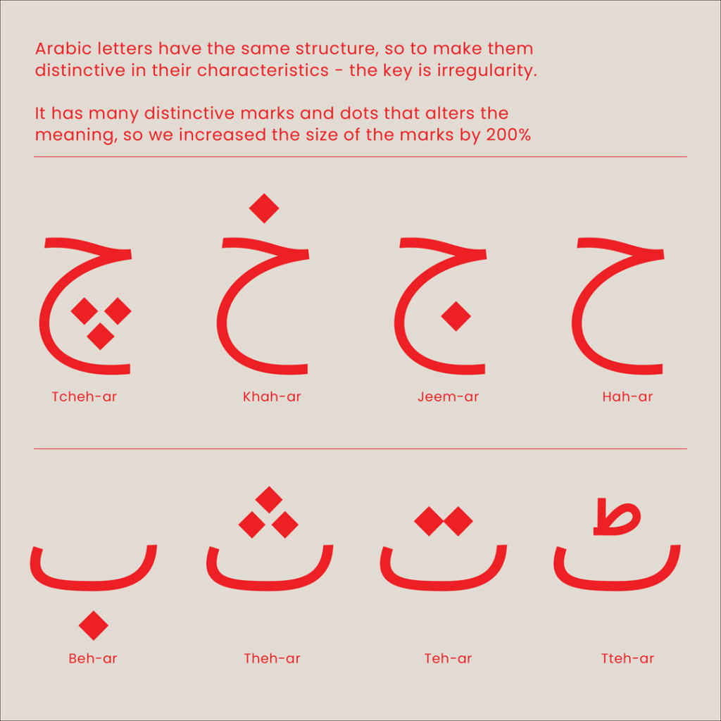
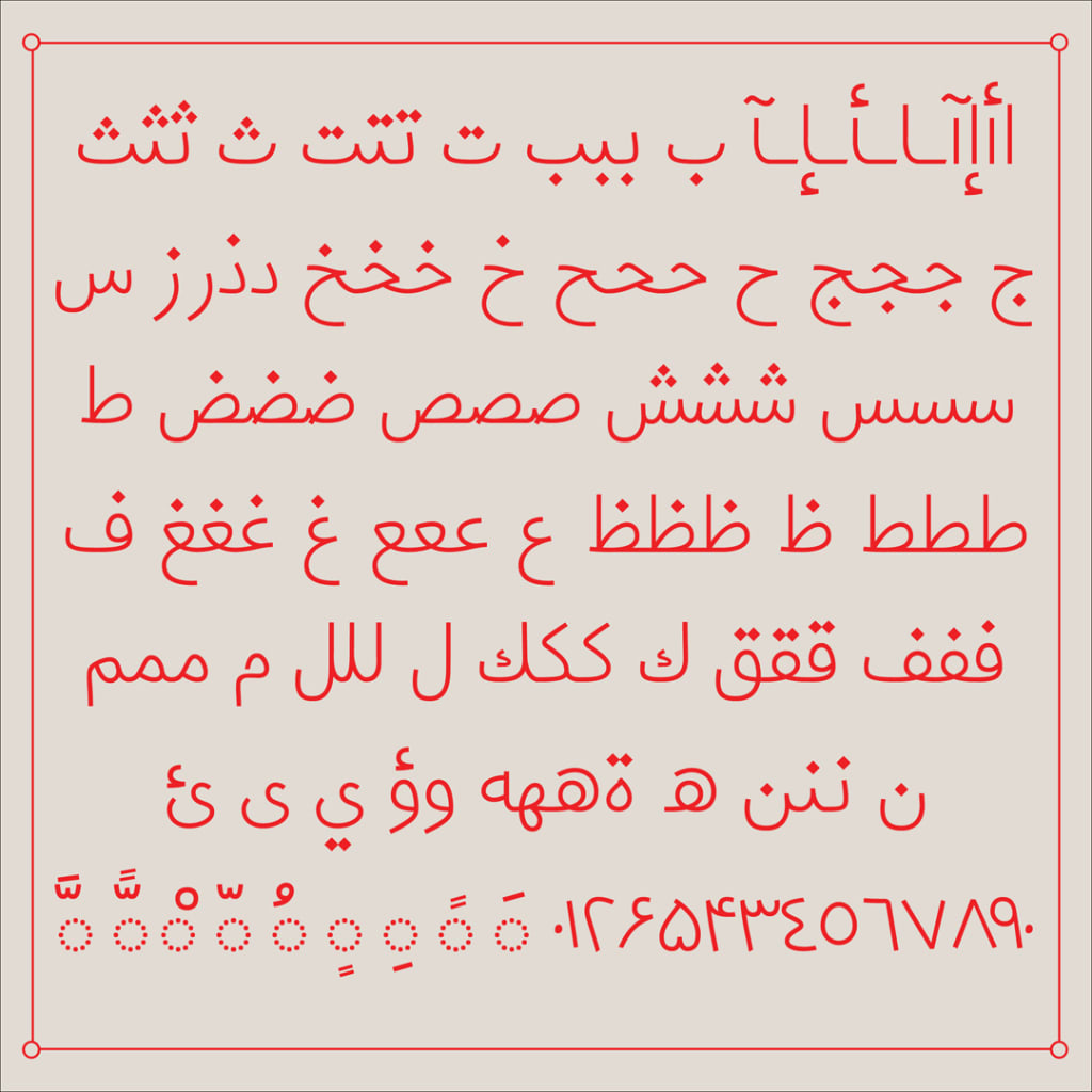
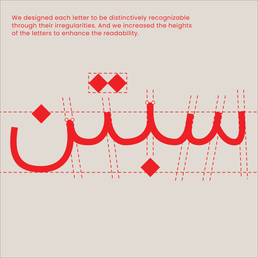
Because Arabic lettering relies on many similar shapes, the Leo Burnett team added a touch of irregularity to Maqroo’s letters. They added irregular space between letters, increased the size and shape of nuqtas and tashkeels (dots and symbols used as diacritics in Arabic), and changed the shapes of the letters’ counter—or the inside space of a letterform, like in B, D, and O in Latin langauges. When a letter is used two times in a row, one is changed “so it looks different,” Mohamed explains. “Even the dots are going to be in a different height.”
They also got rid of ligatures, which are instances when two letters combine into a single glyph. “That confused the readers the most,” Mohamed says.
Do fonts really help?
The science behind dyslexia-friendly fonts is debatable, though that hasn’t stopped many people from trying to make fonts that enhance readability. Take Dyslexie, a font from Christian Boer that uses the same concept of irregularity to help people with dyslexia read the Latin alphabet more easily. Some studies have found that the font was no better than Arial for reading speed and comprehension. Instead, research suggests using shorter text lines and increased space between letters to be most helpful.
Unlike its Latin alphabet counterparts, Maqroo has not yet been tested for efficacy, but until now there hasn’t been an attempt to design Arabic type for readers with dyslexia. ”There’s about 650 Arabic fonts usable across the globe, and none of them happened to be dyslexic-friendly,” says Rahul Sharma of Leo Burnett. At the very least, Maqroo is trying to change that.
Recognize your brand’s excellence by applying to this year’s Brands That Matter Awards before the early-rate deadline, May 3.