Attention, Maxxinistas, your favorite department store now has its own bespoke sans-serif typeface.
T.J. Maxx wasn’t initially in the market for its own font, but after the company reached out to McCann New York for its “Maxx What Makes You, You” campaign, designers at the firm’s design discipline McCann Design found themselves uninspired by Helvetica, the that’s shared by retailers from Target to the Gap.
Charged with making T.J. Maxx “more iconic”, they decided using the same font as everyone else just wasn’t cutting it. “We needed something different,” McCann head of design Matt van Leeuwen tells Fast Company.
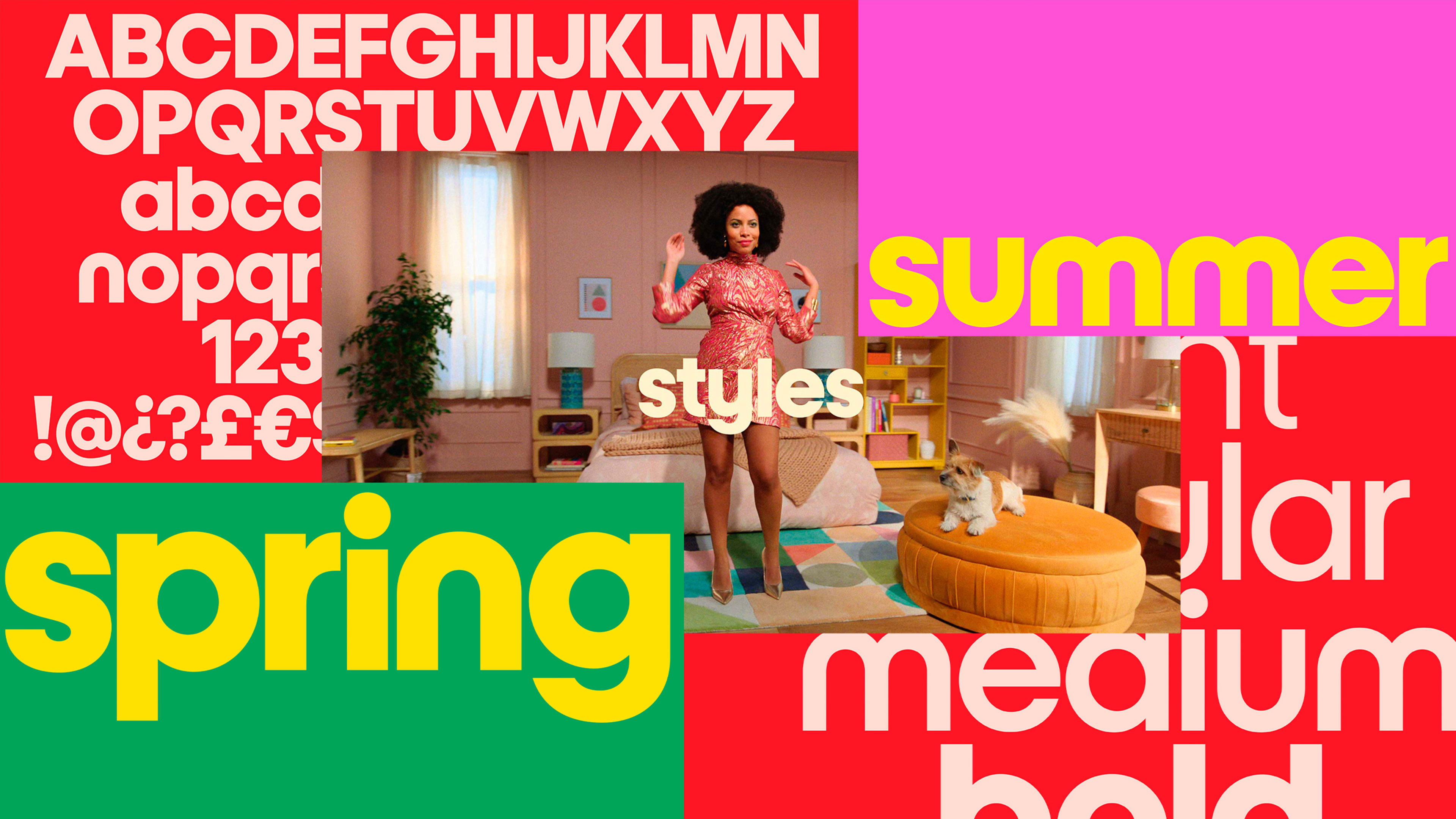
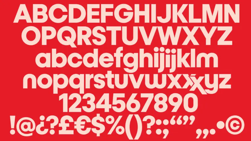
So they turned to MCKL founder Jeremy Mickel, whose work on a custom font for Fischer Price van Leeuwen loved. He turned the five letters in T.J. Maxx’s logo into 26 and they called the font Maxx.
“That really sort of started to pull the whole campaign together,” van Leeuwen says.
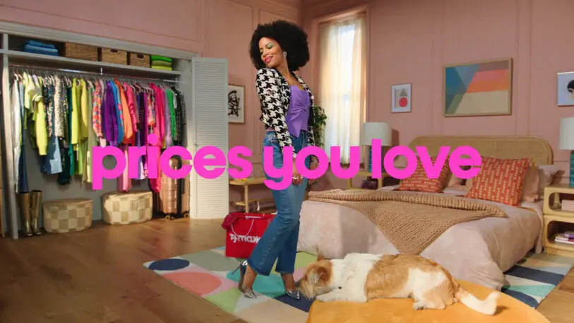
Maxx was designed to be deceivingly simple and intentionally inconsistent. The “m” is completely round while the “a” has a stem. A double “X” can be connected in a ligature mimicking the double “X” in the T.J. Maxx logo.
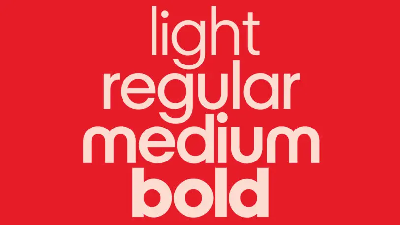
Maxx comes in four weights, light, regular, medium, and bold, which features a drop x height for the lowercase “i” and “j” so the type can be set even more compactly in headlines.
The purposeful irregularities in the font are kind of like visiting a T.J. Maxx store, Mickel says. “There’s a lot of different ideas you pick out, the things that speak to you, and it comes together as this great look.”
Maxx is just one part of a larger design system in the making for the retailer, and it will be featured in television commercials, marketing emails, social media posts, store signage, and seasonal campaigns.
Though MCKL designed Maxx specifically for TJ Maxx’s new campaign, Van Leeuwen has a feeling the font will have an extended shelf life. “I feel like the typeface is going to outlast even this campaign work,” he says.
Recognize your brand’s excellence by applying to this year’s Brands That Matter Awards before the early-rate deadline, May 3.