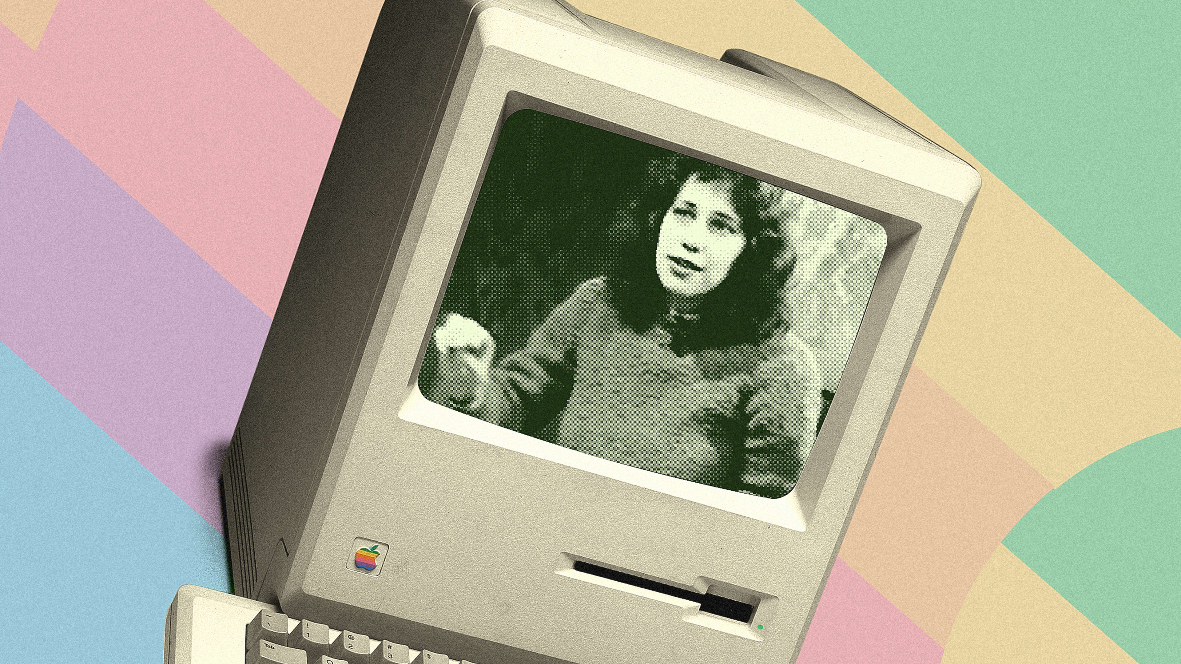
It’s a pleasure to watch Susan Kare showing how the original Macintosh worked. In an episode of Computer Chronicles from 1984, she effortlessly explains why its user experience makes so much sense. As the TV presenters watch her glide through the first widely available commercial graphic user interface, the technology feels so fresh, so amazingly simple and innovative—even by today’s standards, 40 years after Apple launched the Mac.
Kare is the legendary designer responsible for the icons and typefaces on the original Mac. She later joined NeXT as creative director and did great work for every big tech company imaginable, from IBM to Microsoft to Facebook. But, back then, she was just one of a fantastic seven, the key members of the band of merry computer pirates who toiled away for years creating the Mac for Steve Jobs.
Unlike her friend Andy Hertzfeld, the software engineer who recruited her for the Mac development team, Kare didn’t have a clue about computers, typeface design, and pixel art. She was an artist who joined the team in 1982 armed with a notebook of graph paper, a pencil, and a lot of ideas about how to apply her experience with mosaics to design the Mac’s 32×32 pixel drawings. These icons became digital representations of real-world objects, and as Kare explains in the video, it’s what made the Macintosh so user-friendly.
In the video, the “HI [Human Interface] Macintosh Artist”—as her Apple business card said at the time—gives a walk-through of how any normal human being would use a Mac right out of the box.
It all starts with the blinking floppy disk illustrated with a question mark. This icon was the machine’s way of telling you that it needed something (to clarify: back then, the Mac didn’t have a hard drive; it worked exclusively with floppies).
This clever “Hey, where’s my disk?” graphical call was the perfect summary of the UX spirit of this little machine: “You don’t need to read or know anything about computers to operate me,” it seemed to say. As Kare explains, users just needed to find the thing that looks like the on-screen icon and put it inside the Mac. “There’s no other way to put it in, so there can’t be any mistakes,” she says.
After that, the Mac operating system begins to load—but then again, you didn’t need a torrent of text through a screen to know that things were happening. There was only this Happy Mac face in the shape of the machine itself that told you, “Hey, well done! It’s all fine.”
And indeed it was all fine. Watching this video is a reminder of what made me fall in love with the Mac in the first place. Listening to Kare explaining the deceptively simple logic behind the machine’s UX—how you manipulate these icons that represent things in the real world that anyone can understand and feel as true—is a real joy. Everyone who works in UX or simply loves computers should watch it and appreciate the incredible work and painfully endless hours that Kare and her teammates put into distilling all their knowledge and experience into a beige box that literally changed the world . . . one desktop at a time.
Recognize your brand’s excellence by applying to this year’s Brands That Matter Awards before the final deadline, June 7.
Sign up for Brands That Matter notifications here.
