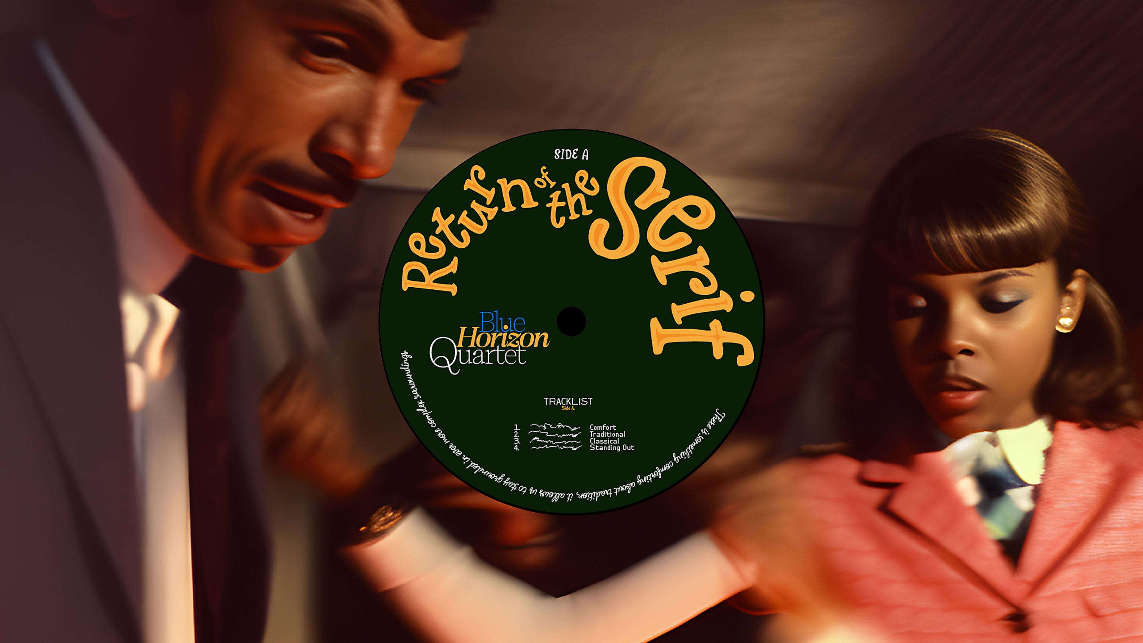
Serifs are making a comeback.
Not that they ever really left, but after years of simple, minimalist design and sans-serif typefaces, forecasters at Monotype sees the return of the serif as one of 10 trends shaping the look of design in 2024, as outlined in its annual type trend report.
“One of my big takeaways from this year is I see designers and agencies having a lot of fun with their design, and that manifests in many different ways,” says Jordan Bell, a type designer at Monotype who worked on the report. “Before, I think simplicity was kind of the name of the game.”
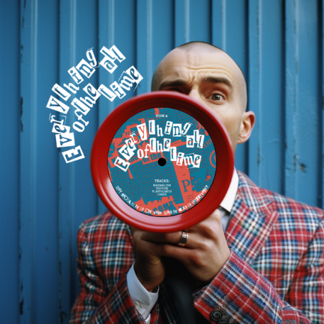
Companies as varied as Minute Maid and the beauty brand Pinklab.Co turned to soft, gentle serifs for distinctive visual identities, while Ben’s Best Blnz, a cannabis company from Ben & Jerry’s Ice Cream cofounder Ben Cohen, shows off a trend the report calls “everythingallofthetime,” an internet-inspired maximalism that mashes up different colors, textures, and typefaces in ways that might break the basic rules taught in design school.
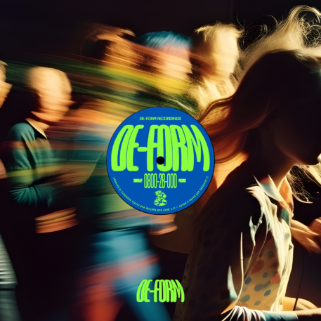
A trend called “de-form” features stretched type, like in the crowded, irregularly inflated bubble letters for the “Too Much to Watch” event designed by Studio Kiln for the Royal Television Society. Nostalgia shows up in the form of digital gradients, bold type, and drop shadows, like the drop shadows in the rebranded Jell-O logo from Brand Opus.
For brands that want to hold on to their sans-serif type but still be a little more expressive, simple quirks can do the heavy lifting. This trend uses familiar, comfortable type with flourishes in a single letterform, like the squiggly “W” in the otherwise sober sans-serif wordmark for the branding agency Wolff Olins. President Joe Biden’s campaign logo with its red flag-style “E” in his last name is another example of the trend.
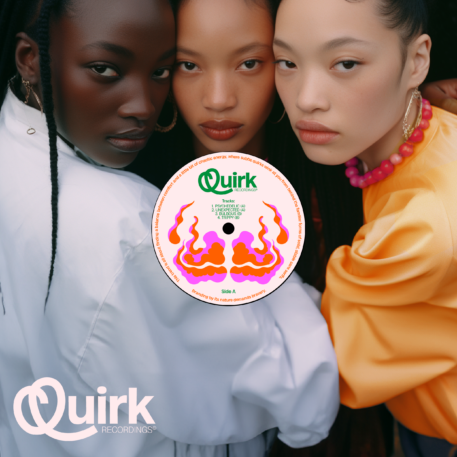
“I’ve started seeing a lot more of those kind of designs and I love that playfulness because it’s in one letter form, it’s not in the whole type treatment,” Bell says. “It’s generally just kind of . . . taking one character and really going wild with it.”
Recognize your brand’s excellence by applying to this year’s Brands That Matter Awards before the final deadline, June 7.
Sign up for Brands That Matter notifications here.
