For decades, companies have realized how important a well executed corporate identity can be to a company’s success. An iconic logo, carefully chosen colors, and typography that are thoughtfully and strategically woven into a visual system can help a company express intangible corporate values and reflect the philosophy of a business.
Depending upon the size of an organization, a company’s brand may need complex rules for how it appears in print, on the web, on packaging, on vehicles, and even how the brand appears in motion. This is where brand guideline documents come in handy. They can be extremely useful for large organizations to communicate the graphic design systems, specifications, and rules that the company spent so much money on.
I absolutely love a good brand style guide. The best ones communicate an easy to grasp philosophy about the ideas behind the designs, and include useful “do’s and don’ts”—examples of the proper use of the rules and, my favorite, what you should never do with their precious logo. They even specify the style and treatment of photography and often the desired tone or vibe of the messaging being communicated.
Government agencies also picked up on the importance of this type of disciplined brand management for communications with their customers— the public—and have created some fascinating brand style guides for enforcing the rules.
‘Unmistakably Army’
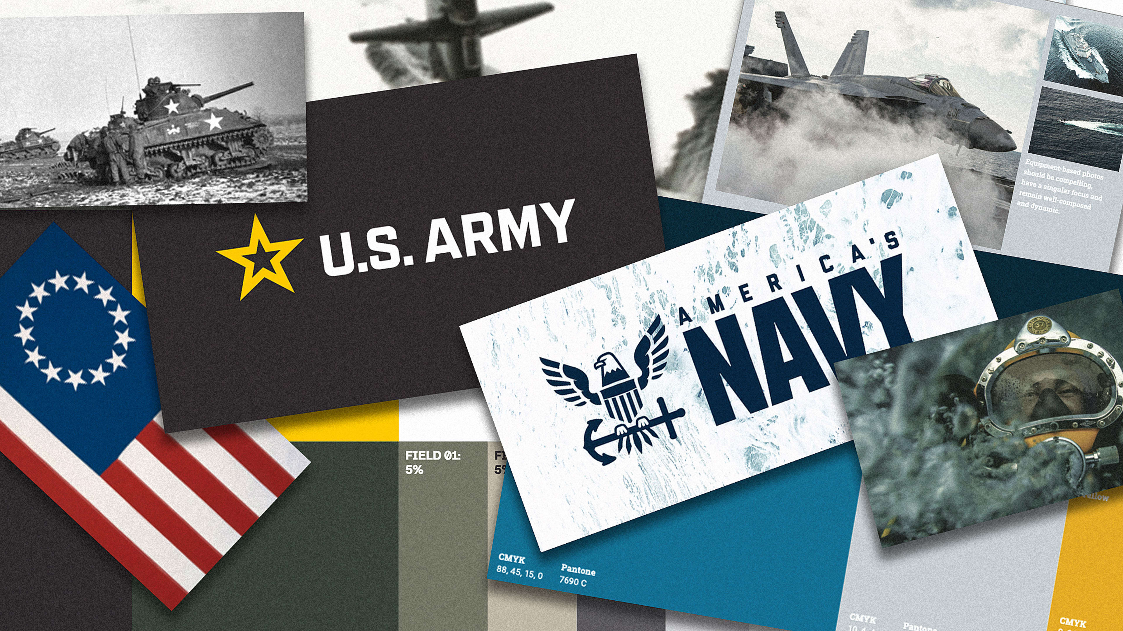
One such government agency that has embraced the power of branding is the U.S. Army. Earlier this year, Siegel+Gale, an award-winning branding agency, developed updated branding for the Army, including a bold 139 page brand guidelines doc.
Before diving into the specific fonts and colors to use, the guidelines set the tone of the brand for the Army with a set of “identity principles”:
- Clear (“Messages should be simple, crisp, and effective”)
- Confident (“It demonstrates belief in positive outcomes and in its unique ability to enact them”)
- Human (“We strive to facilitate easy engagement and illuminate authentic purpose and passion whenever possible”)
There’s also a note about the brand’s strategy, defining two conceptual “pillars” upon which the brand rests: “Passion & Purpose” and “Community & Connection” (though that is technically four concepts).
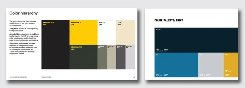
The guide lays out a visual language for the fighting force that is utilitarian, hard-edged, and defined by a primary color palette of four main colors: the iconic dark olive (ARMY GREEN), and three colors that the Army says are inspired by the components of gunpowder: ARMY GOLD for sulfur, WHITE for potassium nitrate, and ARMY BLACK for charcoal. A more modern secondary palette evokes desaturated swatches of camouflage, incorporating the pale dusty greens of FIELD 01 and FIELD 02, TAN, rounded out by two shades of cool gray: GRAY 01 and GRAY 02. The way these colors are applied matters, and to help with this, a “color hierarchy” quantifies the primacy of each color and what applications they may be best suited for.
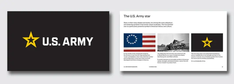
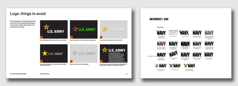
The Army’s logo is anchored by the most American symbol, the five-pointed star. “The U.S. Army star is an enduring brand beacon and an indelible link to its heritage and that of the country it serves. It is a timeless symbol that invokes the future and its limitless possibilities. It is unmistakably Army,” reads the document.
The star is a sharp, powerful shape that is given plenty of room to breathe on layouts, and is allowed to dominate the wordmark, looming large above the text in vertical orientations. The guidelines don’t allow for any rainbow stars, drop shadows, or any other graphic shenanigans.
The Army has its own bespoke font, with the name “G.I.” (which seems like a missed opportunity with all the cool terminology available). The document says the name “. . . . is inspired by the U.S. Army’s people and unique culture. The character and spirit of the font align with the no-nonsense brand identity principles of being clear, confident, and human.”
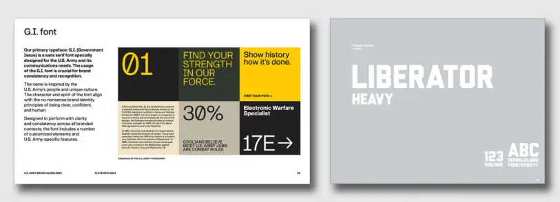
There are reminders that this typeface is for military business first, and less about aesthetics. The zero features a slash which was “. . . designed to embody the utilitarian spirit of the U.S. Army” and prevent confusion with a capital O, says the document. The numeral 1 and capital I are also clearly distinct. The font can be used for 120 languages and their unique typographic marks.
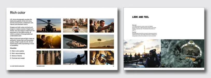
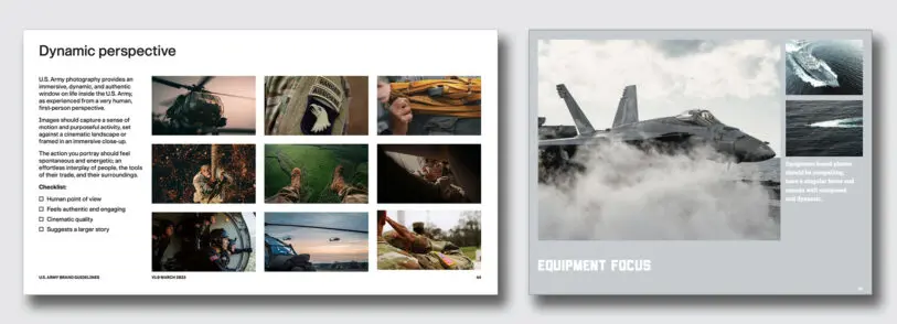
One of the most fascinating sections of this document describes all aspects of how photography is used in Army communications. The rules are organized by the fundamental photographic principles of color, composition, and perspective.
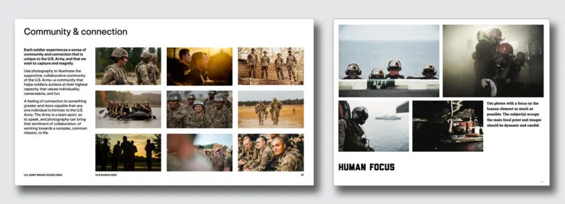
“Warm tones and natural light create an authentic, human feel, and the golden quality of light recalls the U.S. Army’s brand colors while expressing a mood of possibility” reads the document. It calls for the use of bold images with strong contrast, toned to reflect the colors from the Army palette. Also, the use of black and white photos are discouraged.
Compositions are to be clear and direct, and free of any dramatic effects, and notes that photographs “. . . should feel like an authentic moment, unstaged.” When describing perspective, the photography should provide “. . . an immersive, dynamic, and authentic window on life inside the U.S. Army, as experienced from a very human, first-person perspective.”
The focus on showing the positive human side of Army personnel runs through this whole document. It encourages depicting soldiers both in and out of uniform following their passions, developing their careers in the Army, and forging strong social connections with teammates.
Diversity is also a theme emphasized noting “The U.S. Army and its members reflect the diverse geography and population of the United States, and U.S. Army photography must do the same.” There are some interesting caveats with regards to photographs depicting soldiers in uniform. The correct placement of patches and uniform accessories are emphasized, as is the importance of “proper styling and grooming of apparel, accessories, and equipment. ”
But the most stark warning relates to the depiction of weapons appearing in Army photos. The document warns in unusual seriousness “. . . under no circumstances may a weapon of any kind ever appear, in moving or still imagery, to be pointed in the direction of the lens; e.g., at the viewer.”
The Army’s Voice: ‘Not cold or terse’
For an organization as large as the Army, the challenge of speaking with one cohesive voice is significant, and the guide has some suggestions here, too. The Army wants its voice to be factual and concise, but not devoid of humanity. “We are not cold or terse, despite our direct tone.”
While the voice should be confident and “secure in our identity,” it also aims for humility. “We don’t put others down, think we are above growth, or believe we are too strong for support.” But at the end of the day, this voice is stern and focused on the task at hand: “We don’t make decisions based on emotion. We don’t use slang or trendy language.”
Navy: Forged By the Sea
After reading through the Army’s comprehensive brand guidelines, it is especially informative to see how it compares and contrasts to its sea-based brethren, the U.S. Navy. The Navy’s brand guidelines doc shown here is from 2019, and while it is only half the length of the Army’s guidelines document it is equally slick and well designed and is organized in a similar way.
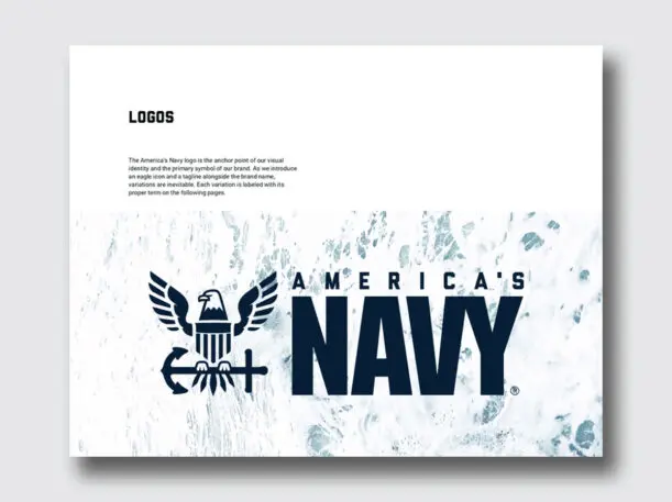
Right off the bat, the actual name of the fighting force is re-branded as “America’s Navy,” with no other variations allowed. “It’s important for America to feel ownership of their Navy—the largest, strongest, and most technologically advanced in the world,” reads the document.
There is definitely a different, more dramatic personality peeking through these guidelines, and the Navy brand statement stirs up some positively cinematic imagery in this prose:
“The sea is the greatest force on earth.
It reaches impossible speeds, depths and distances. It cannot be beaten with the strongest fist, cut with the sharpest knife or stopped by the fastest bullet.”
[. . .]
“Water and salt flow through our veins in the same proportion as the sea. That mighty force is the lifeblood of the greatest Navy ever to sail unstoppably upon it, slip stealthily beneath it or fly unchallenged above it”
We’re doing six pillars
While the Army’s brand rests upon two (four) pillars, the Navy throws down with SIX:
- Strength
- Opportunity
- Direction
- Teamwork
- Creative innovation
- Meaningful adventure
The logo for the Navy features the “America’s Navy” wordmark sitting beside an eagle with a shield for a chest, perched on an anchor.
Drawing on the steely, cool hues of the salty ocean the Navy’s four color palette consists of Navy blue, followed by blue, light gray, and yellow.
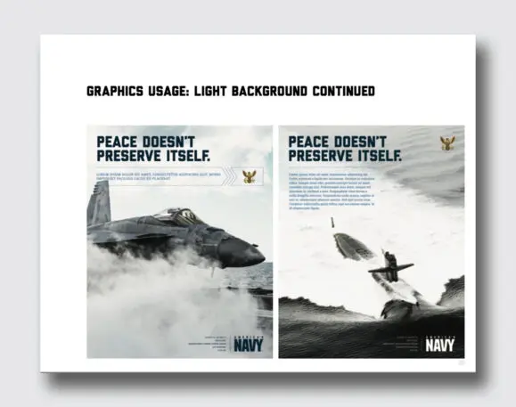
Photography is encouraged to be slightly desaturated, high contrast, and toned with “a subtle steel gray” color to evoke a cinematic feeling which should focus on people as the main focus as much as possible.
The Navy sure knows how to name things, calling its own font “Liberator.”. The document shows the appropriate use of the thick block letters spelling out phrases like “PEACE DOESN’T PRESERVE ITSELF.”
Republished with permission from Beautiful Public Data, a newsletter by Jon Keegan that curates visually interesting datasets collected by local, state, and federal government agencies.
To see more of the tools used to explore this data, read more at Beautiful Public Data. You can subscribe to the newsletter here.
Recognize your brand’s excellence by applying to this year’s Brands That Matter Awards before the early-rate deadline, May 3.