Apple killed my favorite button. The button that shuts the world off from my world. The button that actually does what you want it to do in a nanosecond. Satisfying. Functional. Mechanical.
The mute button is my homie.
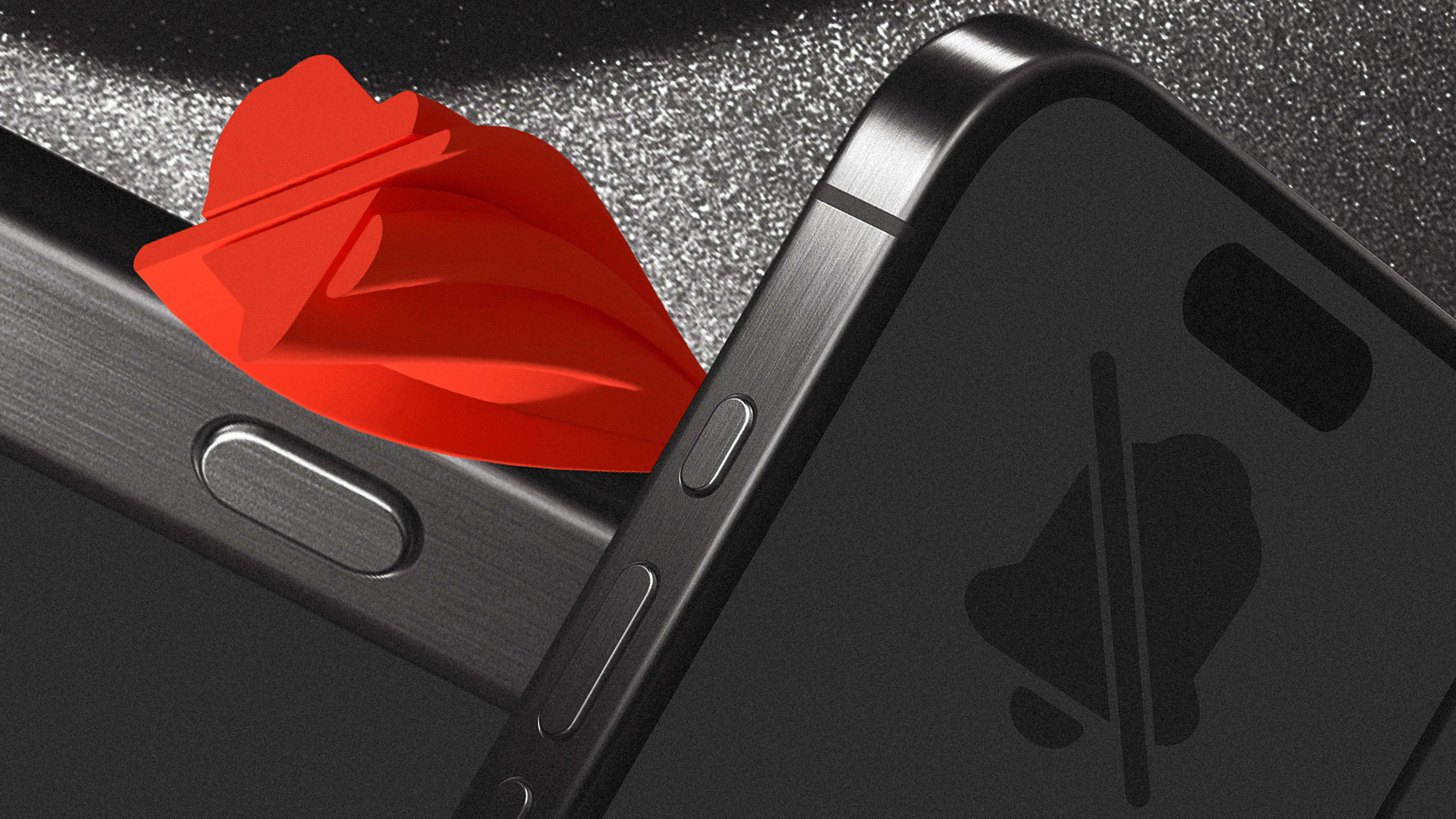
It’s the button you can operate by feel. The button that goes click, mute, click, unmute, click, mute—anywhere, everywhere: the sofa, the movie theater, the doctor’s office, the bus, subway, car, or airplane. It’s always just one single-handed nail flick away. Daylight or night. Doesn’t matter. It silences your notifications instantly. Focus-schmocus mode has never worked for me, but the mute button just works. I love this button, and this button is essential to my phone user experience.
But at this week’s iPhone event, Apple killed it and gave us a new UX mess: the “action” button.
After I finished the keynote yesterday, I spent a good 30 minutes trying to understand how this action thing works. I’m still trying to figure it out. Greg “Joz” Joswiak, Apple’s SVP, worldwide marketing, explained that by default, if you long-press it—looooong press instead of that good old nanosecond click—you mute the phone, just like before (but not really, Joz, not really). If you long-press it again, it unmutes, offering some haptic feedback to let you know what is happening—as opposed to knowing what has happened because of the actual position of the old switch.
Then, he explained, you can assign an action to it, like activate the camera or record a voice memo. Even fire up some macro to do whatever the hell it is you are in such a hurry to do that you need yet another button on your phone to do it. Just click on it, Joz said, and this button will do whatever your favorite action is. But wait, does doing this replace the mute action? Is this click a different click than the long click? I still don’t know because it’s nowhere to be found on the Apple product page. That page implies you can assign any action from a list that includes the mute function, so it seems that it may replace it?
No idea, honestly. Someone will explain it later in YouTube or something. But I watched the keynote again, and I still didn’t exactly get it. Suddenly, I found myself longing for the time in which Steve Jobs or Phil Schiller would go on stage and actually demonstrate the UX for you.
“Look, you get your fingers on a photo like this, you pinch, and boom! It zooms in. You pinch out, boom! It zooms out.” Remember those times when Apple used to rejoice and revel in the infinite attention to detail, the refinement of their thought process distilled in each and every element of the user interface? That pinch demo moment sold the iPhone to the world in 10 seconds! Now we get descriptions of arcane metallurgy processes, Walter White’s meth chemistry lessons to Jesse Pinkman, bazillion transistor counts nobody cares about, and a never-ending list of acronyms that nobody understands.
And then, we get a “there’s no mute button anymore but, trust us, this new ‘action button’ works great. It’s fantastic!” Like when they introduced double- and triple-back tap of your phone to launch your favorite actions. Remember that other “action button”? No? Exactly. Me neither. And I bet that 95% of iPhone users, everyone but the die-hards, would go ‘doublebackwha?’
Because my feeling here is that, just like with the back-tap gestures or the pressure touch, if you are a normal person buying the iPhone Pro, you will never learn about this. You most probably won’t be changing the function of the action button to anything else. Microsoft’s research (albeit from 2011) shows that 95% of users leave the default settings on their computer. Now, a computer is different than a phone, but it speaks to people’s desire to simply use their gadget.
Apple has a long history of adding extra functionality to buttons and keystrokes for power users. But this is the first time they have crippled a must-have UX feature everyone loves in the process. Plus, they could have chosen to enhance the button, as product design studio Ultraviolet’s Brian Charlesworth instantly realized with his simple mute button redesign. There’s no reason why Apple couldn’t have done this in its new $1,000 phone.
Alas, the obvious move didn’t happen, and we ended with an objectively worse UX. In a sea of glass and metal, the mute button was actually the only truly distinguishable UX feature of iPhones (Android has used some form of action or “side” button on its phones for years).
So, why change this in the first place? It feels to me like this new feature will serve nobody but a few pro bros who want to run their macros, after all. This is not progress for the common folk. It’s not advancing the UX, like they are trying to do with the finger tap. It is, once again, replacing an essential part of the UX with yet another nothingburger in a salad of marketing bullet points. There. You can mute me now.
Recognize your brand’s excellence by applying to this year’s Brands That Matter Awards before the final deadline, June 7.
Sign up for Brands That Matter notifications here.
