A lot of typeface designers draw from historical references when creating their fonts. But none do it as strikingly as Tré Seals.
With his foundry, Vocal Type, Seals crafts typefaces based around the history of underrepresented peoples, often drawing inspiration from protest signs and movements. Each of his typefaces comes with a case study detailing the story behind the design—and in a consumer web culture defined by pop-ups and voluminous top-of-page CTAs, one of the best parts of Vocal Type’s website is that visitors have to progress through the font’s backstory before they’re ever prompted to try or buy it. It’s an intentional move, and one in which Seals honors those who inspired the work, while perhaps elevating the field to a new level of nuance in the process.
“I’ve always been aware of how powerful stories are, and how underutilized they are in the design industry, [both] type and graphic,” he detailed in a recent email exchange.

Seals’ latest release is a powerful story, indeed. A few years back, he asked his Instagram followers what movement, person, or event they’d like to see a new typeface pay homage to. One suggestion was a font inspired by the Tiananmen Square protests—the 1989 Chinese demonstrations for government and economic reform, which ended in a state-sanctioned massacre.

Up until this point, though, all of Seals’ releases had been centered around Black and brown culture.
“For a long time, I felt uncomfortable designing font families inspired by cultures I don’t identify with,” Seals wrote. “However, when I saw that many of the phrases from the protest signs and banners [at Tiananmen] came from the Civil Rights Movement, the Black Panther Party, and even American history, I was okay with it because now there’s a connection to my culture.”

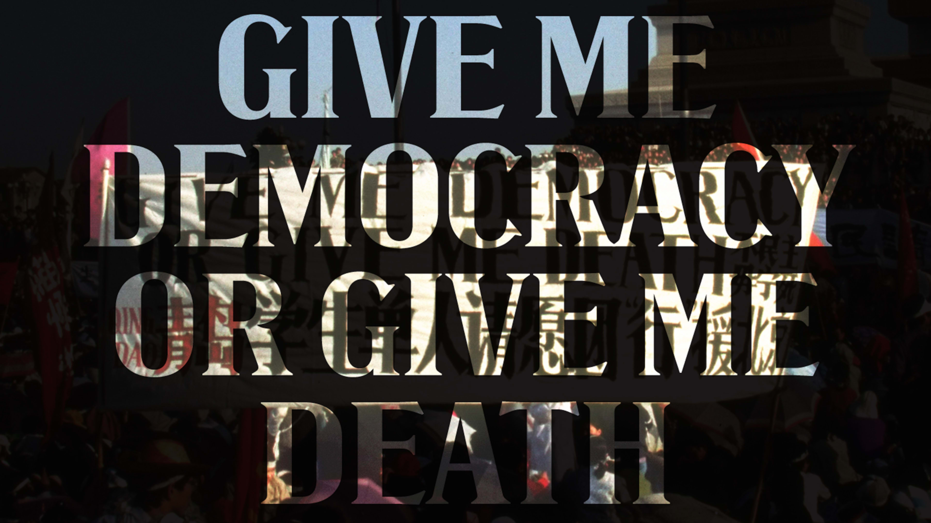
Seals got to work. The first step: Find a protest sign from which to source letterforms. He studied some 2,000 historic photos from Getty and eventually honed in on a banner that had been photographed from different angles bearing the English text, “Give me democracy or give me death,” lettered with serifs. (“I’ve been asked to develop a serif font family for several years,” Seals wrote to me. “However, those who’ve asked, I believe, underestimate how difficult it is to find a protest sign/banner with serif lettering on it.”)

Next, he detailed, given that banners crinkle and photos of them are rarely perfectly framed, he took the images to Photoshop to determine the most accurate letterforms. Afterward, he traced the letters, making tweaks and adjustments so that the subsequent font would have a sense of cohesiveness. And then, the alchemy: After developing a few key letters to establish the DNA of the family, he utilized elements from the existing characters to complete the rest of the alphabet, not unlike a letterform archaeologist.

After around seven months of work, he emerged with VTC Tank Man—named after one of the most profound and symbolic images from the protests: a lone man who stood before a wall of tanks, stopping them in their tracks.

Ultimately, while the project might have initially felt outside the scope of his experience, the end result brilliantly syncs with his body of work—and the reason he weaves the past into all of his font families in the first place.
“I remember my dad told me when I was young that a smart man learns from his own mistakes, and a wise man learns from the mistakes of others,” he wrote. “History is a gift for the wise to learn from and grow from.”
Recognize your brand’s excellence by applying to this year’s Brands That Matter Awards before the final deadline, June 7.
Sign up for Brands That Matter notifications here.
