For the 400 million or so Outlook users around the world, Calibri has been the default font for 16 years. Still beloved by some governmental institutions, Calibri is a smooth sans serif that was developed to be legible in an era when our screens were still pixelated. But in 2021, Microsoft announced that Calibri would be replaced by one of five new fonts. Fair enough, as even as Calibri’s creator, Lucas de Groot, believed its time had passed.
Related: The 14 Worst Fonts in the World
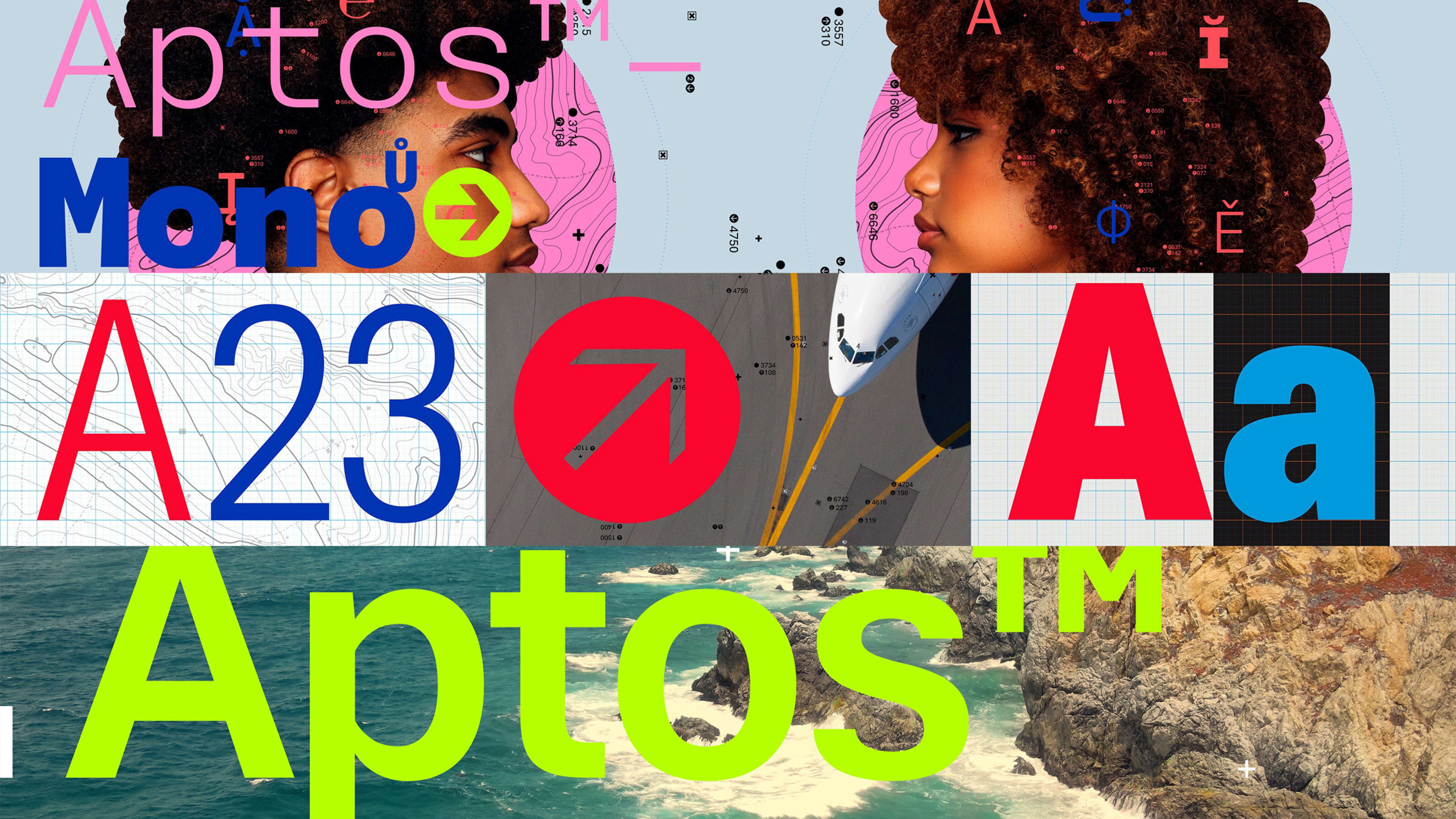
Calibri’s replacement will be Aptos, Microsoft announced today. Developed by Steve Matteson, it will become the default choice on Office 365 apps including Outlook and Word. If you’ve never heard of Aptos before, do not feel out of touch. Since 2021, Microsoft has been testing it under the name Bierstadt, which translates to “beer city.” (And, cheers, it will keep that name in your own Microsoft apps if you’re currently using it to avoid confusion.) Everyone else will get Aptos, named after a town in Santa Cruz, CA.
[Image: Microsoft Design]
The casual observer may not see much difference between Calibri and Aptos. Like Calibri, it’s a streamlined sans serif typeface that lacks the ornate terminals (letter tips) we see in serif alternatives like Times New Roman, another former Microsoft default font.
However, there are certainly differences to note. While Calibri is known for being narrow, Aptos features wider, more friendly-looking Os and Qs (that look more like circles than ovals). Lowercase letters, like the u, appear to stretch across the page luxuriously, like they’re sitting in the backseat of a Lincoln Navigator instead of being jammed into a shared Uber. And if you look closely at the terminals of Calibri, you’ll see they’re curved. Aptos, on the other hand, files them down to sharp edges—perhaps as a reminder to everyone in the Microsoft 365 suite that this is still business.
Matteson says he wanted to imbue the font with a bit of humanity. “I did that by adding a little swing to the R and the double stacked g,” he told Microsoft.
Aptos will be rolling out across Microsoft 365 over the next few months. But there is no mandate to use it. If you’re a Calibri fan, it’ll still be available right there in the drop down menu where you can set it as your personal default
Recognize your brand’s excellence by applying to this year’s Brands That Matter Awards before the early-rate deadline, May 3.
