Offices may not be going extinct, but they seem to be getting smaller. Data from the commercial real estate services firm CBRE shows the average office lease square footage on a downward slide compared to before the pandemic. For some offices, this shift away from quantity is opening up an opportunity to focus on quality.
That’s the tradeoff playing out inside a redesigned office for an entertainment law firm based in Century City, California, which has withheld its identity. Mid-pandemic, the firm found itself navigating the cognitive dissonance of needing more offices for its growing staff while, at the same time, most of said staff was doing much of its work from home.
Designers Annie Ritz and Daniel Rabin of the architecture and interior design firm, And And And Studio, proposed redesigning for this new reality by combining both conditions: the need for more space and the preference of workers for the comforts of home.
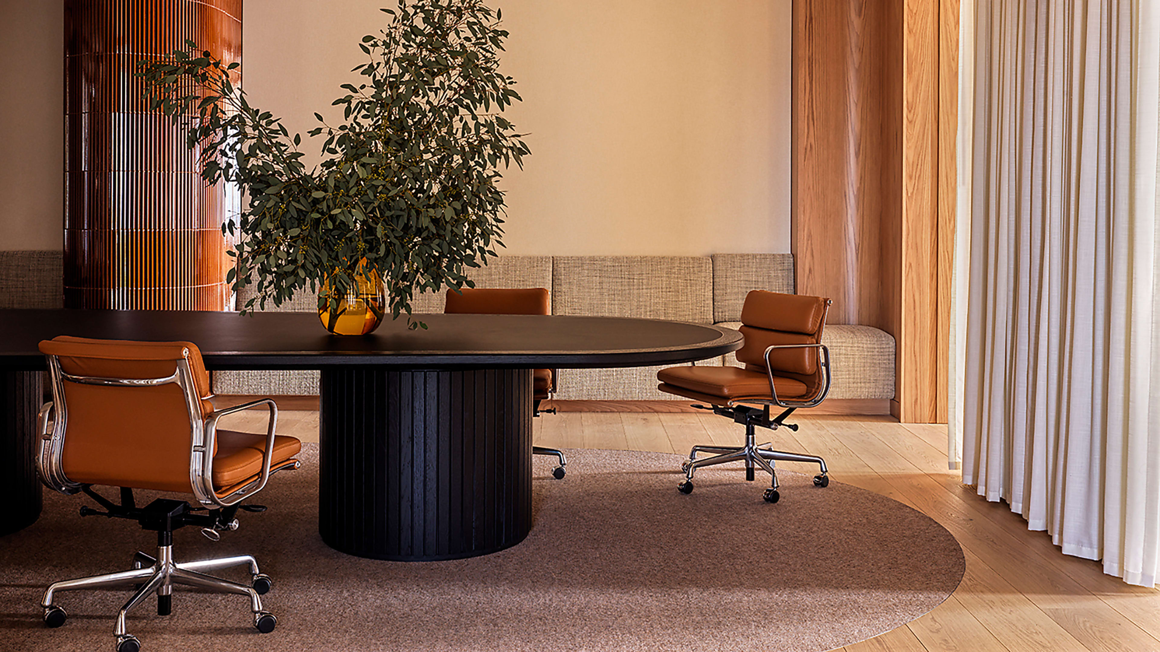
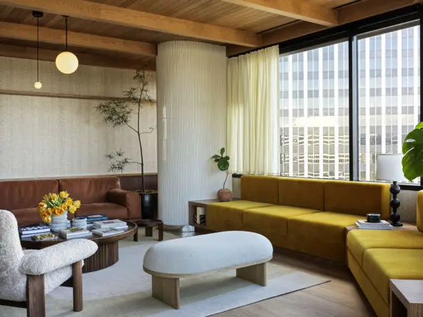
The new interior they’ve designed is heavy on the warm and soft materials more commonly found in a home than a stodgy office. To push the feeling over the top, And And And Studio picked a palette of materials and colors that can only be described as “1970s.”
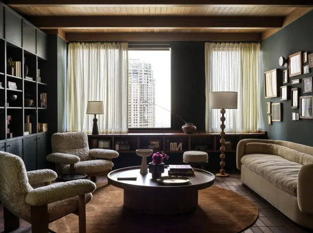
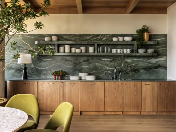
Wood panels line many of the walls, and single-shade area rugs add a low shag. Brown tile lines the reception desk, and bold green marble fills the kitchen. Plush cushioned couches scream suburban romper room, and the color scheme features several shades of gold, amber, and burnt orange. Common areas are lined with cushy seating, couches, and tables that are just as good for eating lunch at as hosting an informal meeting. “It’s a complete contrast to the overly slick, polished marble, Class A office,” says Rabin.
The 22,000-square-foot office had to be reconfigured to accomplish these changes. The firm’s floor plan went from 25 offices along its perimeter to 35. Some offices were reduced in size by more than a quarter. That’s a complicated prospect in the hierarchical world of top-tier law firms, where the prestige of a firm’s partners tends to manifest in the form of bigger offices. “Every inch is measured and compared,” Rabin says.
The aesthetic spreads through the entire office, whether in the still-large private offices of the firm’s bigwigs or in the more communal areas of the kitchen and the hallways. “We didn’t want to make just the reception area nice, and then you turn the corner and it’s all white walls and gray carpet,” Rabin says.
Keeping the office a relatively compact square footage made this level of design detail more feasible, Rabin says. It’s a detail-centric approach he thinks other offices may want to take as they figure out how to appeal to their employees. “The age of 200,000-square-foot offices where we just need to build it out and throw people in there, I think that’s over,” he says. “There has to be a draw to pull people back in.”
Recognize your brand’s excellence by applying to this year’s Brands That Matter Awards before the early-rate deadline, May 3.