For more than seven decades, Fanta has been synonymous with fruit, from its flavors and ingredients to its very logo. So it may come as a surprise that with its first-ever consistent global brand system, Fanta is dropping its logo’s signature orange—and the real juice in its ubiquitous orange soda.
While Coca-Cola’s second-oldest brand has gone through a number of iterations over the years, oranges worked their way into the logo in 1970, and permutations of fruit and stem remained a stalwart of the design.
The brand evolved into two distinct identities (with a few outliers). There was the domestic U.S. Fanta, consisting of a softer, childlike aesthetic and a formula akin to most drinks in the country (think: high-fructose corn syrup and various dyes). And there was the international counterpart used in 80% of Fanta’s markets: a bold logo leaping from within the signature orange, with formulas containing varying amounts of orange juice and natural flavors and/or colors.

The problem with the orange fruit in the mark? Coca-Cola global VP of design Rapha Abreu says it came down to the fact that the logo on, say, a grape soda, confuses consumers.
“We know orange is the most iconic flavor, but we have a range of flavors,” Abreu says. “And we want to make sure that we are true to that.”
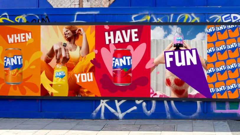
Beyond fixing the mismatch of fruits, the team sought to focus on an attitude of “playfulness and fun.” One goal of the identity was to move Fanta from being seen as a brand exclusively for a younger audience and to broaden its reach. For that reason, Abreau says, they elected to adapt the international logo instead of the rounder, more youth-skewed U.S. variant. By removing the orange and relocating the relevant fruit on the packaging, the boisterous (nigh chaotic?) “pop” logo springs forth more readily. The brand’s full line of flavors, meanwhile, builds out a kaleidoscopic palette that brims with energy.
Lisa Smith—global executive creative director at Jones Knowles Ritchie, which developed the identity alongside Coca-Cola—says it’s the largest spectrum of colors she has ever worked with. She adds that the pop speech bubble aesthetic communicates spontaneity and being of the moment, elements that reinforce the brand’s goals. Collectively, Smith says, the work takes an intentional anti-precious, imperfect bent. The team explored “all the opposites of what formal typography is all about,” she adds, making the logo “deliberately very, very playful.”
A mixed-media-influenced ecosystem featuring photography by Tim Marsella and illustration by Lucas Wakamatsu is aimed at enhancing the overall concept of play. (Gretel contributed the motion identity, and Relative handled packaging guidelines and imagery.)
Fanta’s evolution away from fruit
The new identity dovetails with Fanta’s new—and controversial—formulas for its orange soda, which began in the U.S. and will, Coca-Cola confirmed, spread across its global markets over time. While there’s no singular global formula for Fanta, about half of all global formulations no longer have juice—such as the formula used in the U.S.
Fanta began morphing into the product so many consumers know today in 1955 in Naples, Italy, when orange juice was added to its drink. Today, the amount of orange juice varies by country and region, and the new formulas are already proving to be a blow to many die-hard consumers. (While Coca-Cola explains there’s no singular global formula for Fanta, the company says about half of all global formulations no longer have juice—such as the formula used in the U.S.)
Reactions on social media and Reddit have been decidedly mixed, eliciting everything from strings of orange hearts to outbursts of “Dear @fanta What have you done?”
Abreu notes that there were conversations about changing the formula at the beginning of the brand refresh, and the final taste profile was closely guided by consumer feedback. “The brand identity change is a great way to signal to consumers that there’s something new,” he says.

While the team notes that the orange was dropped from the logo for practical considerations, one can’t help but feel the symbolic weight of fruit and stem disappearing from the logo at a time when artificial sweeteners are on the rise in the mainstream beverage industry.
Like a swig of anything, time will tell how it will all go down. But for the moment, the orange is out—in more ways than one.
An earlier version of this story claimed that the new U.S. formula for Fanta was going to be exported to global markets. A Coca-Cola spokesperson had stated this in error and the piece has been updated.
Recognize your brand’s excellence by applying to this year’s Brands That Matter Awards before the final deadline, June 7.
Sign up for Brands That Matter notifications here.
