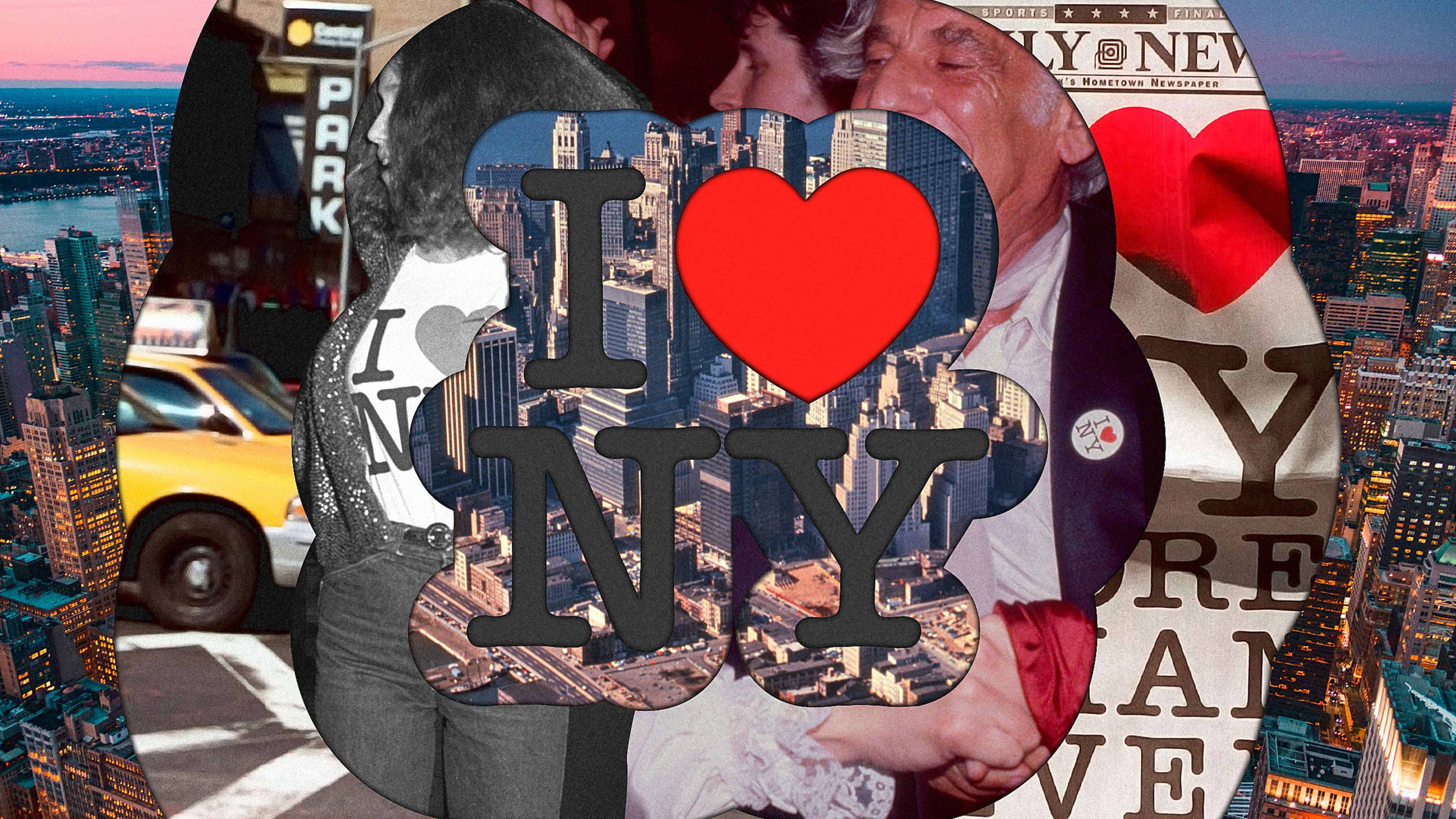
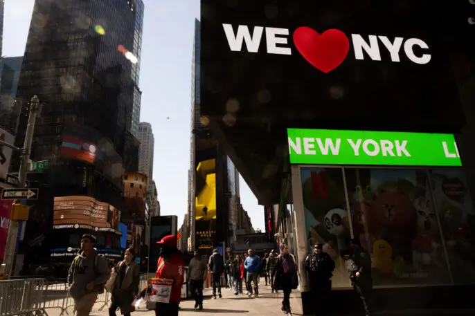
By now, it’s clear that pretty much nobody “hearts” the recently launched “We ♥ NYC” campaign. While people have taken issue with the emoji use, the typeface, the colors, and general soullessness of the campaign, it’s also clear that much of the outrage has stemmed from the unfavorable comparisons to Milton Glaser’s iconic I ♥ NY logo.
The new design certainly has its faults, but it’s also an interesting case study in how logo commentary has changed over the years. When Glaser designed I ♥ NY in 1976, there was no “design Twitter”; no branding blogs; no podcasts. But if there had been, what would people have said?
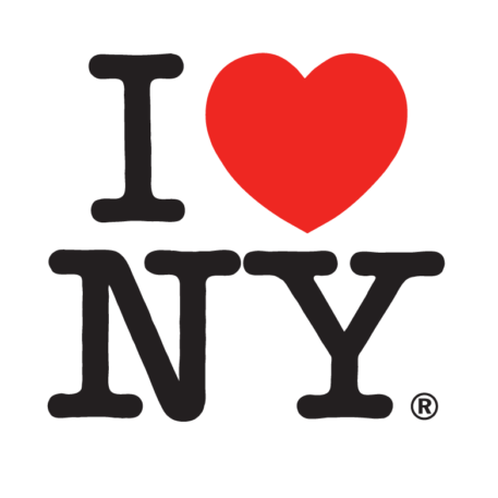
It turns out that I ♥ NY is one of those rare logos that’s both insanely famous and universally admired—even from the very moment it launched.
According to those who were there, it was a much-needed beacon of positivity in a state and city where hope was in short supply. The New York Times described the late ’70s as “some of the darkest, bleakest years” in the state’s history: Its fiscal crisis was painfully evident in both the streets and the people. Then, more than ever, NY needed a little love.
When I ♥ NY came out, “New York was in terrible shape,” says writer Steven Heller, who was then an art director at the New York Times. “It was depression, whether economically or just mentally or both. It was a brilliant idea on the part of [ad agency] Wells Rich Greene to take on a kind of visual renovation that would launch a rebirth of the city.” If there were any negative reactions to it, “they were in the minority,” he adds.
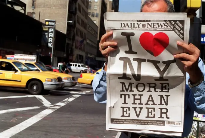
Walter Bernard, an art director who worked with Glaser at New York Magazine, says that while the logo has since been adopted as a symbol of New York City, it was actually devised as a campaign to bring tourists to New York State. “The State was very jealous of that logo,” Bernard says, adding that the state objected years later when Glaser made his post-9/11 ‘I ♥ NY More Than Ever’ image; blustering about infringement of what they saw as “their” logo.
“Nothing came of that; they had to back down, it was so silly,” he continues. “It’s not like Milton ever made a dime off it, in any case. Of course, the agency was paid, but I know Milton did the logo because he wanted to help out.”
When it was launched, Glaser’s I ♥ NY was the graphic component of a broader campaign including a fondly remembered jingle and a suite of TV ads that kicked off with a joyfully choreographed Broadway spectacular in 1977. The campaign received some press, but Glaser’s logo was not singled out as a spark of design genius.
“The big splash at the time was the television commercials and the song,” recalls Bernard. “Logos at the time were just there at the bottom; sort of like signatures that weren’t given much attention.” At first, Glaser’s logo didn’t garner much attention. But eventually, Bernard says, “people began to find an affection for the little ‘I ♥ NY’, and the logo took off by itself after not too long.”
According to Beth Kleber, the founding archivist of the Milton Glaser Design Study Center and Archives, the phrase “I Love New York” preceded Glaser’s design. The New York Department of Commerce, looking to reverse the state’s financial crisis, commissioned a market research project around “all kinds of taglines and slogans of varying degrees of lameness,” Kleber says.
During the research phase, they heard a recurring refrain from people when they talked about New York: “I love New York.” “There’s an old-school advertising rule of thumb about a few words you should try to incorporate in your slogan,” Kleber says. “Two of those are ‘love’ and ‘new.’”
Glaser seemed like the obvious choice for the phrase’s graphical representation. “He was already a very well known, successful designer at the time and had founded New York Magazine in the late ’60s,” Kleber says, with the equally famous editor, Clay Felker. “[Glaser] had built his career in New York City, and was, in many ways, this quintessential New York figure and New York designer.”

The genesis of I ♥ NY is now stamped in historical graphic-design folklore: Glaser sketching it in the back of a cab, on his way to the project meeting. According to Bernard, Glaser had already submitted a design in which ‘I Love New York’ was spelled out in a lozenge-shaped graphic device; but it was only in the taxi that “he thought, That’s not good enough.”
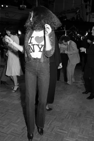
Kleber says that, at first, the deputy commissioner of the New York State Department of Commerce was concerned that I ♥ NY was too cryptic. To test that theory, Glaser decided to take his work on vacation. He and his wife wore T-shirts bearing the design on their trip to the Caribbean. The couple was repeatedly approached by people telling them that they, too, loved New York—and the logo.
“It became ubiquitous very quickly, but I think Milton regarded this as a freak of nature—a crazy, very rare occurrence in which a designer creates something that basically leaves their hands and enters the zeitgeist,” says Kleber. “But you also lose control over your creation to such an extent that it becomes part of the culture.”
Not long after its launch, I ♥ NY was deemed “very successful,” as Bernard puts it. Over the intervening decades, I ♥ NY has become a powerful symbol that’s recognized around the world. But to those who were there when it first appeared, it has a different resonance, which extends well beyond its graphic nostalgia. “I still think of it in its original context,” says former NYT art director Heller. “It had a certain immediacy that it doesn’t necessarily have now. When you see it on the street and in souvenir shops, you don’t get the sense of its critical sensibility. It was more desperate when it first arrived on the scene because the city and its people were more desperate.”
Recognize your brand’s excellence by applying to this year’s Brands That Matter Awards before the early-rate deadline, May 3.