We tend to think of physical posters as ephemeral objects that get pasted up and discarded a few weeks or months after their usefulness. They are not typically the type of thing that would last beyond the dorm room—and certainly they couldn’t last a couple hundred years, right?

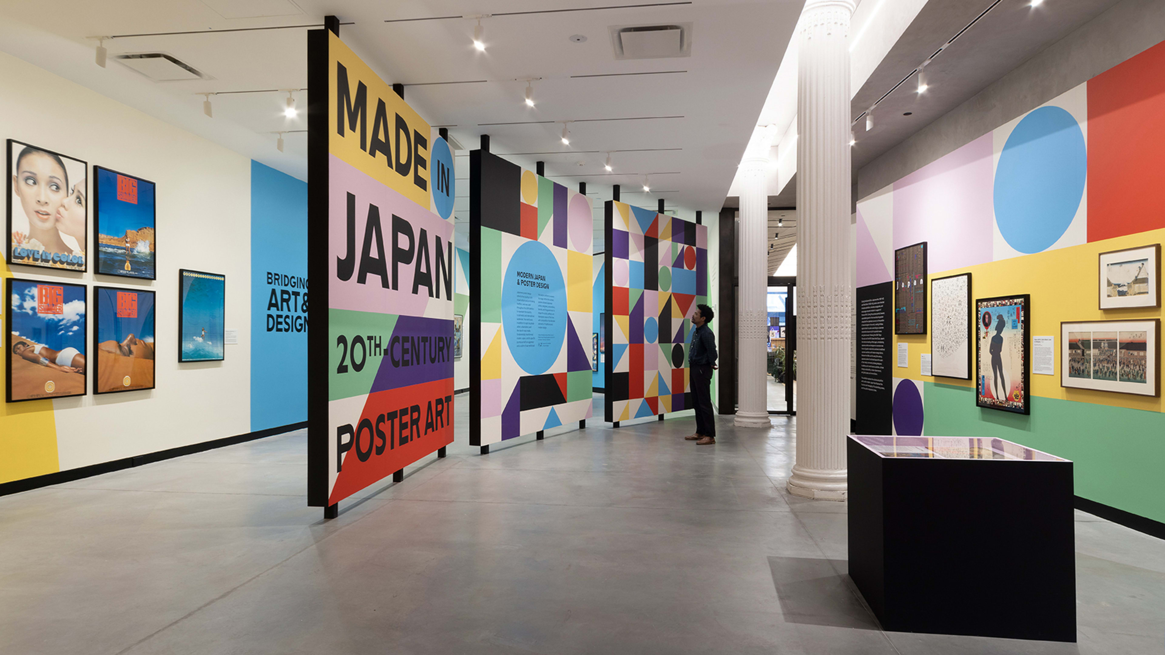
But if you were asked to visualize a piece of art dubbed “the wave,” you would likely instantly picture Hokusai’s The Great Wave off Kanagawa, a ukiyo-e woodblock print created during Japan’s creative arts boom of the Edo period (1603–1867). That’s where the country’s unique poster tradition is deeply rooted—a tradition that the Poster House museum in New York City is currently celebrating with the exhibition Made in Japan.
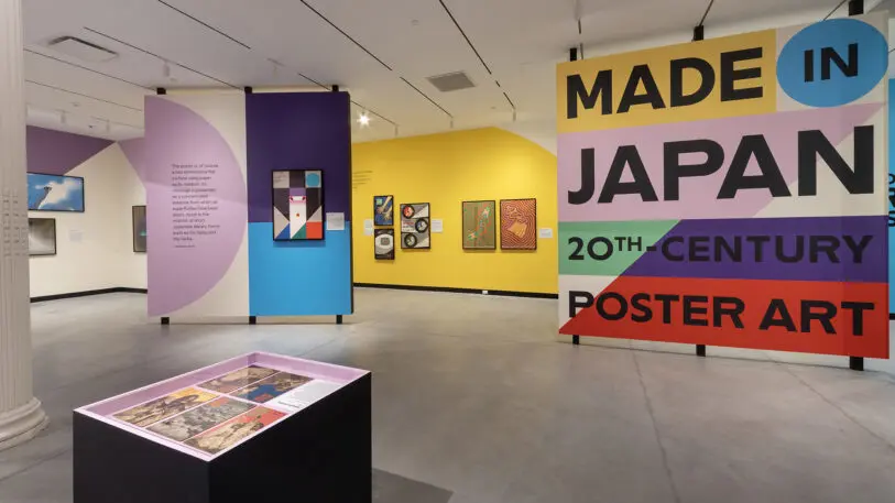
The show documents how art and design paralleled the Second Sino- Japanese War, World War II and, ultimately, the post-war years—a time of radical change marked by industrialization, urbanization, and consumerism.
“We wanted to really provide an exciting and dynamic visual narrative of 20th century Japanese history, culture, and society through the lens of posters,” says Erin Schoneveld, who curated the show with Nozomi Naoi. “I hope it offers a new perspective on the evolution of commercial art and design outside of a Western framework.”

The 73 featured posters from the Merill C. Berman Collection do just that by providing a visual survey of works that help forge Japan’s modern identity.

Here, Schoneveld breaks down five seminal posters from the exhibition that reveal how art reflects history—and how history influences art.

XVIII Olympic Games, 1964 (Kamekura Yūsaku)
Following World War II, Japan underwent major political and economic shifts and reemerged in the international community with a focus on recovery, peace, prosperity, and resilience. And posters played an important role in shifting the image through the lens of cultural exchange, Schoneveld says.
The 1964 Olympics marked the first time the Games were held in Asia, and “this particular Olympics marked a watershed moment for Japan as it reentered the world stage,” she says. Kamekura, one of Japan’s most famous designers of the time, created this poster and the official logo for the Games. Photography was a new medium for Kamekura, who brilliantly captured torchbearer Yoshinori Sakai—who was born August 6, 1945, the day the United States bombed Hiroshima.
“It’s a poster that became synonymous with innovative Japanese design of the postwar period,” Schoneveld says.

Petticoat Osen: A Tale of Forgetfulness, 1966 (Yokoo Tadanori)
The interplay of text and image has long been a hallmark of Japanese posters, dating back to the Edo period. Schoneveld says that with an influx of American products and fads into Japan, and the political turmoil of the postwar era, many Japanese designers began to rethink the hierarchies between fine art and commercial work—and infuse the two. Avant-garde collectives began to form, and designers like Yokoo began experimenting with a range of media. While simultaneously working for major clients like Toshiba, Yokoo created this piece for a theater troupe.
“This particular poster emboldened him to develop this sort of really bright, colorful, psychedelic style, but it’s also emblematic of just who he is as a designer—very playful, very subversive, and not afraid to cross a variety of different boundaries,” Schoneveld says. “The bright hues, the dynamic composition, this powerful energy and emotion that you see expressed in the work—he’s taking experimental styles and combining them with Western imagery and Japanese motifs.”

Big Summer, 1973 (Shin Matsunaga)
With the shift away from the wartime industry, design played a critical role in promoting domestic consumer products, especially as they emerged or reemerged on the international scene. As economic prosperity was flourishing, Schoneveld says a middle class with disposable income arose, leading to a leisure boom.
“This is an era that really witnesses this first golden age in the postwar period of graphic design. And posters really begin to reflect an international style, but maintain a distinct Japanese identity,” she says.
The cosmetics company Shiseido has been around since 1872 but seized on the new leisure to promote a cosmopolitan aesthetic and celebrate the individual. In this poster, part of a series, the brand moved away from Western models, instead using a Japanese model to create the vision of dunes emerging from the powder Shiseido was advertising.
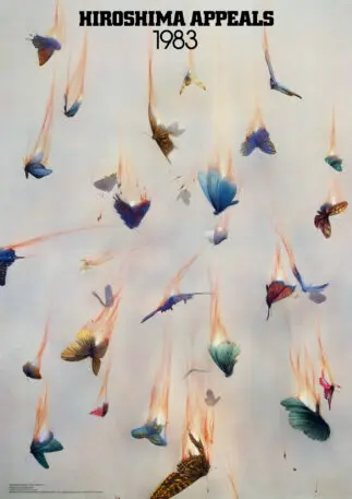
Hiroshima Appeals, 1983 (Kamekura Yūsaku)
The Hiroshima Appeals campaign—created by the Japanese Graphic Designers Association and the Hiroshima International Cultural Foundation—launched in 1983 with this devastating image promoting world peace.
The image shows the other side to the coin of economic growth—namely, pollution, deforestation, and questions regarding sustainability. It also addressed the critical issue of nuclear nonproliferation, following the bombings of Hiroshima and Nagasaki.
“A lot of designers responded to this environmental crisis, or the larger questions about peace, about nuclear disarmament, through creating posters that were not necessarily to sell a product, but to sell an idea,” Schoneveld says.

Nihon Buyō, 1981 (Ikkō Tanaka)
Whereas some of the posters in the show reflect Japan’s evolution within, this famous poster by Tanaka is more emblematic of the way the country leaned on its rich history and culture and fused it with design to present back to an international audience.
Created for the UCLA Asian Performing Arts Center to promote classical Japanese dance, this piece manages to invoke modernist principles while bringing a traditional nihon-buyō dancer to life through geometry.
In addition to becoming an iconic image that goes full circle to the arts of the Edo period, it serves as the creative DNA for the exhibition design of the Poster House show—replete with color, shape, and the spoils of Berman’s archive. “It felt like we were stepping inside of a poster,” Schoneveld says. “It’s amazing.”
Recognize your brand’s excellence by applying to this year’s Brands That Matter Awards before the final deadline, June 7.
Sign up for Brands That Matter notifications here.
