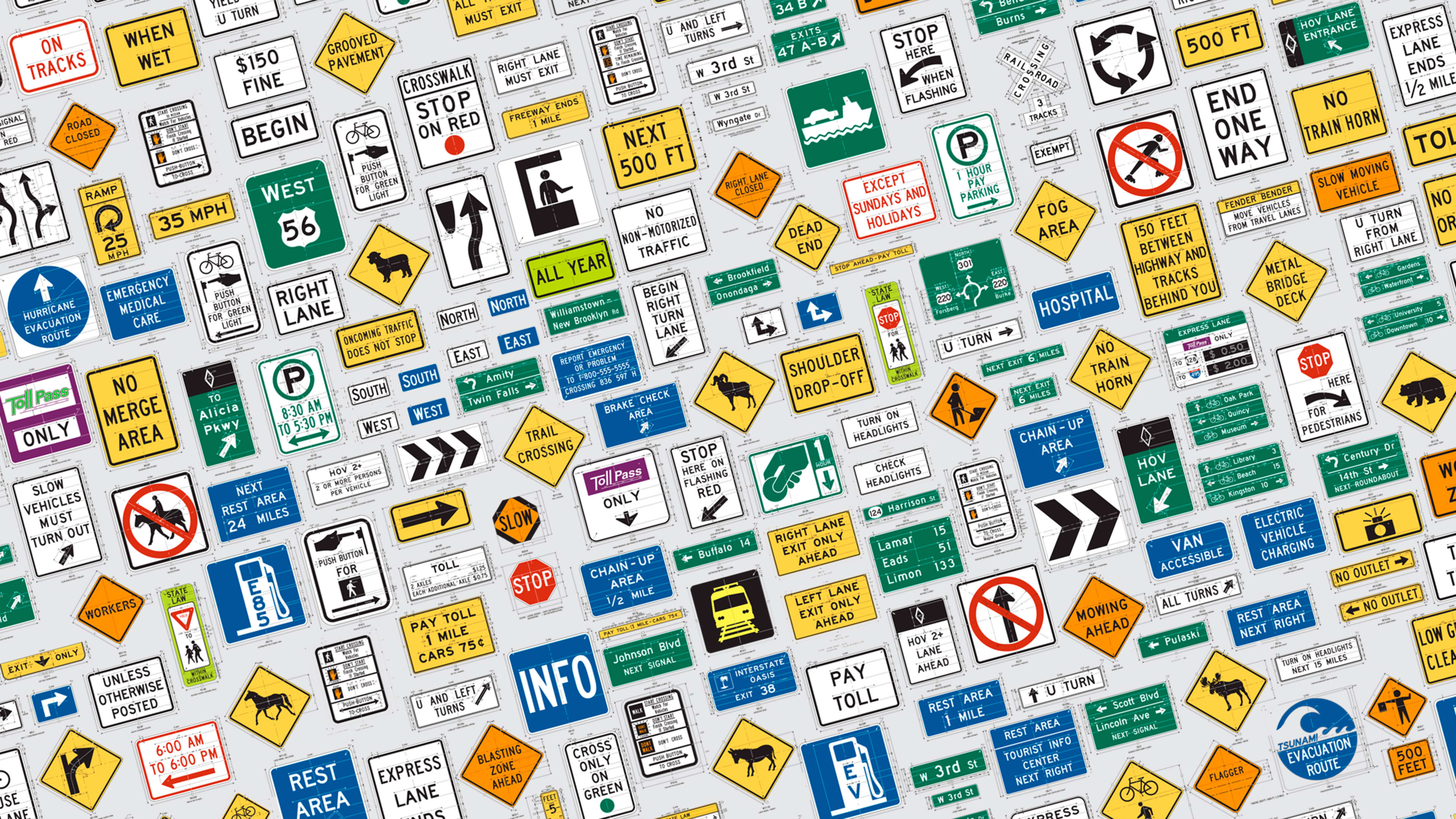
Driving across America today, you will encounter a dizzying variety of cultures, landscapes, people, and animals. But the one consistent thing that will stay the same from Maine to California are the signs you pass on the highway. And that is because America’s roads and highways have a big, fat style guide.
First published in 1935, the Federal Highway Administration’s (FHWA) Manual on Uniform Traffic Control (MUTCD) is a hefty tome consisting of close to 900 pages containing the federal standards for all traffic safety signs, roadway markings, and other “traffic control devices” that a driver on a road in the U.S. might encounter.
The MUTCD states that it “shall be recognized as the national standard for all traffic control devices installed on any street, highway, bikeway, or private road open to public travel.” Exact specifications for the font, size, spacing of letters, background colors, reflectivity, mounting location, and orientation help ensure that traffic signs are consistently readable at a glance while driving anywhere in the U.S.
The word uniform is key here, as you can only imagine the chaos if each state had its own version of stop signs and safety warnings. But states do have some freedom in the signs that they use.
Shall, Should, May
Within its pages, many of the rules are marked as “Standard”—along with the verb “shall,” indicating a mandatory or required rule. But some other rules are marked as “Guidance” (the state “should” follow this rule), “Option” (the state “may” follow this rule), or “Support,” which just offers extra information on the rule. The law offers states some flexibility in how they interpret the standards, and defines a process for experimenting with new signs and markers.
By law, each state is required to adopt the U.S. MUTCD as its standard, or supplement the national manual with its own state-specific amendments, or adopt its own manual altogether (as long as it is in “substantial conformance with the National Manual”). Ten states have their own MUTCD: California, Texas, Missouri, Minnesota, Utah, Michigan, Indiana, Ohio, Delaware, and Maryland.
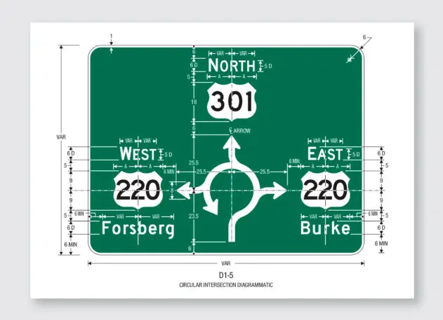
Here are some example passages from the federal MUTCD that illustrate the detail of the standards:
“The DO NOT ENTER sign, if used, should be placed directly in view of a road user at the point where a road user could wrongly enter a divided highway, one-way roadway, or ramp (see Figure 2B-12). The sign should be mounted on the right-hand side of the roadway, facing traffic that might enter the roadway or ramp in the wrong direction.”
Section 2B.37 DO NOT ENTER Sign (R5-1) – #2 (Guidance)
“The only acceptable alternative background colors for Street Name (D3-1 or D3-1a) signs shall be blue, brown, or white. Regardless of whether green, blue, or brown is used as the background color for Street Name (D3-1 or D3-1a) signs, the legend (and border, if used) shall be white. For Street Name signs that use a white background, the legend (and border, if used) shall be black.”
Section 2D.43 Street Name Signs (D3-1 or D3-1a) #18 (Standard)
“On multi-lane streets with speed limits greater than 40 mph, the lettering on post-mounted Street Name signs should be composed of initial upper-case letters at least 8 inches in height and lower-case letters at least 6 inches in height.”
Figure 2D-10. Street Name and Parking Signs – #5 (Guidance)
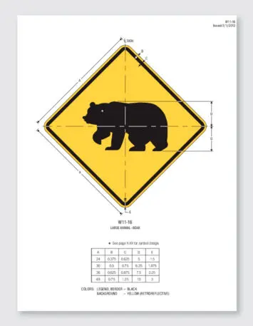
In addition to the MUTCD, the FHWA also publishes an accompanying guide called “Standard Highway Signs—Including Pavement Marking and Standard Alphabets.” This manual includes 375 pages of precise schematics for a wide variety of signs, indicating the exact shape of the ursine silhouette on the “W11-16 LARGE ANIMAL – BEAR” sign, the exact radius of the rounded corners of rest stop signs, and the distance between the peaks of the shield emblem that highway route numbers are enclosed in.
Controversial Typography
The official standard font used by the FHWA and the MUTCD is known as the Standard Alphabet, broken into six variations or series. The typeface is also commonly known as Highway Gothic.
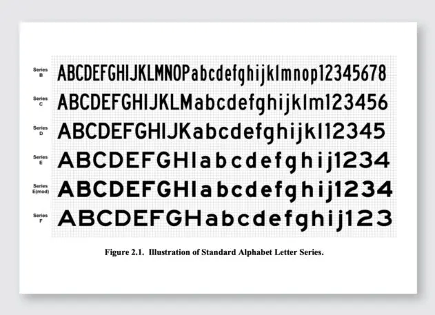
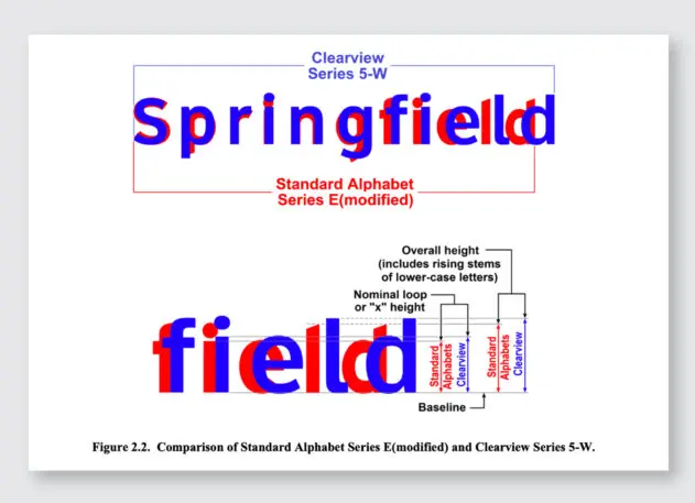
An attempt to update the 75-year-old typeface resulted in the 2003 release of a new font named Clearview intended to improve legibility when illuminated at night and in different driving conditions.
There was quite a bit of hype for Clearview at the time, with supporters claiming studies showed that signs with the new font led to a reduction in crashes, though this was statistically unproven. In 2004, the FHWA authorized provisional use of the font for traffic signs.
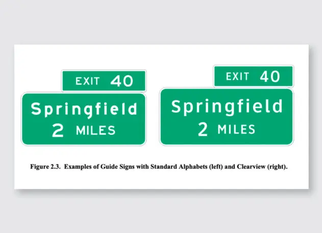
Big problems emerged when this new typeface was approved. When developing Clearview, the new font failed to match the readability of the Standard Alphabet typeface at the standard letter sizes defined by the MUTCD. The designers had to increase the letter size to achieve a higher degree of legibility. This created problems for sign manufacturing and design, as it changed long-held standards for sign dimensions. And though this typeface was merely approved as an option that states could use (in a limited number of circumstances), it created enormous confusion for state transportation departments who thought this might be a replacement for Standard Alphabet (it wasn’t). Such a complex and carefully considered system now had unhelpful ambiguity.
Of course, the bigger type required bigger signs, which cost more money . . . and the whole thing blew up. In 2016, 12 years after allowing Clearview, FHWA rescinded the font’s interim approval. The whole debacle resulted in a mandated report to Congress detailing exactly what went wrong during the whole episode.
An Evolving Document
Over the years, the MUTCD has been updated to reflect improvements to road safety and rapidly changing technology since the first edition was published in 1935.
It has also been updated to adapt to the realities of war. In 1942, there was a “War Emergency Edition” of the manual containing regulations for accommodating “blackout” conditions, including devices to minimize any ground-based reflectivity or illumination.
The 11th edition is due to be released in 2023, and people are eagerly anticipating its publication. Currently the FHWA is still collecting comments on the proposed amendments to the document, having received more than 17,000 comments from the public to date.
This obscure federal style guide has its fans. There is a Facebook group with 19,000 members titled “there is NO way that is MUTCD-compliant,” which collects examples of signs that are clearly (often hilariously) not compliant with MUTCD standards.
Republished with permission from Beautiful Public Data, a newsletter by Jon Keegan that curates visually interesting datasets collected by local, state, and federal government agencies.
To see more of the tools used to explore this data, read more at Beautiful Public Data. You can subscribe to the newsletter here.
Recognize your brand’s excellence by applying to this year’s Brands That Matter Awards before the early-rate deadline, May 3.