What would the letter “P” look like if Picasso drew it? And what about the letter “N” if Noguchi sculpted it?
The authors of a new book have used artificial intelligence to find the answers. Titled Artificial Typography, the book depicts 26 letters re-imagined through the lens of 52 artists. It was designed by Andrea Trabucco-Campos and Martín Azambuja, two alumni of design studio Pentagram who used the popular AI image generator Midjourney to conjure up striking letters that could not have existed in the real world.
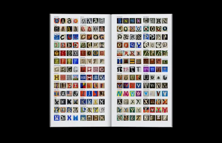
Each spread features two versions of a letter, as if each was interpreted by a different artist. “A” is for Jean Arp and Hilma af Klint, “B” is for Louise Bourgeois and Basquiat, and so on. Each letter was created using fairly simple text prompts, like “Letter ‘R’ in the jungle, painting by Henri Rousseau” or “Psychedelic art poster with a red letter ‘Y’ by Tanadori Yokoo.”
By creating stunning visuals from simple text descriptions, AI image generators like Midjourney or Dalle-2 have opened up big opportunities for designers and creatives looking for inspiration or testing out new ideas. They’ve also stirred controversy about the validity of an artwork that is generated by an algorithm–and questions about rights issues for artists whose work is protected but also available to be remixed by AI engines. But for Trabucco-Campos, the point of Midjourney isn’t to invalidate the work of an artist, but to act as a collaborator that lets creatives expand their horizons. “Our role shifts from designers to art directors and curators,” he says.
The curator’s role becomes apparent during two critical phases: choosing the right prompt and selecting the best image from the pool of options the generator spits out. The first involves enough knowledge and understanding of the artist’s style and body of work. A prompt like “Noguchi, black and white, on paper,” for example, would ignore the fact that Noguchi was mostly known for his sculptures, rendering the final image inauthentic. The second takes craft and judgment. “It puts an emphasis on art direction and the idea, which is what some of the best image makers spend their time on,” says Trambucco-Campos. “Once you achieve a certain level of craft, making doesn’t take you as long as the thinking before the making.”
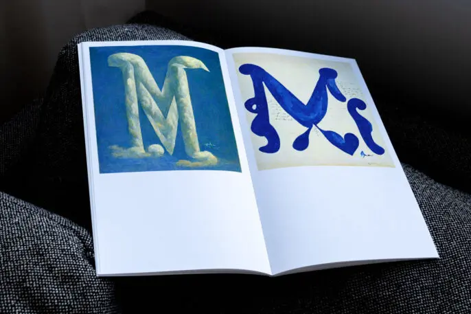
The results are enthralling. The “M” for Matisse is reminiscent of the French artist’s famous Blue Nudes. The “N” for Noguchi, depicted in textured stone, may well have been pulled from the archives of the Noguchi Museum. And the “T” for Turrel, with its radiant yet blurred boundaries, has a similar magnetic quality to that of a real-life installation of James Turrel, known for his large-scale, immersive light installations. But none of those associations are immediately apparent in the book, as the designers chose to leave the names out until the very end.
In the end, “it’s a history primer,” says Trabucco-Campos. It’s also a powerful example of what AI can do at the click of a button.
Recognize your brand’s excellence by applying to this year’s Brands That Matter Awards before the early-rate deadline, May 3.