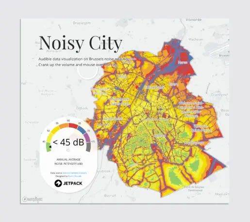
About two years ago, Karim Douïeb saw a map of Brussels, where he lived, in a local paper. The accompanying article talked about noise pollution in the city, but he didn’t think the map did the research justice. So, a few months later, the data scientist built his own—with an added twist.
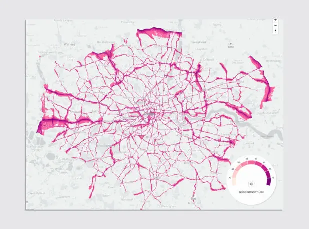
[Image: courtesy Jetpack]Noisy Citylets you scroll over an illustration of Brussels that looks a bit like a heat map: The quietest areas are portrayed in green, the loudest show up in purple. It’s a colorful feast for the eyes, but it’s actually all about the ears. That’s because Noisy City is an audible data-visualization map. You can toggle the sound on and off, move the cursor around, and experience how individual streets sound. “People could zoom in on their neighborhoods and realize what the noise pollution is,” says Douïeb, who runs a data-visualization company called Jetpack. Now, Douïeb has releasedthree more maps:of New York City, London, and Paris. While there are some limitations to them, they bring much-needed awareness—and a visceral reaction—to a problem that can only be experienced with your ears.
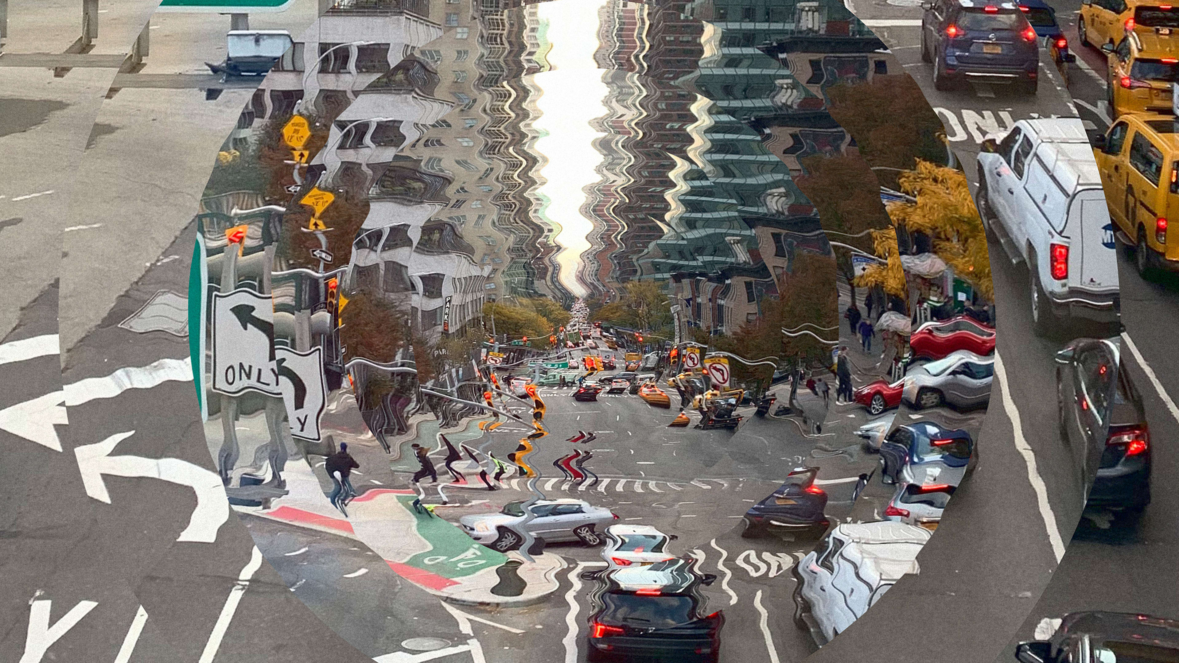
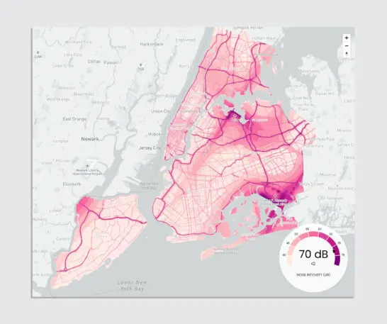
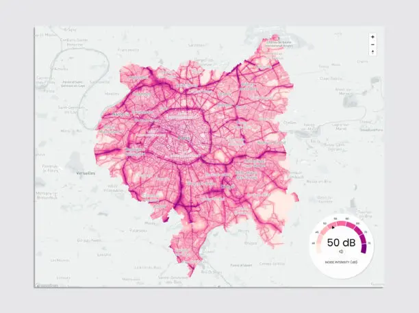
New York [Image: courtesy Jetpack]Noise pollutionis more than a source of irritation. According to the European Environmental Agency, noise exposure is thesecond cause of poor healthin Western Europe, after air pollution. Prolonged exposure to loud noise has been linked with premature death in the elderly population, and it can cause high blood pressure, heart disease, sleep disturbance, and stress.Paris [Image: courtesy Jetpack]The main culprit here is road traffic. (Fittingly, the maps were commissioned byPossible, an organization advocating for car-free cities.) Looking and listening to the maps confirm this immediately. The darkest lines and loudest regions on the Paris map point to the series of highways in and around the capital, as well as the Seine, which is flanked by big boulevards and constantly humming with boats. In New York City, Brooklyn’s BQE highway shows up in dark purple together with big dark clusters around LaGuardia and JFK airports. (The JFK cluster stretches out as far as Rockaway Beach in Queens, and according to a 2017 study, living under a flight path couldincrease the riskof developing high blood pressure or having a stroke.)
Paris [Image: courtesy Jetpack]Ultimately, data visualization is only as complete as the data, which show a few gaps here. The maps include various degrees of road traffic data and airport traffic noise, but omit construction noise, which is omnipresent in many big cities. Some data, like in New York City, are collected from such organizations as the U.S. Department of Transportation. Others, like London, are entirely modeled and only show traffic from main roads.
Either way, the collected data aggregate to an average, which can be misleading: If you were to map out noise pollution during rush hour, you’d likely get a completely different result. Despite all that, the visceral reaction is there: When I zoomed in on my neighborhood in Brooklyn, the map crystallized what I already knew: that two bridges, one train track, and the nearby elevated highway make it one of the loudest places in this city.
Recognize your brand’s excellence by applying to this year’s Brands That Matter Awards before the early-rate deadline, May 3.
ABOUT THE AUTHOR
Elissaveta is a design writer based in Brooklyn. Her writing has appeared in The Atlantic, Wired, CityLab, Conde Nast Traveler, and many othersMore