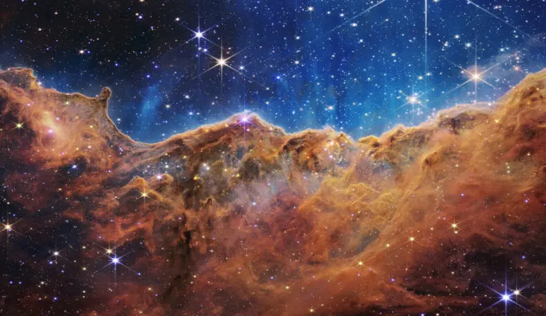
When the first batch of images from the James Webb Space Telescope were released to the public last week, people around the world were treated to a flurry of dazzling and colorful glimpses into deep space. They show sparkling swirls of galaxies, the emanating cosmic dust of the Southern Ring Nebula, and the painterly landscape view of so-called cosmic cliffs.
The images are a treat for the eyes. And through a unique and dedicated effort by a team of writers and scientists, they’re also a treat for those unable to see.
The images coming back from the Webb telescope are all being given detailed alternative-text descriptions—word versions of images that are processed into sound by the screen reader software used by people with visual impairments. Alt text is a keystone of inclusive and accessible design on the internet, allowing people to access online resources in multiple ways. The alt text for the new images from the Webb telescope are being heralded as exemplary.
Margaret W. Carruthers, deputy branch manager for writing and design at STScI, says the process of turning these images into text is kind of a design endeavor. “I think of this writing as an engineering design problem,” she says. “In this case, we have these graphics that are really important and conveying a lot of information, but some people can’t access them.”

The alt text puts it into words: “Image of a group of five galaxies that appear close to each other in the sky: two in the middle, one toward the top, one to the upper left, and one toward the bottom. Four of the five appear to be touching. One is somewhat separated. In the image, the galaxies are large relative to the hundreds of much smaller (more distant) galaxies in the background. All five galaxies have bright white cores. Each has a slightly different size, shape, structure, and coloring. Scattered across the image, in front of the galaxies, are a number of foreground stars with diffraction spikes: bright white points, each with eight bright lines radiating out from the center.”

The team has also found other tricks for making these alt text descriptions as useful as possible. Directional words are helpful, especially when explaining a variety of objects in relation to each other. Also important are geometric terms, such as circles, diamonds, or swirls. And because the universe is in constant flux, Carruthers says, “you also need to convey the dynamics you see there, the sense of action.”

That became very clear when the team started sharing some of these alt text descriptions with people who use screen readers. “When we started working more directly with people who are actually using these descriptions, we realized that’s not actually the best practice,” says Rhue. “So we decided, let’s bump this up.”
Now the alt text can stretch up to 1,024 characters, or about 350 words. Writing a description that short is one challenge. A bigger one is making the description accurately reflect what’s in the image—and creating what’s hopefully a similar image in the mind of the person who’s reading it.
“I aim for a description that you could take—not having seen the image—and you could make a sketch that pretty much looks like what we have,” says Carruthers.
In fact, Carruthers did that exercise: reading her description to other team members without showing them the image and asking them to sketch what they visualized. “We could see, oh that worked well; but hold on, they totally came up with something else when I used a particular word,” she says. “It really helped a lot for how to frame things.”
STScI had additional guidance from Prime Access Consulting, a firm that works with museums and other educational institutions on inclusive design and accessibility. Rhue says they helped create a specific style guide that STScI’s writers and editors can use to ensure future alt text descriptions are accessible and comprehensible. The alt text creation team also includes an audience reviewer who has a visual impairment, and Rhue hopes to expand the number of people with disabilities reviewing the text before publication.
Rhue says it’s also important to make them interesting, which helps bolster the case for more science, and perhaps even more people entering the sciences. “If we can generate descriptions that grab people’s attention and make them want more, then we’re doing our job,” he says.
As more images come back from the space telescope during its anticipated decades-long mission, the team of writers, editors, and astronomers will continue this process of translation and interpretation for every image published on STScI’s websites. It’s a multistep process; the images collected by the Webb telescope are mostly in the infrared section of the electromagnetic spectrum, and therefore invisible to human eyes. These images have to be processed for the sighted to be able to see them, and then processed again for those with visual impairments.
Carruthers says this process is all in service of explaining the universe to people. “If nothing else, we need to be accurate,” she says. “I think we can also be evocative and beautiful.”
Recognize your brand’s excellence by applying to this year’s Brands That Matter Awards before the early-rate deadline, May 3.