I used to be embarrassed that I often buy books based on their cover, but I’m not anymore: Book covers are a labor of love, filled with artistry and design.
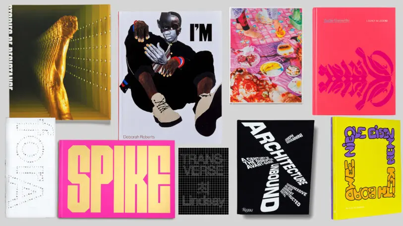
That’s the animating force behind the annual 50 Books | 50 Covers list, which was just released by AIGA, a professional association for the design industry. The competition, which first began in 1923, offers insight into this particular moment in time, where there’s a growing diversity in design as well as a fixation with typography.
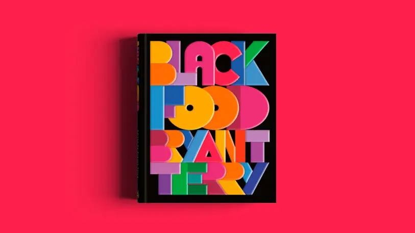
One notable example of this is Black Food by Bryant Terry, which is a cookbook. But in an unusual move, there’s no food photography on the cover, but rather just bold, fun, multicolored typography. “It’s using type to create something that felt appetizing, but also speaks to black culture,” Munro says. “It’s embodying the chef who wrote it, and there’s just a vitality there that you don’t forget.”
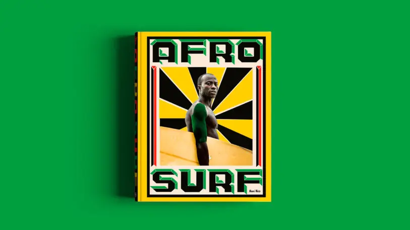
Afro Surf, by surfer Selema Masekela, for instance, is about surf culture in the African continent and features a picture of a Black surfer staring directly at the reader, surrounded by green, yellow, and red graphics that call to mind African visual culture. It reflects the content of the book, which is about a pastime that brings joy, but it also engages with current conversations around systemic oppression by discussing how Black surfers are redefining a sport that has been historically white. “It’s about who’s visible, who’s included,” Munro says.
As they culled through the many books to come up with this list, Munro says an underlying question was what is the value of a book in our world. He argues that in our tumultuous times, full of political polarization, climate disasters, and a pandemic, books play an important role because they help people escape. “Books can transport you somewhere else and open up new worlds,” he says. “Having a beautiful, resonant book is a real treasure: It’s an expression of knowledge or storytelling that can give us hope.”
Recognize your brand’s excellence by applying to this year’s Brands That Matter Awards before the early-rate deadline, May 3.