About four years ago, I received a surprising email—not surprising because of what it said, but because of the way it looked. The text was set in Courier, that font you see in movies when hackers write code on a black screen. The email became sort of a running joke at the office, and I couldn’t take this person seriously when they emailed again.
That’s judgmental, I know, but it turns out I’m not alone. A new study suggests that fonts can indeed change the way we feel about a certain message. The study was run by Monotype, the world’s biggest type foundry, which partnered with applied neuroscience company Neurons. Together, they surveyed 400 people in the UK, who were presented with different words laid out in three contrasting types. The scope of the study is fairly small, and the motivations behind a type foundry publicizing a study about the impact of type can’t be ignored. But the study does confirm one thing: Fonts are subjective, and they can mean different things to different people.


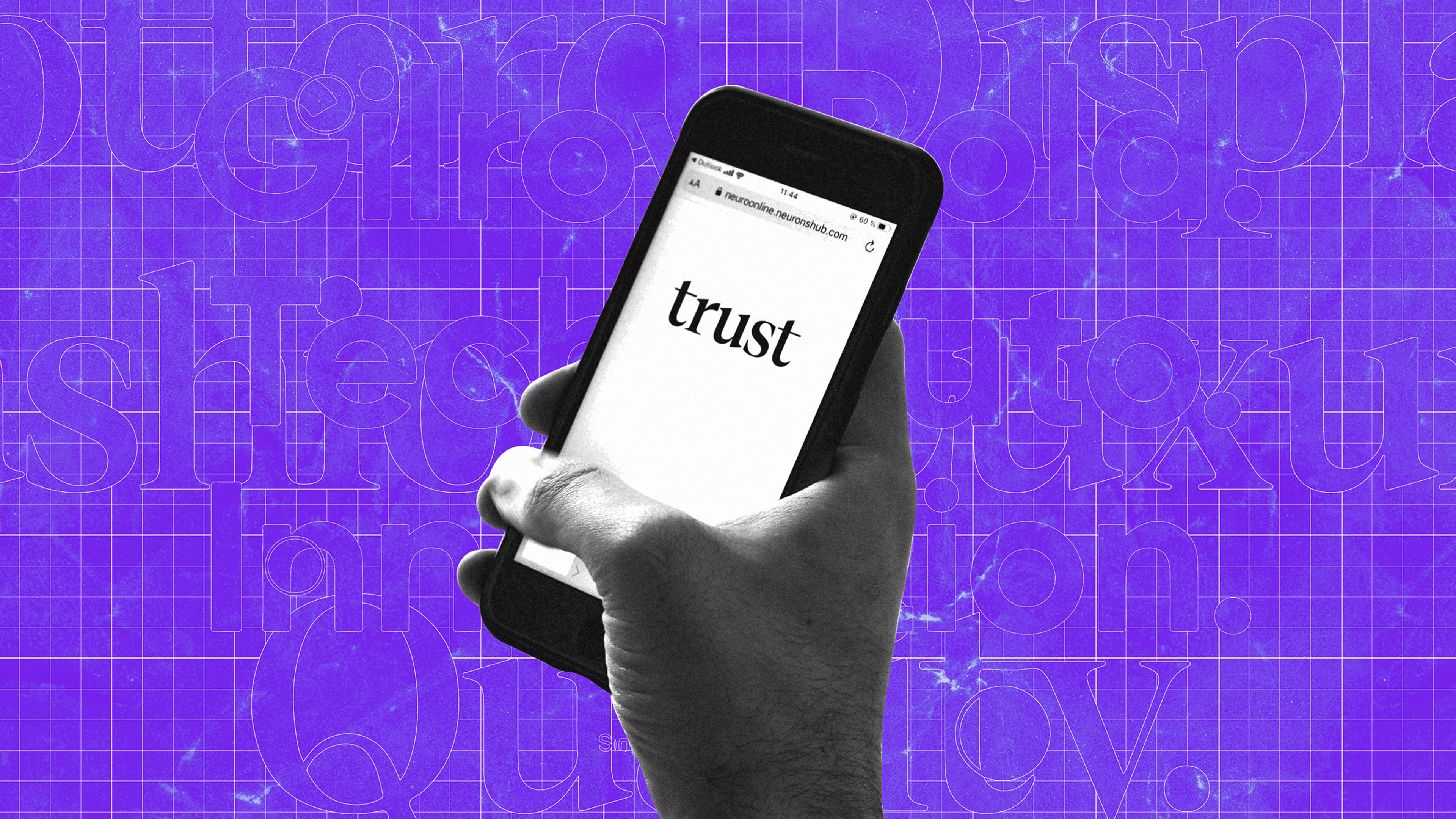
In total, the team surveyed 400 men and women between the ages of 18 and 50. Each participant took the survey online and was given three kinds of stimuli: single words (“quality,” “trust,” and “innovation), those same words in a sentence (“quality never goes out of style”) and that same sentence coupled with the name of a random brand (like Skova or Smith’s Bank).
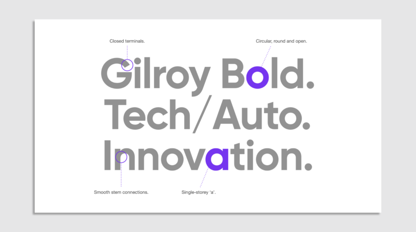
Each of these stimuli was set in three contrasting typefaces: FS Jack, a soft, lightweight sans serif; Gilroy, a bolder, more geometric sans serif; and Cotford, a serif font that looks more historical. (Monotype designed two of the three fonts, excluding Gilroy.)

As Ramsøy explains, some fonts can trigger existing associations with nostalgic brands. “Winding fonts work great for grandma’s jam products,” he says. To avoid preexisting associations, the team chose fonts that aren’t directly associated with particular brands but can be associated with three sectors more broadly: Gilroy for the tech industry; Cotford for luxury and fashion; and FS Jack for banking and financial services (in other words, a large sampling of Monotype’s client portfolio).

Ultimately, she admits, the study only scratches the surface. Do older people prefer the same type as younger folks? Is there a gender bias? What happens when you add 10 or 20 more fonts to the equation? And do results vary based on where you live? The team didn’t study any of these factors, but Storm says a more in-depth study could help them dig in more. “We would be very interested in looking at demographical and regional differences, to see if culture has a large impact on this,” he says.
For now, we know that different fonts can elicit different emotions based on the same word. And given that participants were given between half a second and 2.5 seconds to choose (most answered within 1 second), it’s clear that those reactions come from the gut. Until a more in-depth study can be run, that’s a promising start.
In the meantime, I know where I stand on Courier.
Recognize your brand’s excellence by applying to this year’s Brands That Matter Awards before the final deadline, June 7.
Sign up for Brands That Matter notifications here.
