When Casey Eye Institute set out to build its new Elks Children’s Eye Clinic in Portland, Oregon, the institute’s director, Dr. David Wilson, knew that for the patients he was serving, it had to be a different kind of building.
“We, as a culture, have determined that vision at the level of 20/40 is what we’re going to design to,” Wilson says, of a vision level considered to be slightly worse than the 20/20 average. Though that level works fine for most people, those with vision impairments or vision loss—the exact people coming to an eye clinic—will have a harder time seeing and navigating their way through a space.

It’s a problem Wilson sees every day in the Casey Eye Institute’s main facility, right next door, on the campus of the Oregon Health & Science University. The clinic has small signage, excessive glare, and interior colors that are hard for people with limited vision to differentiate and navigate. Wilson met weekly with the architecture firm NBBJ, which was designing the new space, to ensure those problems weren’t repeated.

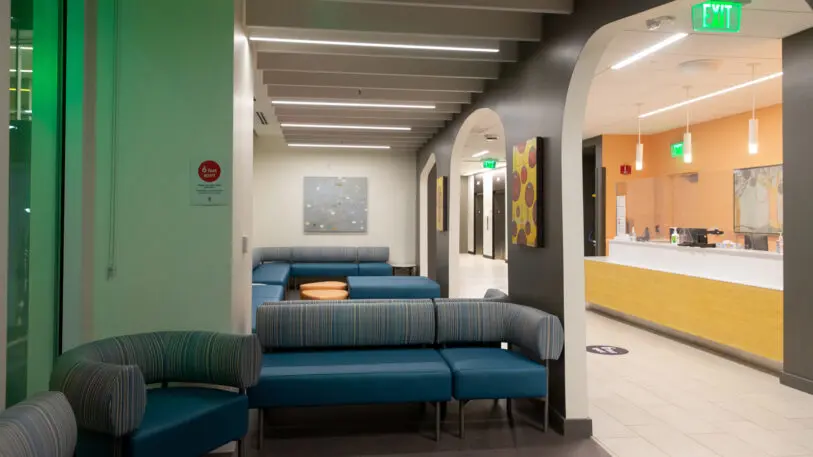
“Some of the initial challenges a patient faces when they enter a building [are] right when they come in the front door,” says Wilson. It was important that the new clinic have large reception desks located just inside the building’s entrances, and for these staffed desks to have high contrast in their colors to be more visible to patients. The ground floor front desk is bright white with a black slatted wood wall treatment behind. The curved desk also includes a handrail that leads directly to the elevators, allowing people with limited or zero visibility to more easily make their way to other floors of the building.

Flooring was another important consideration, Wilson says. To reduce the risk of tripping, particularly among the clinic’s older patients, no carpeting was used in the space, and junctions between floor materials were made as seamless as possible. (Name aside, the new facility sees patients of all ages.)

Alex Almerico, an interior designer at NBBJ, says the design also paid close attention to other materials and objects that could pose problems to people with limited vision: Furniture is placed only in specific parts of waiting areas to reduce bump or trip hazards; colors and textures on floors help to differentiate spaces, like walkways and reception areas; surfaces were given matte or textured finishes instead of polished or reflective surfaces that might cause a glare; dark colored hallways have brighter wood doors to indicate patient exam rooms.
In the institute’s other building, Almerico says, little thought seemed to have been given to what it’s like for someone with limited sight. “In both the elevator lobby and the existing clinic, it was just a sea of white walls and white doors. When we were there observing, we saw patients who were literally using their hands to walk down the wall,” she says.

Part of the way the designers envisioned such a space was to attempt to see it through the eyes of patients. They developed a series of filters to overlay on top of their design renderings to show how the space might be seen by someone with limited vision: A cataracts filter put a fuzzy blur around most edges; a glaucoma filter made the space look like a narrowing tunnel; a macular degeneration filter put a dark black hole in the middle of the viewpoint.
“Being able to lay [the filters] onto the rendering and just consider that others who are coming to the space don’t see it the same way as you just kind of reinforced our decision-making and helped us to be a little bit more empathetic to how others experience the space,” Almerico says.

But she says the design isn’t intended to have some specialized treatment that only optimizes it for those with major eye issues. Some design elements serve all patients equally well. “Each of their patients sees space in a different way, so there’s not a one-size-fits-all solution,” Almerico says. What they have in common is low-contrast sensitivity, or a hard time differentiating spaces and surfaces without strong color contrasts. “Each of these conditions is impairing their vision in different ways, and each of them would benefit from enhanced contrast.”
Almerico says these should be considered best practices for other interiors. Improving the legibility of a space for those with limited vision, she argues, helps everyone using it. “I’ve already found myself moving on to other projects and implementing similar practices,” she says.
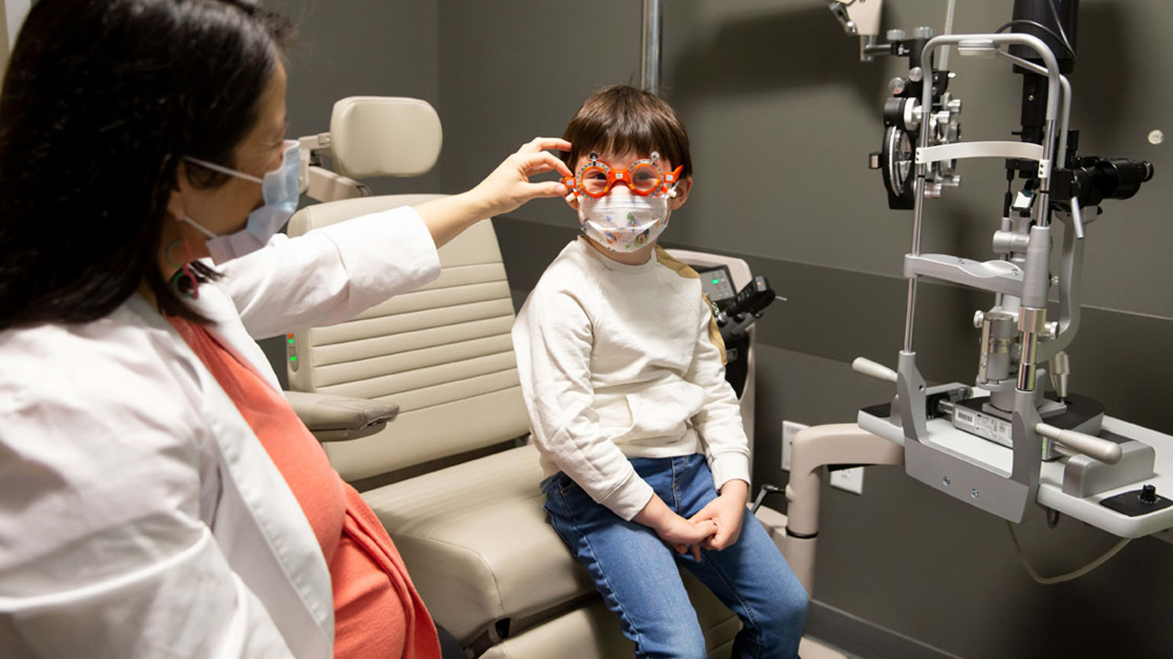
Even for the clinic’s patients without major vision problems—the majority, in fact, of the roughly 150,000 patients the building will serve annually—the design focuses on cutting down the potential challenges a trip to the eye doctor can present. The big one: light sensitivity due to the pupil dilation required for many eye exams. “There are sub-waiting areas within the patient exam areas so [dilated patients] don’t have to go out into the main patient areas, which are brighter,” Wilson says.
The clinic treats other more specific vision issues, including macular degeneration, which is the leading cause of blindness in older Americans, as well as inherited diseases in children. Gene therapy, an emerging treatment in ophthalmology, is one way the clinic addresses these inherited conditions. The clinic has a specially designed room to help assess the success of gene therapy treatments. One of few such facilities in the U.S., it’s an auditorium-size reconfigurable maze that patients navigate under different light conditions in order to compare their vision before and after treatments.

Adding this kind of clinical space to the facility was a novel move, but the bigger challenge for the design, Wilson says, was simply changing some of the standards that OHSU uses for branding and signage on a campus that includes both public research facilities and patient-focused clinical spaces. Using bigger lettering, Wilson says, took some convincing.
“One of our strongest arguments was that these design concepts aren’t really just for our building,” Wilson says. “We aren’t asking for a deviation. We’re really asking you to use these design concepts in all of OHSU’s buildings.”
The clinic may get a chance to expand these design ideas soon. The institute’s other facility, a building adjacent to the new one, is preparing to undergo its own redesign, and Wilson says many design elements will be repeated there. He says the vision-focused design of the clinic shows not just how to serve people on the rare days they go to the eye doctor, but also how to make their day-to-day lives easier. “What’s relevant for our building is equally relevant for every building in any city,” he says.
Recognize your brand’s excellence by applying to this year’s Brands That Matter Awards before the final deadline, June 7.
Sign up for Brands That Matter notifications here.
