Tracking the spread of COVID-19 through testing data has its limits. Not everyone has access to tests, for instance, and people who are asymptomatic may not even seek a test out. These and other blind spots were especially evident during the recent wave of the omicron variant, which spread so rapidly in some communities that people couldn’t find a COVID-19 test even if they wanted one.
Now a new data tool from the Centers for Disease Control and Prevention (CDC) aims to fill in some of those gaps by measuring levels of SARS-CoV-2 in wastewater. The public health agency recently updated its suite of tracking tools to include data from the National Wastewater Surveillance System, which was launched in September 2020 to help monitor levels of the virus at the community level.
“People infected with SARS-CoV-2 can shed the virus in their feces, even if they don’t have symptoms,” the CDC writes. “The virus can then be detected in wastewater, enabling wastewater surveillance to capture presence of SARS-CoV-2 shed by people with and without symptoms.”
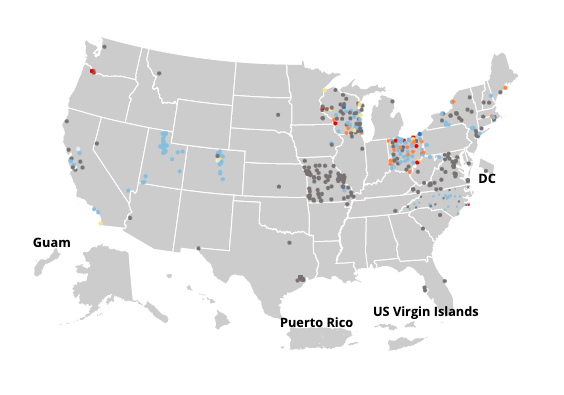
The tool includes a dashboard that lets you search for your state and county, along with an interactive map. Color-coded dots show you how much SARS-CoV-2 RNA levels have either increased or decreased in your area over the last 15 days. The map also lets you view proportions over that same period. The data is sourced from wastewater treatment plants and updated nightly at 8 p.m. ET.
As it stands right now, the map is a bit spotty. If you scroll around, you’ll notice a lot of gray dots, which indicate that there is not enough data in those areas to get a proper reading. But hopefully that will change as more data comes in. The good news is, you’ll also see a lot of blue dots in the percentage map, which indicates that the percentage of the virus has decreased in a lot of areas over the last two weeks.
That said, proportions of the virus remain very high throughout the country. Omicron may be trending downward from peak levels of a few weeks ago, but it has by no means fizzled out yet.
You can check out the CDC’s new map and dashboard here.
Recognize your brand’s excellence by applying to this year’s Brands That Matter Awards before the early-rate deadline, May 3.