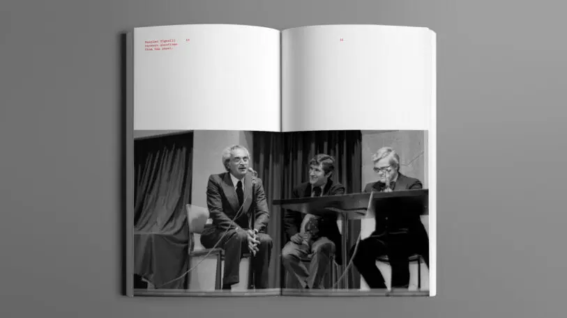
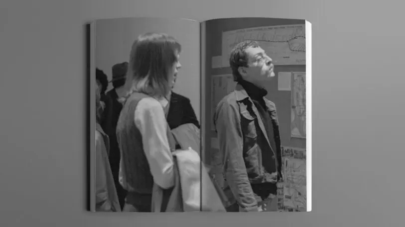
In 1978, The Cooper Union, an art school in New York City, held a debate between two designers that would determine the future of information design for the largest public transit system in the world. But proof that it happened was elusive until now.
Last summer, filmmaker Gary Hustwit found a recording of the event that had never been made public. Hustwit, along with Standards Manual and design agency Order, is now publishing a transcript of the recording and images for the first time in a new book called The New York City Map Debate, with a foreword by Pentagram partner (and map lover) Paula Scher. The transcript reveals entreaties and insults. Powerful evidence backing each side. At the end of the day, it wasn’t just a heated design drama. It was a microcosm of shifting design tastes away from stripped down minimalism—and the result had real implications for subway riders for decades. “The ideas here about communication, about data visualization, about how to present a lot of complex information—some of the ideas from both sides still apply [today] even though we’re barely using paper maps,” Hustwit says.

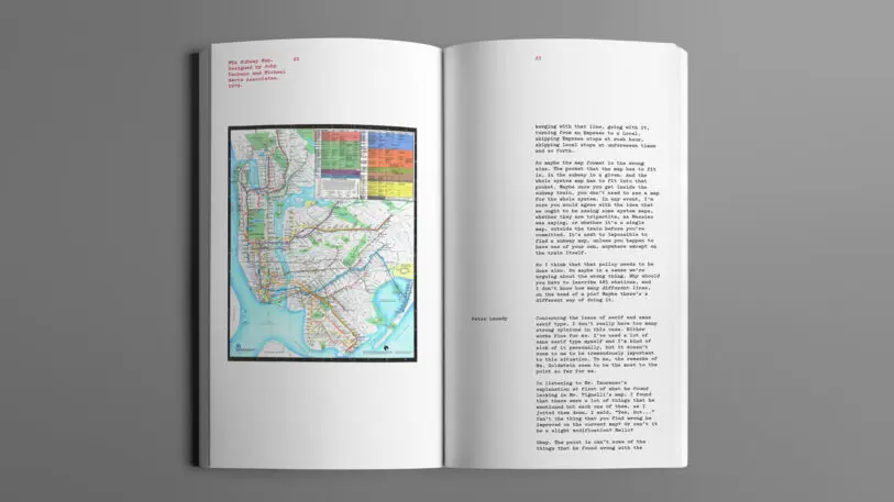
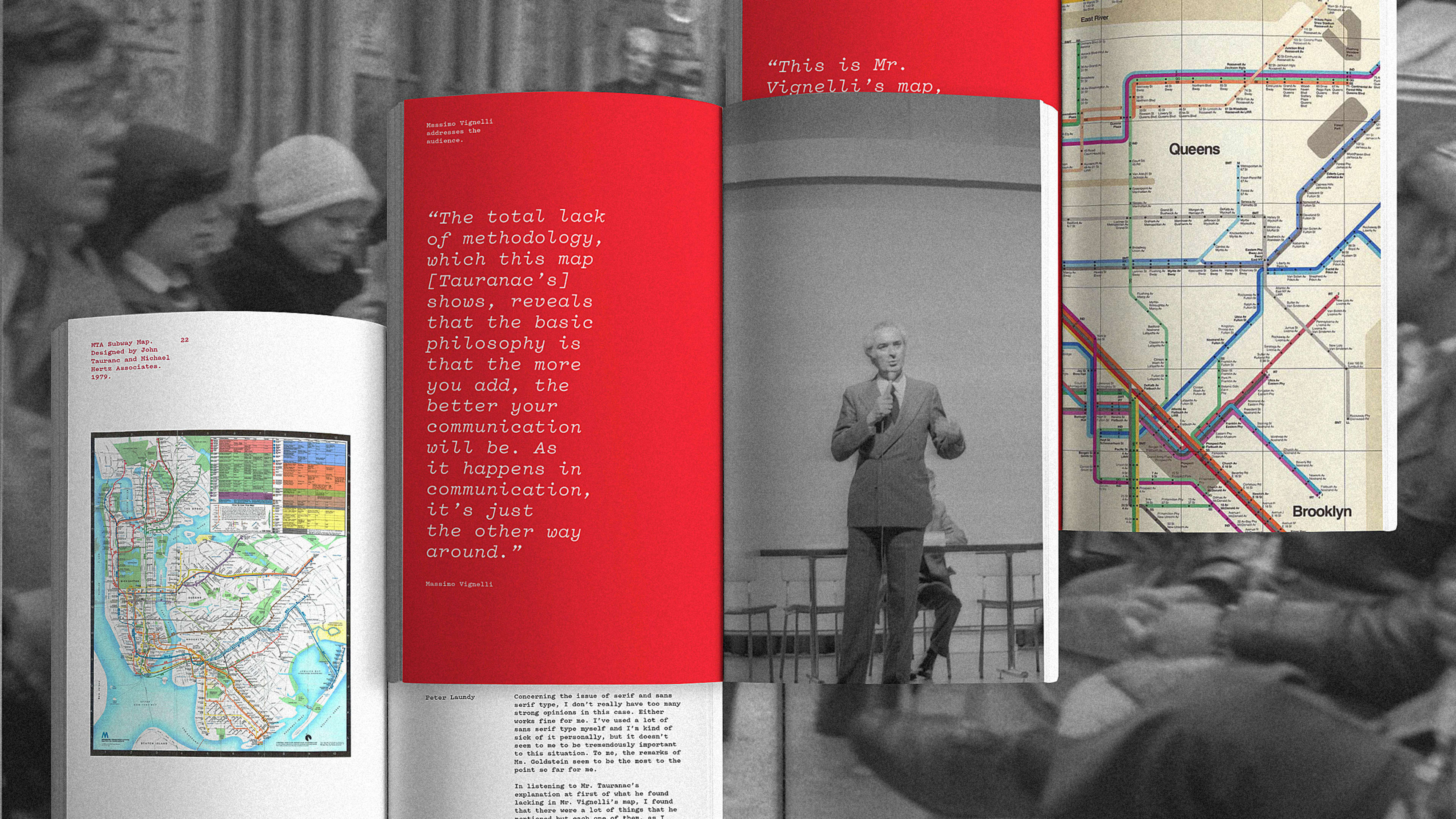
To Vignelli, those were unnecessary details. But it created confusion, according to Hustwit. And a counter movement to replace it emerged, led by the chair of the MTA Subway Map committee, John Tauranac. Tauranac worked with design firm Hertz Associates to develop an alternative map that showed more information about the city and streets. “Vignelli had stripped down [the map] with as little as you need,” Hustwit says. “Tauranac wanted as much information as possible.” The stage was set for when it all came to a head in 1978: Would the city’s subway map be minimalist? Or maximalist?
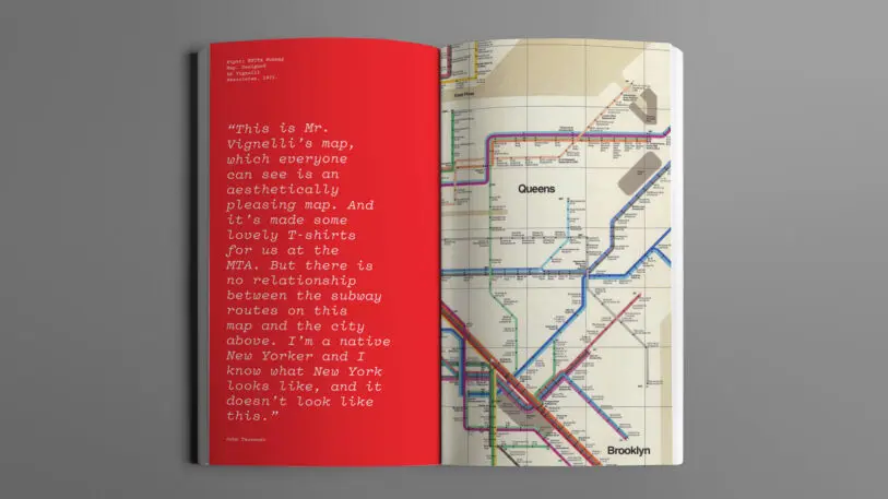
Vignelli pointed to his map’s simplicity and rationality, methodically showing subway maps around the world as precedent. Tauranac made the case that it should resemble the geography of the city as much as possible. Ultimately, it came down to politics, personalities, and people who “really hated” the Vignelli map, according to Hustwit. “The total lack of methodology, which this map [Tauranac’s] shows, reveals that the basic philosophy is that the more you add, the better your communication will be,” Vignelli said. “As it happens in communication, it’s just the opposite way around.” Tauranac countered: “This is Mr. Vignelli’s map, which everyone can see is an aesthetically pleasing map. And it’s made some lovely T-shirts for us at the MTA. But there is no relationship between the subway routes and the city above. I’m a native New Yorker, and I know what New York looks like, and it doesn’t look like this.”
The debate got at some pretty existential design questions. “How much information do you need to communicate something?” asked Hustwit. Determining the right amount of information, the right design or visualization for each context is “the challenge any communication designer faces,” Hustwit says, whether it’s one word or an entire brand. These subway maps exemplified two opposing approaches.
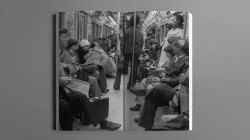
The debate was also a microcosm for a larger shifting of the design winds in the late seventies, with Vignelli’s map as collateral damage in the move from modern minimalism to postmodern maximalism. “[Vignelli] was trying to bring order to a very chaotic environment through design. Through the signage of the subway and the map, it was his way of trying to bring logic and clarity and clear communication to a city that was not about it at all,” says Hustwit. “He tried to use graphic design and wayfinding to clean it up. Looking back, it was a futile attempt.” Hustwit kindly suggests that both sides won: Vignelli’s 1972 map is now considered a work of art, and Tuaranac and Hertz’s late ’70s version lives on in subway cars to this day.
But Tuaranac’s map is far from perfect. As my colleague Mark Wilson wrote last year, “It’s more geographically accurate, but it actually condenses information that was in the Vignelli map. For example, it combines individual train lines such as the C, D, and E lines into singular trunks.” That makes it difficult for the MTA to convey when individual lines are not running or have been rerouted. So the MTA and design agency Work&Co tried to rectify some of the problems in Tuaranac’s map with an app released last year. It combines the best of both the Vignelli and the Tuaranac maps—let’s just call it a truce.
Recognize your brand’s excellence by applying to this year’s Brands That Matter Awards before the early-rate deadline, May 3.