When Google’s Chrome OS was released in 2011—a desktop operating system made to be powered by low-cost computers dubbed Chromebooks—it was tough to know if this was the sort of initiative Google would launch and let die within three years, or whether it was a real game-changer in the market, like Android. After all, Google experiments with moonshot ideas all the time, then cancels them.
Ten years later, I think we have our answer. Chrome OS is now the second most popular desktop operating system in the world. It has edged out Apple’s macOS, trailing only behind Microsoft’s Windows, which still commands a roughly 75% share of the market. As students began learning from home in 2020, Chrome OS, the operating system on Chromebooks, only asserted more of its prominence, with sales growing 122% in Q3. Chromebooks have been the most popular option for K-12 classrooms in the United States for years, and today, 40 million students learn on these devices. (Seventy-one percent of all Chromebooks are used for educational purposes, while 23% are purchased by general consumers and 6% for business, according to IDC data.)
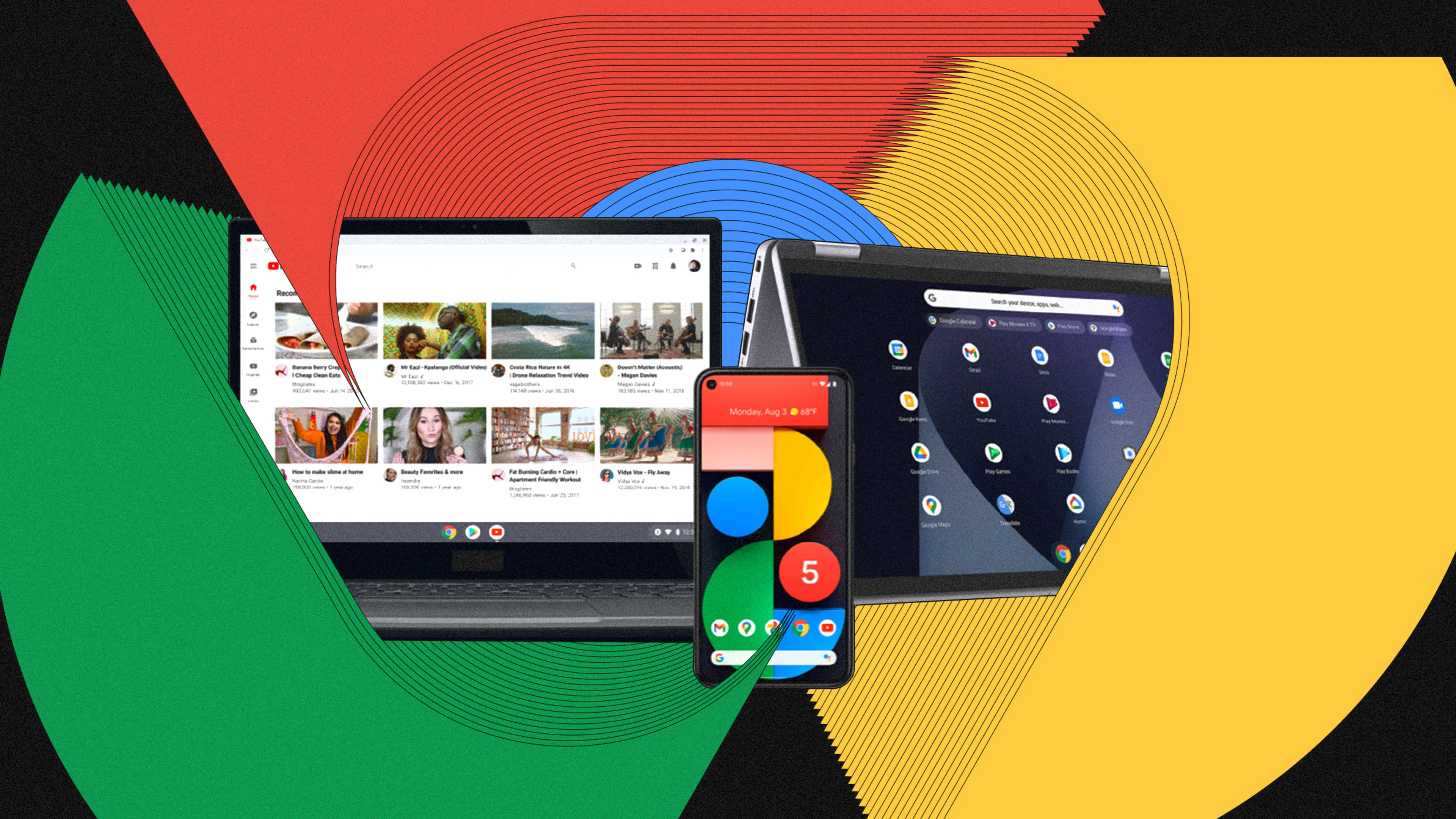
By design, Chrome OS and Chromebooks live hand-in-hand. The operating system was built around the web browser to run smoothly on a computer without much processing power or storage. And that means you can pick up a Chromebook for as little as $110, though fancier options, with convertible tablets and premium finishes, can still top $1,000.
But cheap does not guarantee success. As Chrome OS turns 10, we talked to Jenn Chen, the UX lead on Chrome OS, about what the team has learned during her last nine years working on the platform.
“During early days of Chrome OS, we were pretty scrappy, learning a lot as we went,” says Chen. She points to two bold decisions that the team made out of the gate that would go on to define the platform—but only after the team listened to user feedback and iterated on them a lot. Whereas Android gets one major release with big updates each year, Chrome OS is in constant flux, currently on its 89th release. And over those updates, Google realized that there could be no one approach to user interface to rule them all. Rather, people use computers in vastly different ways, and Google needed to accommodate them.
[Images: Google]
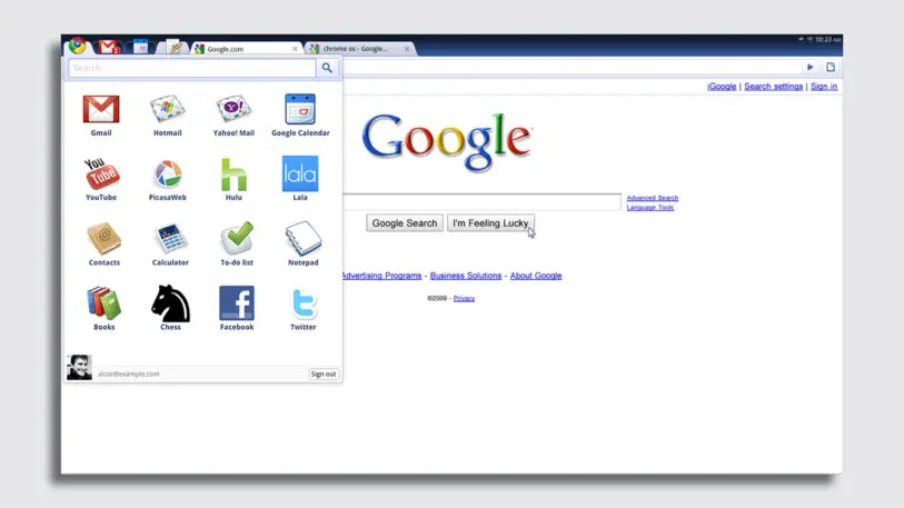
Learning how to touch
Google’s first reference Chromebook (a demo device meant to be cloned by other manufacturers) offered something rare for laptops of that era. It included a touchscreen, putting it halfway between a notebook and a tablet or smartphone.
“That was our concept car moment that we thought touch was really important,” says Chen. “Smartphones were [mostly] ubiquitous, [but] touchscreen modes were a gimmick on computers.”
Chen is the first to admit that the touchscreen experience on early Chromebooks was pretty lousy. The initial focus was, just make everything you can normally tap with your mouse be tappable with your finger. Offer one-to-one parity, and the OS will be touch capable!
Yet an early proof point for Google that touch was worth pursuing was when designers studied classrooms, because that’s where manufacturers were building the earliest Chromebooks which were touch capable, complete with options like notebooks that could fold into tablets.
“One of the things that clicked for me was a pilot we did with one of our first convertible Chromebooks in a classroom, seeing how young kids without motor dexterity used to have to sit in a classroom and be taught how to drag and drop,” says Chen. “It’s not an easy behavior! It’s really hard to move a tiny cursor with a touchpad or mouse, and classrooms were often using a lot of time teaching kids how to do that.” But touching is an intuitive behavior, without any sort of skill for a child to master.
Today, if you’re using a convertible Chromebook, like the Lenovo Duet, the touch options are far more mature than in the early days, and subtly hint that the screen can be touched in case you don’t know. When you take a screengrab in notebook mode, a sizable button appears on screen, reading “annotate image.” You can tap it to to be automatically ushered to Google’s Chrome app called Canvas, where you can start scribbling. Or you can even grab the tablet off the keyboard to more comfortably draw on the image you just captured.
Battling claustrophobia
Touch was a good idea in Chrome OS that just needed to be polished, and polished more, before it was integral to the experience. You could say that touch was a good idea that was poorly implemented at the start.
Chrome’s other big UI gamble, around the management of windows, was different. It was a bad idea with perfect implementation. And so the team had to go back to its own assumptions to rebuild it.
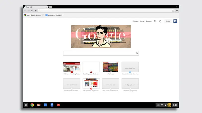
“Content not chrome” was a mantra of that era, arguing that the filigree and framing of UI was less important than all the actual information on your screen. Full screen apps grew popular on the iPhone, where limitations in memory often meant only one app could be open at a time. Then Microsoft made full-screen apps standard in the Windows 8 Metro design language, and had you toggle between pieces of software like PowerPoint slides. Chrome OS went the same direction. Googlers insisted that the browser was what we spent most of our time in anyway, so why not just make the OS a giant browser and be done?
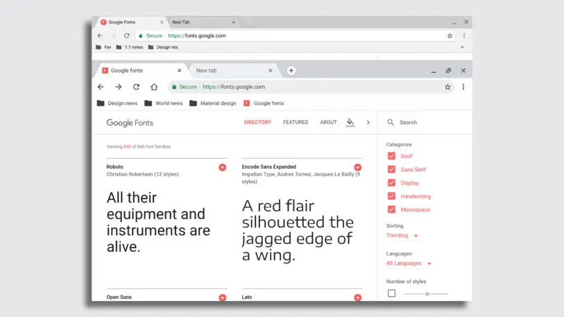
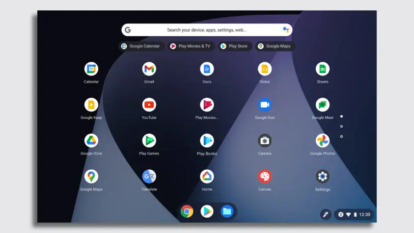
To mitigate this discomfort, the Chrome OS team developed what’s called “free form window management,” or the option to resize windows however you like (as you’ve traditionally been able to on Windows and Mac OS). At first, Google only offered two buttons: one to close the window, and one that juggled minimizing and some other options, in attempts to keep things as simple as possible. But over time, the team relented into the user habit of minimizing. They cemented that button as a standard, while offering more options for window management. A feature called “desks” (2019), lets you load up and swap between several different windowed desktops.
As the Chrome OS team developed out the system’s tablet UI, it actually circled back to embrace many of its original rules—like full screen apps and limited window management options.
Recognize your brand’s excellence by applying to this year’s Brands That Matter Awards before the early-rate deadline, May 3.