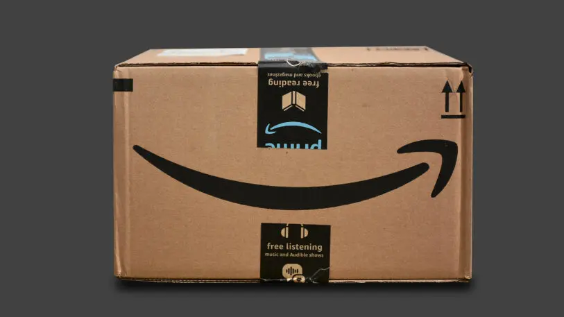
Amazon can squeeze a lot into a box.
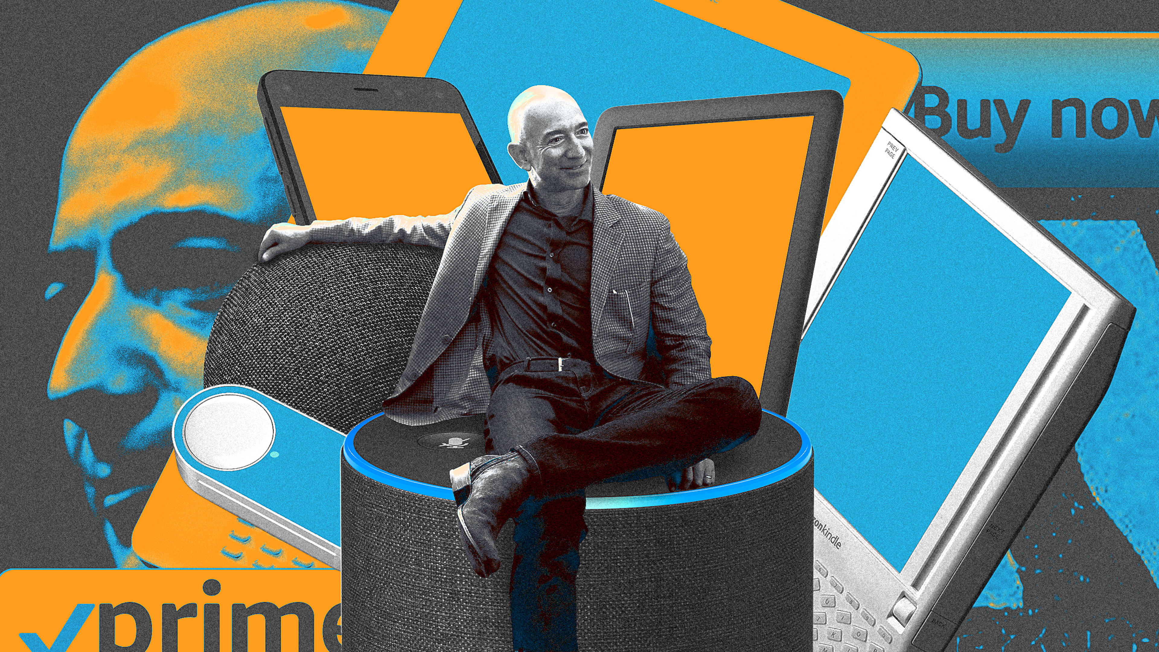
Jared Ficklin was part of a secret team at a prominent design firm tapped with helping design and develop a watershed device from Amazon, the Fire Phone. The Fire Phone was going to be Amazon’s arrival in the design world. The Kindle was a breakthrough e-book reader, sure. But it was too utilitarian to be an object of desire, the sort of budget device you’d expect from a budget retailer. Developing a premium smartphone could ascend Amazon to the rare air of Apple, transforming it into a company that could make covetable things. This was important to Jeff Bezos. As he said in an early memo, he wanted Amazon to be like Apple or Nike, “loved” by customers and perceived as “cool.”
“Risk taking is cool. Thinking big is cool. The unexpected is cool,” he wrote then.
Ficklin worked for months under clandestine conditions he had never experienced before: inside a faraday cage, or an electrified room, with walls that blocked wireless signals. This level of security ensured no wireless signals could go in or out to leak information on the product. Eight perfectly clean human bodies, working on laptops that were required to stay in that room over the course of months, eventually permeated the space with an unavoidable biological odor. When his team visited Amazon’s Seattle offices, they were banned from taking Ubers, which could theoretically be tracked, or even from entering the building through the same entrance, lest an eagle-eyed reporter notice.
“We started calling this the Jeff Phone; we felt we were basically making a phone for Jeff Bezos,” Ficklin says with a laugh. “We were slowly designing a phone for billionaire tech company owners. But at the time there were three of those, and two [Tim Cook and Bill Gates] already had their own phone. It was like, who is this phone being marketed to?”
The Fire Phone flopped, in large part due to Bezos’s strategic error in over-indexing on one “cool” feature. To this day, Amazon design is rarely mentioned in the same breath as beloved companies like Apple and Nike, or even fellow technological giants Google, Microsoft, and Samsung.
The Fire Phone illustrated that while Bezos is an open-minded and often instinctual thinker—many designers tell us they genuinely enjoyed working with him—he didn’t turn Amazon into a company that puts design first and places value on the insights and skepticism of designers. That’s important, because design-led companies consistently beat the industry standard, growing revenue faster and offering more returns to shareholders. In one study, design-led companies outperformed the S&P Index by 219% between 2004 and 2014. A major part of design’s value proposition is the process. Designers identify problems to create solutions.
Amazon, on the other hand, has often identified solutions before naming the problem. Sometimes that approach worked. But often, it didn’t. And it created an ecosystem with a surprising number of hidden costs. “Amazon will never be a design-led company. It’s evident in the quality of the products they ship. And although the design is still thriving there, I don’t believe it’s fundamental to the core DNA of the company,” says a former Amazon designer who worked closely with Bezos on several products. “Just because there’s ‘customer obsession’ doesn’t mean there’s an investment in quality and design rigor.”
Smile!
Bezos’s design philosophy mirrors his broader approach to business, mixing outsize ambition with an obsessive focus on customer experience. His work on Amazon’s logo is indicative of how his own instincts in this process could be invaluable—a logo that is a bright point for the company, adorning every box Amazon ships with a smile, to this day.
In 1999, Joanne Chan and David Turner of the brand identity firm Turner Duckworth sat down with Bezos to talk about redesigning Amazon’s logo. At least a dozen executives flanked the CEO around a large conference table. Bezos sat in the middle on one side, and Chan and Turner sat in the middle on the other side.
Amazon’s logo at the time was like most internet logos in the late ’90s. It read out the full “amazon.com” for a culture still mastering web browsers, with a frowning orange swoosh beneath the word. Amazon was still known for selling books, and it was soon to get into the business of selling CDs. But Bezos took this moment to explain, firsthand and under a nondisclosure agreement, where he planned to take the company next.

“And I think he said ‘patio furniture.’ David Turner and I looked at each other like, Yeah right! They’ll never be able to sell furniture online!”
While unbelievable, Bezos’s brief was clear. First, don’t frame Amazon as a company that just sells books, because it will sell everything. Second, communicate that customer service is of paramount importance.
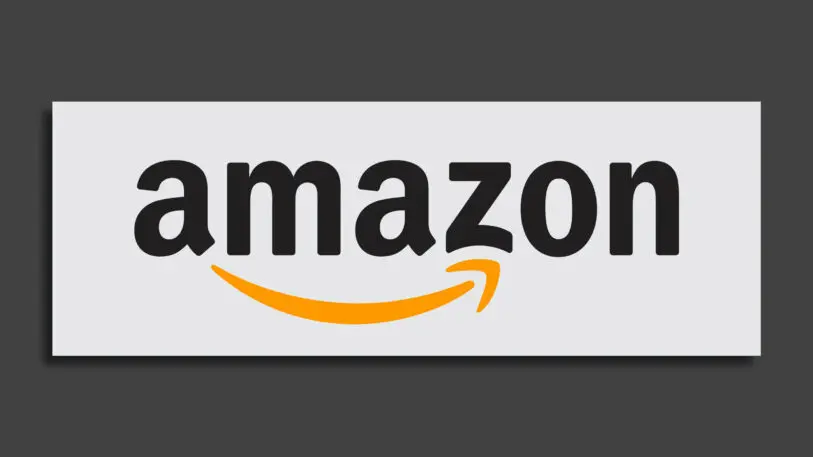
Several weeks later, Chan and Turner returned with a few options, and the first idea they presented was Bezos’s favorite. You’d recognize it because it’s still the logo that Amazon uses today. It reads “Amazon” with an orange smiling arrow beneath the word, the arrow pointing from the a to the z in the logo, implying that Amazon would sell everything from a to z. The smile symbol, the design team pointed out, could one day function without the word Amazon at all.
Bezos gave more specific feedback on the logo later, but the tweaks were small, and Chan says he trusted the team to be the experts in the process. The only strong pushback from Bezos was regarding some two-color stationery that Turner Duckworth proposed for Amazon’s internal use, which featured the Amazon logo in black and orange.
“He said, ‘Where does my customer benefit from doing two-color stationery? Let’s just do one-color stationery,’ ” Chan recalls. “That’s how laser-focused he was. He wanted everything to go back to customer satisfaction.”
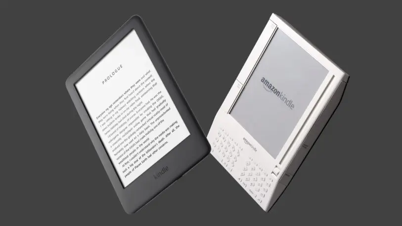
The Kindle learning curve
Amazon’s name is now synonymous with many of its physical products, like the several generations of Echo and Fire TV. But in 2004, when Amazon began development on the Kindle, it had never made hardware before—and the Kindle project offered Bezos an opportunity to learn how. The project showcased a balance of Bezos’s own hubris and humility, as the original Kindle was both humble and grandiose at the same time.
Amazon’s products are born inside the company’s secretive Lab126 group. Lab126 has 3,000 employees by current estimates, making it one of the largest internal design groups in the world. (Amazon declined to comment for this piece or confirm the lab’s head count.)
In 2004, Lab126 founder Gregg Zehr, a former Apple engineer and Palm executive, was building his team from scratch. So he tapped Robert Brunner, the former director of industrial design at Apple who was then a partner at Pentagram, to serve as an external consultant on the project. (Brunner would later go on to found the lauded design firm Ammunition, which created products ranging from Beats by Dre to Ember coffee mugs.) “Jeff was really very hands on on this project,” Brunner recalls. “He was having a good time, I think.”
“I can remember spending hundreds of hours talking [with Bezos] about the front of the Kindle, tens of hours on packaging, and what the UX would be when you unboxed the device. I can remember spending probably hundreds of hours on the leather cases,” says Mark Randall, a former VP of supply chain at Amazon who worked tightly with the industrial design team. “The inside of the leather case was made of microfiber, and he’d be rubbing it, kneading it, literally making sure it was absolutely perfect before it shipped. He was just incredibly [detail-oriented].”
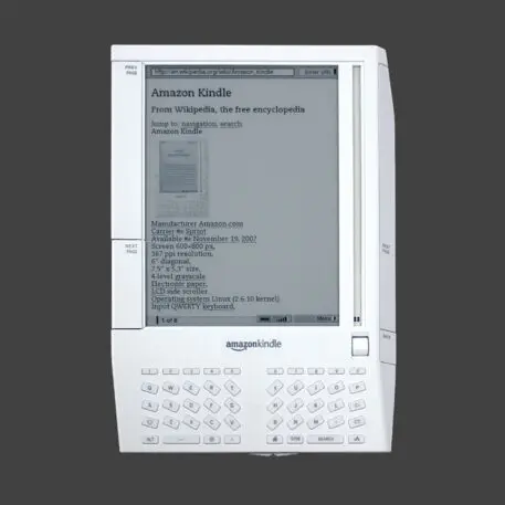
Some decisions were made early, like that the Kindle would have an e-ink screen, because it would be legible under sunlight, just like real paper. Other topics were larger debates.
Bezos was firm that he wanted the device to have a keyboard, instead of being a sleeker device that was mostly a screen. “We as designers were not in favor of the upfront keyboard. . . . Having a QWERTY keyboard didn’t feel like a reading device. Obviously, Jeff won that argument,” Brunner says with a laugh. “And if you think that at the time one of the most successful devices of that era was the Blackberry. It was ubiquitous across any executive. Jeff had his Blackberry and thought the keyboard was really well executed.”
The other big decision was how books could be downloaded to the device. The Kindle had Wi-Fi, but a cellular modem would make the Kindle a completely untethered, connected device that could download books anywhere. The question was, who would pay for a wireless subscription for their e-book reader?
“I remember this meeting where Jeff said, ‘You know, I want to bury the wireless cost in the cost of the book,’ ” Brunner says. “He figured out in his spare time the cost of delivering a paper book versus an e-book was relatively similar, so let’s just put it in there as part of the cost of the book.”
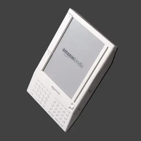
Examine the industrial design of the original Kindle today and it’s a wild object that time has largely forgotten. Its design is asymmetrical, with the right edge of the device faceted off to grip with your right hand. Below the screen lives a big keyboard. Beside the screen is a scroll wheel and a tiny mirror slider to show your position on a page. The back of the device is covered in hieroglyphics.
“There was this hyperbolic idea that this was a new Rosetta Stone,” says Symon Whitehorn, who worked alongside Brunner on the design, unsure if that brash overconfidence was born from Bezos or another executive.
But as maximalist as the Kindle looks, its functionality was pared back for ease of use. Bezos resisted the urging of many within Amazon to turn the Kindle into a PDF-editing productivity machine, and backed Pentagram’s cleaner, three-piece approach to the UI: the store, your library, and the reading space. This UI paradigm still defines the Kindle today. “Nobody is too good; everybody is good enough. It has that sort of feel to it,” Brunner says. “Jeff was like that in the beginning. He just wanted to make sure people had access.”
As for its name, “Kindle,” that wasn’t invented by accident, but by the thoughtful work of Karin Hibma and her late husband, Michael Patrick Cronan, who specialized in marketing products like the Apple’s Lisa computer and naming the company TiVo. (Hibma also named this website, Co.Design.)
“[Bezos], at one point, made a comment that he wanted to do something that would not be braggadocious, but small and humble, about starting something,” Hibma says. Kindle was already a word that Hibma and Cronan had flagged in early explorations. No wonder it was also the word that Bezos ended up choosing: It was the perfect word for the start of something larger at Amazon.
Catching Fire
Bezos’s obsession with customers didn’t always lend itself to a fruitful design process. A failed collaboration with Motorola is a case in point.
Bezos famously began product work by having his employees write press releases about a new product or feature before it even entered development. It’s a way of backing into product development but ending somewhere that would hopefully ensure consumer interest and satisfaction. This is not how most product development works at major design studios, which identify a problem first and experiment with solutions second.
When Amazon was considering developing its own smartphone in the 2010s, before the Fire Phone was born, the company invited Motorola to discuss a potential collaboration. It’s easy to forget today, but Motorola was a powerhouse in phone design during that era. It dominated the aughts with the Razr. Before the iPhone, Apple tapped Motorola for a doomed collaboration on the Rokr. The phone, first planned to hold more than 1,000 songs and integrate seamlessly with iTunes just like an iPod, was designed with the expensive storage to do so, before Apple downgraded the number of songs to 100—seemingly sabotaging the launch. Motorola was understandably nervous to partner with a giant like Amazon following the Apple disaster. (Apple did not respond to a request for comment.)
Looking back, Wicks realizes that Motorola’s traditional approach probably didn’t resonate with Bezos or the larger Amazon team, who operated less on product romance than practicality. “Our culture was so driven by the touchy-feely, the product, the story, and that’s how we did great things,” Wicks says. “[Products] were thoughtful strategies, but there was also this strong emotional push for what you believe. It’s just different approaches that would have had to be reconciled.”
Conversations didn’t die right after that meeting, but the partnership never caught on. “There was some exploratory work back and forth on some things,” Wicks says. “But as a takeaway, if we did want something to happen there, there was a definite mismatch on how we’d typically go about that process around innovation.”
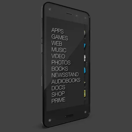
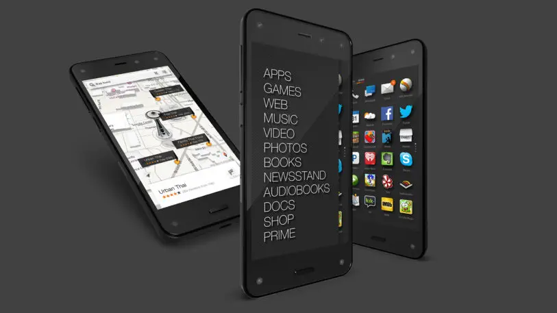
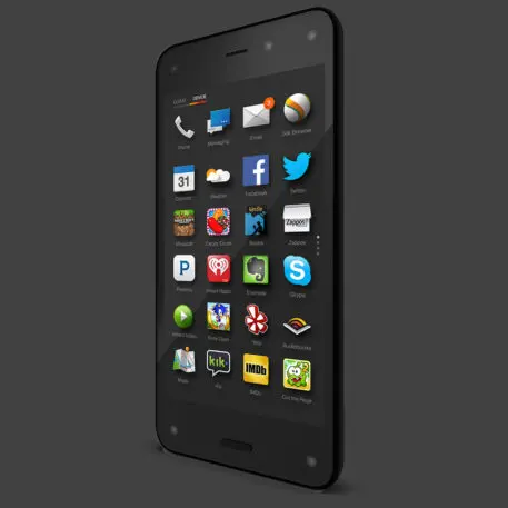
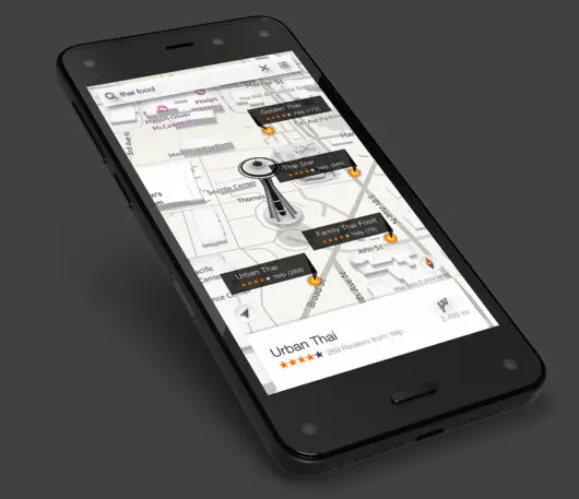
The Fire Phone debuted and disappeared between July 2014 and August 2015. There are several reasons it failed. The phone premiered for $650, which priced it toe-to-toe with the polished iPhone. In prioritizing a novel UI over functionality, it launched without mainstay apps like Starbucks and Google Maps. So Amazon dropped the price by hundreds of dollars, and then offered it for just 99¢ with an AT&T contract. “The tech press had a field day when the Fire Phone came out,” recalls Randall, the former VP of supply chain at Amazon. “Jeff was like, ‘Eh, that wasn’t successful. We go again.’ Stuff like that doesn’t faze him in the slightest.”
It helped that the Fire Phone didn’t need to succeed. Amazon is not Apple. Its devices, usually priced on a budget, have never needed to make oodles of money on their own. Rather, they are physical bridges to Amazon’s various digital services—and, most important, its gargantuan retail store. The Fire Phone had a dedicated button so you could scan a product to find it on Amazon. But that function was myopic compared to the wider world of possibilities Apple offered with its rich App Store. Bezos wanted to sell an object that was as “cool” as Apple’s products with a price to match, but didn’t offer the functionality to get there.
Still, it was a bold move. Amazon was not a consistently profitable company into the early 2010s; the company didn’t explode with revenue until 2017. And yet, even as Amazon was losing money in much of its digital retail business, it continued to invest in Lab126, where it only lost more money.
“Investing as hard in Lab126 as large as he did when the company wasn’t making money was a ballsy move,” says Randall, alluding all the way back to the Kindle days. “I was at many strategic executive meetings. . . . Even when [Bezos] was challenged by others, he was adamant, ‘I’m going to do this.’ He said, ‘The hardware business is hard. It’s going to take a long time. We’d better start now, double down.’ ” While the Fire Phone didn’t work out, it did seem to teach Bezos where his competitive strengths were: fast, cheap, and capable design.
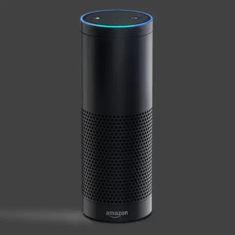
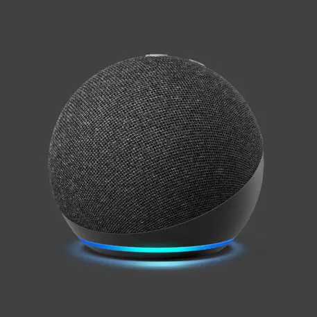
The Echo
The Fire Phone was quickly followed by the Echo. Where the quirky, 3D Fire Phone flopped, the Echo—which was arguably the first device to make spoken interface mainstream—became a hit. It’s an excellent example of how Bezos was sometimes able to start with that press release vision and turn it into a product that people would buy, especially with enough time for revision.
At the heart of Amazon’s innovation culture lives the Japanese concept of kaizen (or what’s often translated as “continuous improvement”). You can see the value of kaizen in Amazon’s shipping speeds from a few days, to two-day, to one-day, to same-day. By chipping away at a product over two decades, iteration actually piles up into innovation.
The Echo, and its assistant, Alexa, were in development as early as 2011, as engineers were tasked to figure out how to leverage the cloud and machine learning to build something new. Bloomberg reports the core technology rolled out of a highly ambitious, canceled augmented-reality project. Bezos cites Star Trek as an inspiration; he is a longtime fan. (When Bezos was a fourth grader in Houston, he says he played Star Trek with his friends every day after school. Someone played Kirk, another person would be Spock. But usually, someone was the Computer, too.)
By 2016, when Bezos actually appeared as an alien on the show Star Trek Beyond, Echo and Alexa had more than 1,000 people working on it. But according to Randall, whose background in manufacturing made him a leading figure at Lab126, it was always a very small group who knew Amazon’s hardware plans in the beginning, even as Lab126 scaled and it was developing the Echo.
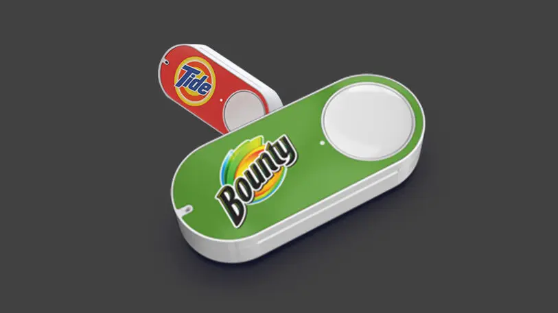
“I describe it to people as an iceberg. The way we planned our [hardware] business was an iceberg,” Randall says. “Above the water were the Kindles. Below the waterline were 90% of other projects we were working on confidentially. Many products were, literally, Jeff knew, I knew, Gregg Zehr knew, and maybe one or two others knew.”
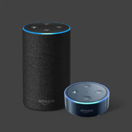
Echo was just one of those products that were often being developed in secrecy from Amazon’s own company within stealth offices in Cupertino. Over several releases, the Echo was miniaturized, covered in cloth, and in some cases even got a screen. Amazon added more and more functionality to Alexa along the way, from telling stories to children to connecting to millions of smart devices.
To stoke consumer interest, Echoes constantly sat on or near the top of Amazon’s own sacred retail store. As of 2019, 100 million Alexa-powered devices had been sold. The Echo solves very few problems in real life, but Amazon “kaizened” its product to the top. “I’ll take 20 failures like Fire Phone if tomorrow you could tell me we have a 100% chance of getting another Alexa and Echo,” said David Limp, Amazon’s SVP for devices, in an interview with Fortune from that time.
Over time, Bezos’s interest in Amazon’s product design waned. “Jeff was an incredible leader who dove deep with design,” says a former Amazon designer who worked closely with the CEO. “He started to focus his time externally, on rockets and robotics, in 2017-2018. So [Amazon’s] design slowly became less interesting.”

Amazon’s UX is a veneer
For all the effort Bezos put into hardware, the ultimate distillation of his design philosophy is the end-to-end UX of ordering a product and getting that product to your door in two days or less.
Amazon’s site and app design are stubborn in their lack of evolution. A legend in the design industry is that when Amazon moved its buy button just a few pixels, the change increased sales. The story might be true, and it might not (we reached out to Amazon for confirmation; the company declined to comment). But the allegory explains the mentality behind Amazon’s often incremental innovation: The consequences of significantly redesigning any part of a $386 billion store are almost too great for Amazon’s management culture to fathom.
“I think the removal of all the barriers of entry—all the friction points in looking for an item, buying an item, getting it delivered, tracking it—is still the core staple of the Amazon experience. And they’re able to do more with that every single day. This is where their core competitive advantage remains,” says Yves Béhar, a designer and acquaintance of Bezos. “Apple with the iPhone, from a brand standpoint, has sort of captured it as a must-have item. And Amazon, respectively, has owned a similar unbeatable advantage when it comes to the entire e-commerce stack.”
If that’s the case, then Amazon’s true design legacy is its retail infrastructure—an undeniable modern wonder propped up by all kinds of hidden costs.
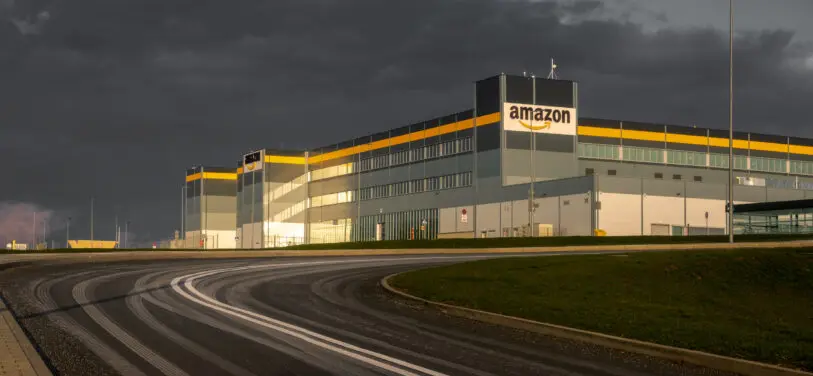
But then you look at the fulfillment center conditions, where employees have confessed to peeing into water bottles to meet productivity goals, to ending up living in homeless shelters following limited seasonal work, or being stopped from unionizing to earn a true living wage, not to mention the charges of discrimination against Black employees, and the costs of that convenience become clear. “[Amazon has] a very truncated, shallow understanding of people and how experiences impact other folks in that ecosystem. It’s a great online shopping experience, easy to check out, quick delivery for me, but very little consideration for other people impacted by that ecosystem,” Castillo says.
Another huge hidden cost of Amazon’s infrastructure is paid by every citizen on Earth: It’s ecological. Amazon stalled until 2019 to release its first expansive environmental report, at which time the company revealed its emissions were equivalent to those of the country of Norway—and worse than UPS, FedEx, Microsoft, Apple, and Alphabet/Google. Much of its impact was from delivering billions of packages a year, but Amazon also runs the largest cloud hosting service in the world, Amazon Web Services (AWS), which helps power platforms like Netflix and Facebook. As of 2019, these servers were operating on just 12% renewable energy.
When we look back on Bezos’s legacy at Amazon, will we see him as a paragon of intensely efficient UX with a spotty track record on industrial design? And to what extent will we remember the human and environmental costs of his ambition?
Bezos has indeed been customer-obsessed. However, this value alone does not mean a company is human-centered. The shortcoming of Amazon, as Bezos steps down as CEO, is not its value, but its values. These are the invisible costs of convenient UX, and why Amazon, to this day, may have become so large that it’s essential, but it is still neither cool nor loved.
Recognize your brand’s excellence by applying to this year’s Brands That Matter Awards before the early-rate deadline, May 3.