As a general rule, the CIA tries to stay out of the news. But its new website didn’t arrive on the scene very quietly.
The site and its corresponding new logo seemed more reminiscent of ’70s Joy Division than a staid government agency, a fact that critics on Twitter were quick to point out. But despite its synth pop feel, some design experts said the new site seemed to accomplish its mission: to aid the agency in recruiting.
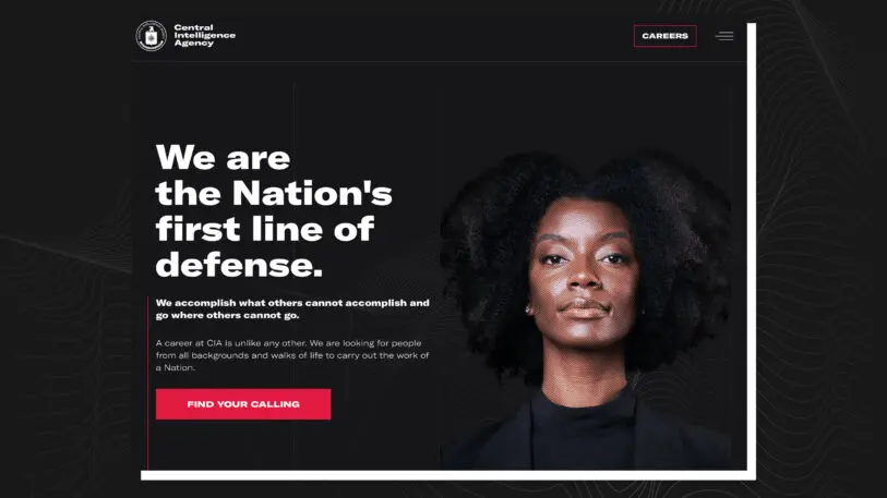
[Image: CIA.gov]The updated site and logo are just the latest in a renewed recruitment effort by the CIA under director Gina Haspel. Over the past few years, the agency has been upping its outreach to millennials andminority communities, including joining Instagram and launching itsfirst TV recruitment ad on Hulu last summer.
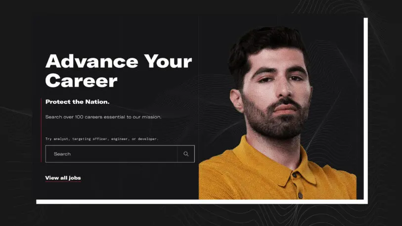
[Image: CIA.gov]It’s clear that recruitment is the site’s top priority just by looking at it. The only buttons above the fold are “careers” and “find your calling,” along with aspirational, career-oriented messaging. A carousel of photos showcases young professionals from diverse backgrounds. “It’s obvious the CIA is more interested in recruiting,” says Bret Sanford-Chung, VP and CMO executive partner at marketing and analytics firm Forrester. She notes the stark contrast to sites like theFBI,where you have to dig to find a jobs page. The CIA makes clear that “it’s all about recruitment. I’d have to dig to find the other stuff.” She says she always asks clients, “What’s the site’s purpose?” Here, “it’s very clear here what CIA’s purpose is.”
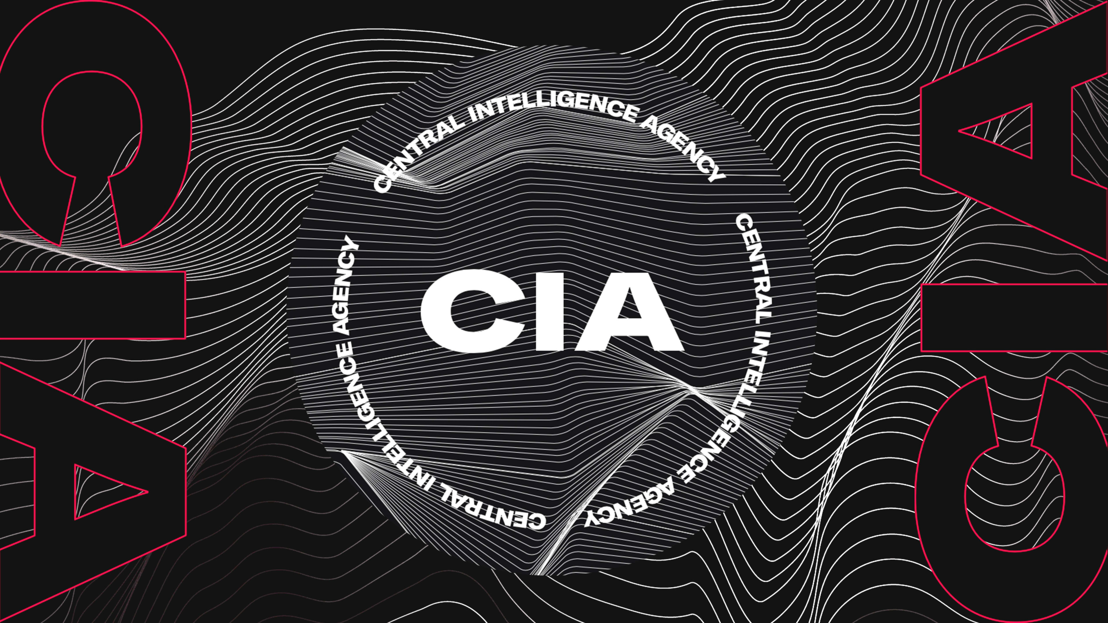
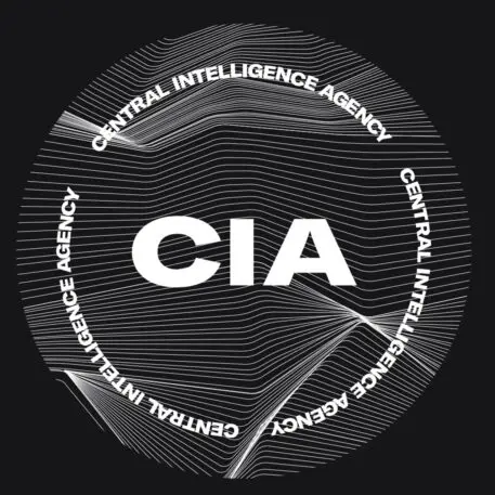
[Image: CIA.gov]If you click the hamburger menu on the top right, you see the most contentious design element: a secondary logo that just features the CIA acronym over radiating white lines. The circle is bordered by a repeat of the words “Central Intelligence Agency.” The site also includes astreamlined job board, with approachable copy that plays up adventure and suggests users “explore the world, CIA-style.”[Image: CIA.gov]Designers critiqued the logo by offering up their own trendy “rebrands” like thisCriterion Collection CIA logo,album covers,or a million Joy Division references like thisUnknown Pleasures-CIA T-shirt. Critics online found a certain amount of irony in the agency’s attempt at a hip visual language, which, they noted, separates the CIA’s new look from what it actually does. “By using trendy aesthetics, they can veil what they truly operate and exist to do, which is not simply to be ‘the nation’s first line of defense’ but to impose violence on both Americans and people in other countries — largely Black people and people of color,”writesElly Belle inRefinery29. “Destabilizing sovereign nations but give it some hip typefaces,”commentedone person on Instagram.
advertisement
Others found positive elements. “I’m actually quite stunned—in a positive manner—at what they’re trying to achieve,” says Pentagram partner Eddie Opara, who was surprised to see this redesign approach, as it was devoid of the traditionally iconic patriotic elements. He sees the site as effective in what it’s trying to do: recruit, with clear call to actions above the fold. Dark tones create a sense of distance and curiosity, he says, adding that the site “indicates a really telling aspect about what the nation needs at this moment of time, and that sense of inclusivity and diversity is coming through in an active manner through young, millennial-type diverse faces.”
But when it comes to the nitty gritty of the visual design and experience, Opara sees a lot of room for improvement. The image quality isn’t great; the contrast between color and black and white could be improved; and the background wave pattern could be used as transitional rather than behind the copy, which makes it more difficult to read.
Did the waves remind him of Joy Division, by chance? Opara laughed, and found the idea of the CIA ripping off Peter Saville, the designer behind Joy Division’s Unknown Pleasures and a former Pentagram designer, funny. “No, I saw the sense of data and wading through data and these fields and undulations of landscapes they have to navigate in this torrid world,” he says.
Government design is notorious for low budgets and red tape, and it’s unclear who designed the site. A CIA spokesperson declined to comment as to whether the agency has an in-house design team or who the design leads on the project were.
[Image: CIA.gov]Critiques aside, will this new look bring in fresh faces to the CIA? Sanford-Chung says it has potential with the right audience. “It also is speaking to a sense of finding your calling; to a sense of searching and yearning that they realize a lot of folks in their recruiting demographic are feeling,” she says. “There is more desire to do something that matters post-COVID.”
As for the criticism that the site nakedly caters to millennials who are likely to associate the wavy grids and black and white motif with pop culture rather than with spying, coups, and assassinations? “You could say it is millennial pandering, but so what do they want?” Opara asks. “An 80-year-old codger coming in as a spy?”
Recognize your brand’s excellence by applying to this year’s Brands That Matter Awards before the early-rate deadline, May 3.
ABOUT THE AUTHOR
Lilly Smith is an associate editor of Co.Design. She was previously the editor of Design Observer, and a contributing writer to AIGA Eye on Design.More